The Bathroom Reveal

The blog has been a bit neglected lately since I don’t have a lot of spare time, and I have been spending most of the time I do have on the podcast (which is getting better and better each week – check it out!).  It hit me the other day that I had never officially revealed how the bathroom looks now that we are finished with our mini remodel.  Let's remedy that now. 

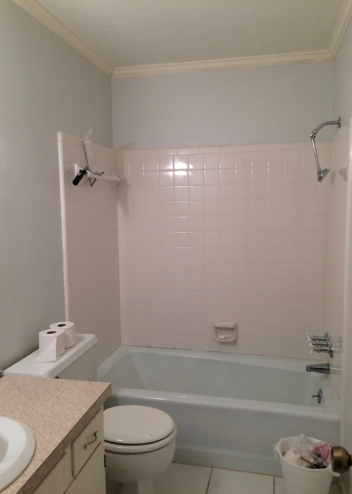
Before I reveal how good it looks now, I want to remind you how it looked when we started.  Our house was built in 1977, and while it had been well maintained, maintenance was about all that had been done to it.  The late 70’s and early 80’s were still alive and well in our home.  The hall bathroom was a 1970’s builder’s special – basic, beige, and boring.  It was serviceable, there was nothing really “wrong” with it, but it felt dingy no matter how much you scrubbed it and the atmosphere was far from relaxing.

After the shower doors were removed.

After the shower doors were removed.

We started the bathroom’s transformation, with removing the stuff that couldn’t be salvaged.  The Shower doors were the first to go.  It felt SOOO good to get those out – they were gross, and no amount of bleach and scrubbing would get the parts under the door seals clean!  Next we removed all of the caulk ….. the ridiculously bad, hideous caulk.  It was really terrible.  It was like they had a bad caulk, and decided to cover it up with more bad caulk – repeatedly.  It looked like an incredibly cheap hack job.  If we had done nothing in the bathroom but replacing the bad caulk, it still would have been a huge improvement in the appearance of the whole bathroom. 

Significantly Cleaner Looking after painting.

Significantly Cleaner Looking after painting.

Next we decided to cool things down a bit.  We painted the walls in BM Paper White, a cool, almost white grey, and the trim in BM Simply White.  This left the tiles in the bathtub surround looking distinctly pink.  Since new tile was not in the budget, we painted the tile using Rust-oleum tub and tile paint.  I admit the tile looked great, but if I had it to do again I don't think I would paint the tile, I just don't think it will be very durable.  

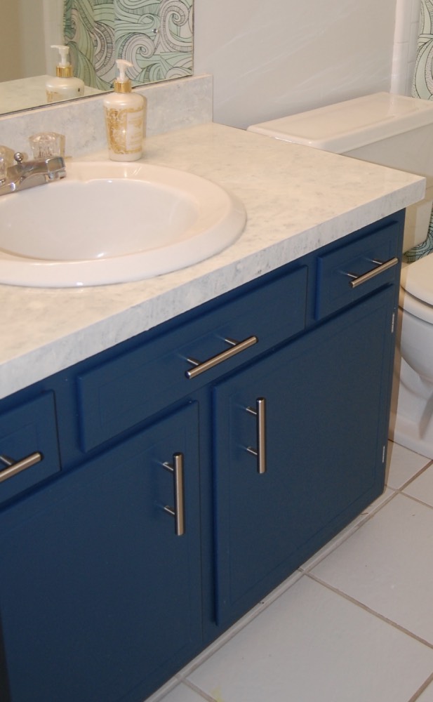
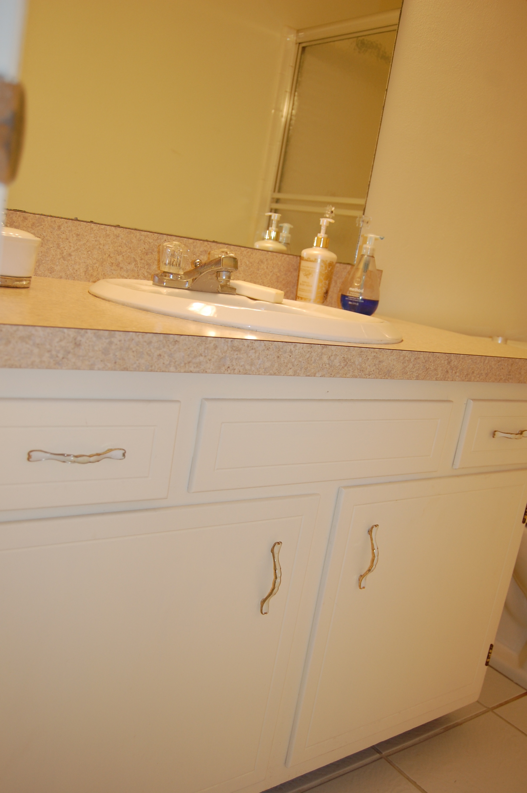
The bathroom cabinet after a coat of paint, new hardware, and a refinished countertop.

The bathroom cabinet after a coat of paint, new hardware, and a refinished countertop.

Cabinet interior after paint and new flooring.

Cabinet interior after paint and new flooring.

Next, we completely refinished the cabinet, inside and out.  It received a new paint job, and hardware.  The countertop was also refinished.

Floor Tile:  Before decades of dirt, after nearly new!

Floor Tile:  Before decades of dirt, after nearly new!

We even made the tile look nearly new by refreshing the grout.

While there are still a few things we would love to update as time and budget allow (like the mirror), the end result of this mini makeover was even better than we expected.  The bathroom looks fresh and clean, and it has a bit of personality now.  Something that was really lacking previously.

The beautiful Danica Odyssey shower curtain, that was the inspiration for the entire bathroom transformation.  I still love it and think it was a great choice.  It really makes the bathroom feel like a kid friendly space, without being a kid's space.

DSC_0203.jpg

To finish off the look I added a neon pothos in an aqua orchid pot, and some beautiful photos of the ocean.  The photos were given to Firebeard and I by the photographer, Joe Boris, for our wedding, and they are beautiful.  If you are looking for a photographer in the Atlanta area he is your man.  He does everything from lifestyle photography to corporate photography, and his work is impeccable.  

I think the most shocking thing about these before and after pictures is that one of the few things we didn't change in this bathroom was the lighting.  Initially we had fully intended to change out the lighting, because the bathroom just seemed SOO yellow when we started the makeover, but once we removed the yellowy beige paint from the walls and ceiling the room transformed.  Without yellow reflecting everywhere the room suddenly seemed bright, white, and cool.  It was an amazing visual transformation that we really didn't expect.  

To see all of the details of the bathroom transformation, including our many trials and tribulations, you can find them all here.

Stay turned for additional mini remodels!

Coat Closet Mini Makeover

We took a quick break from our bathroom remodel, to get some perspective before putting on the finishing touches.  During that break we tackled a quick and easy project - our hall closet.

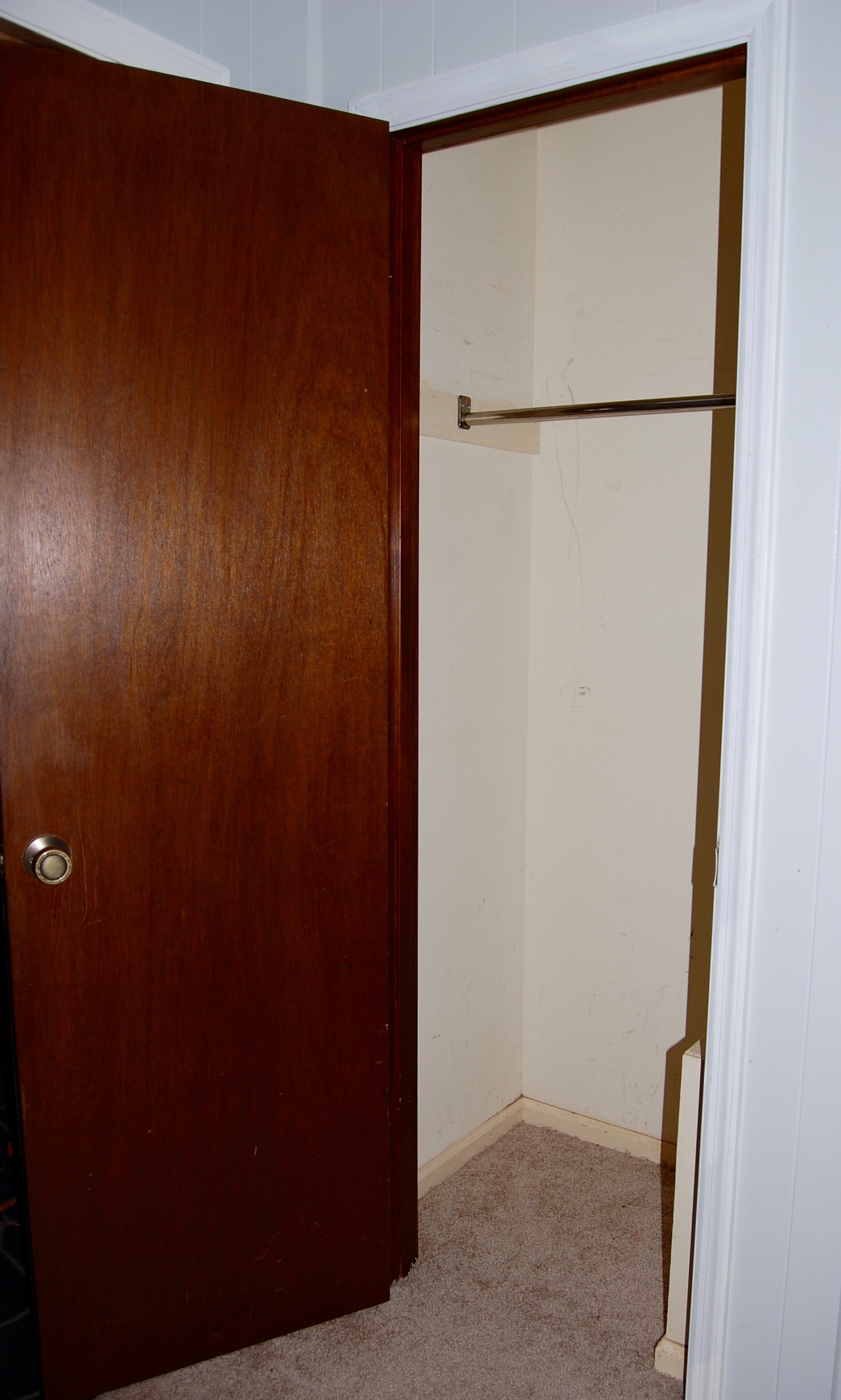
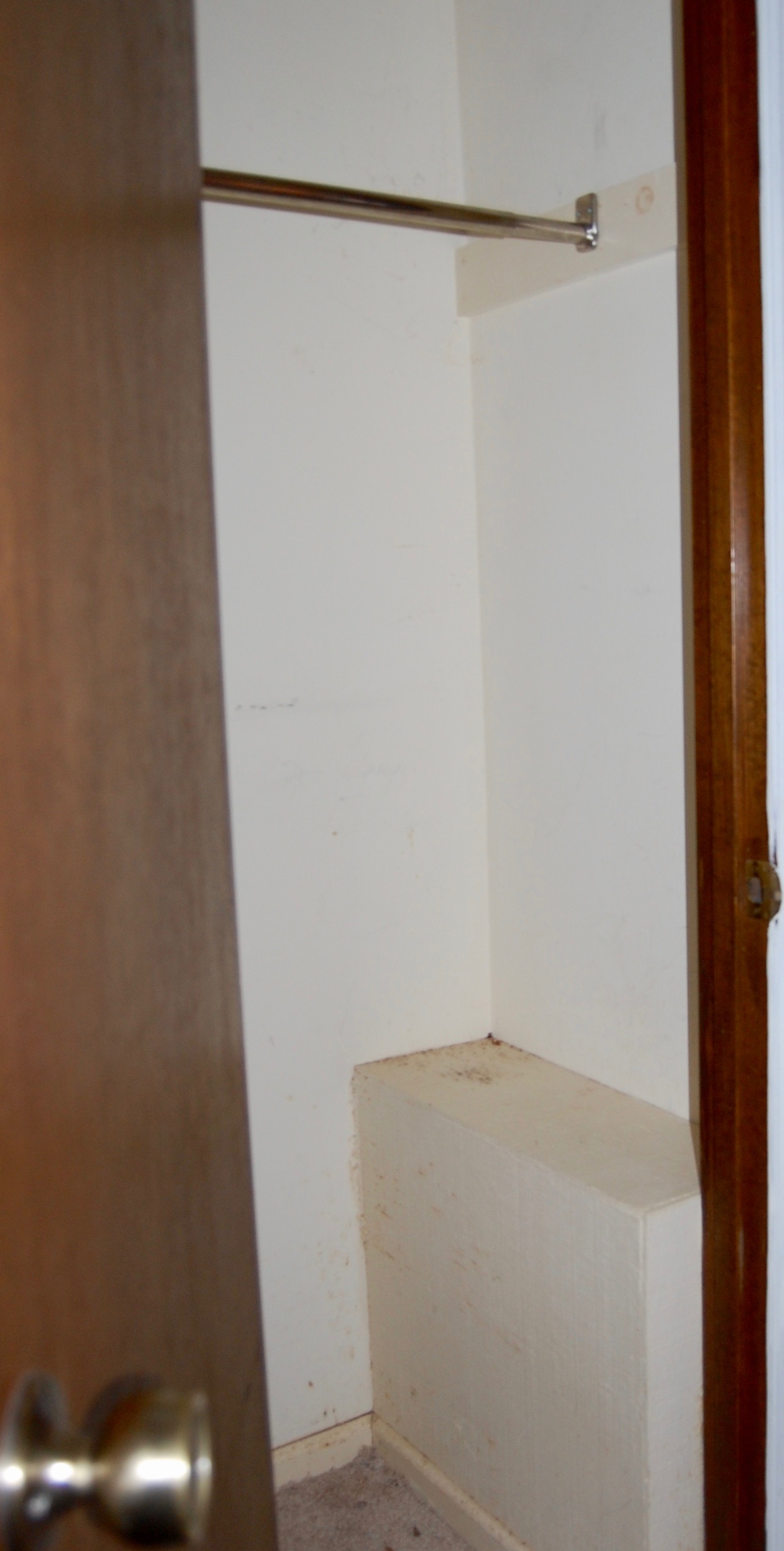
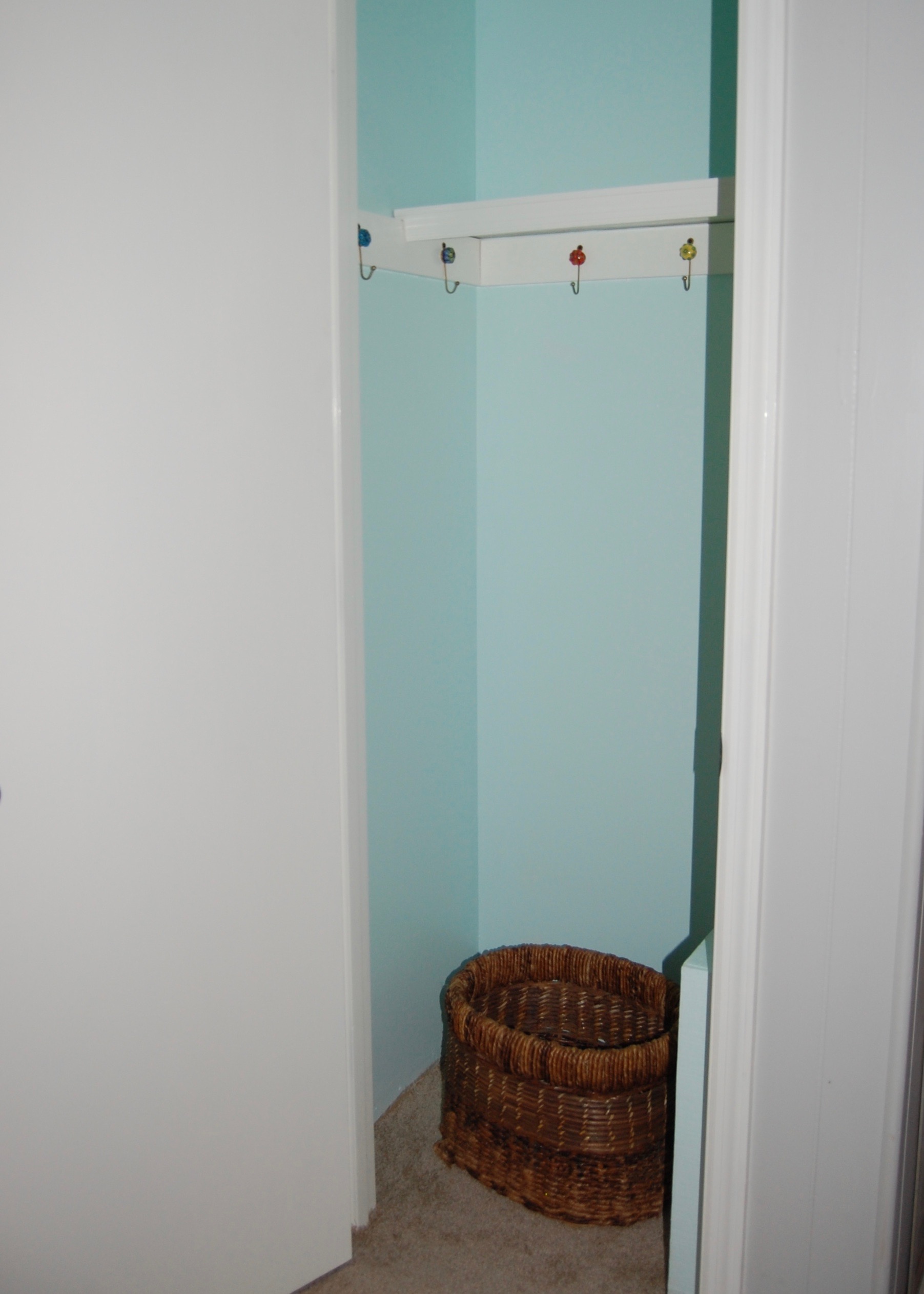
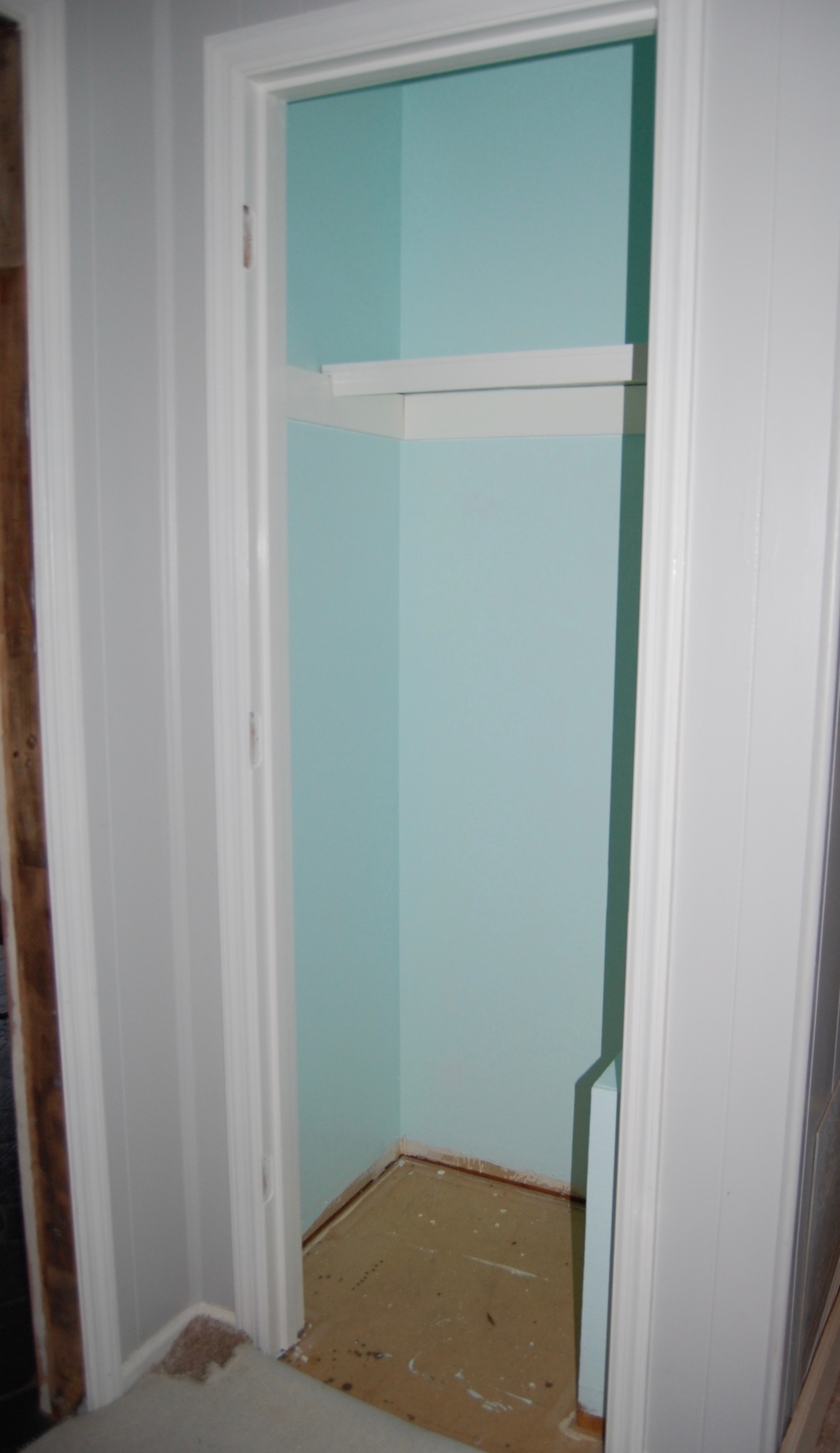
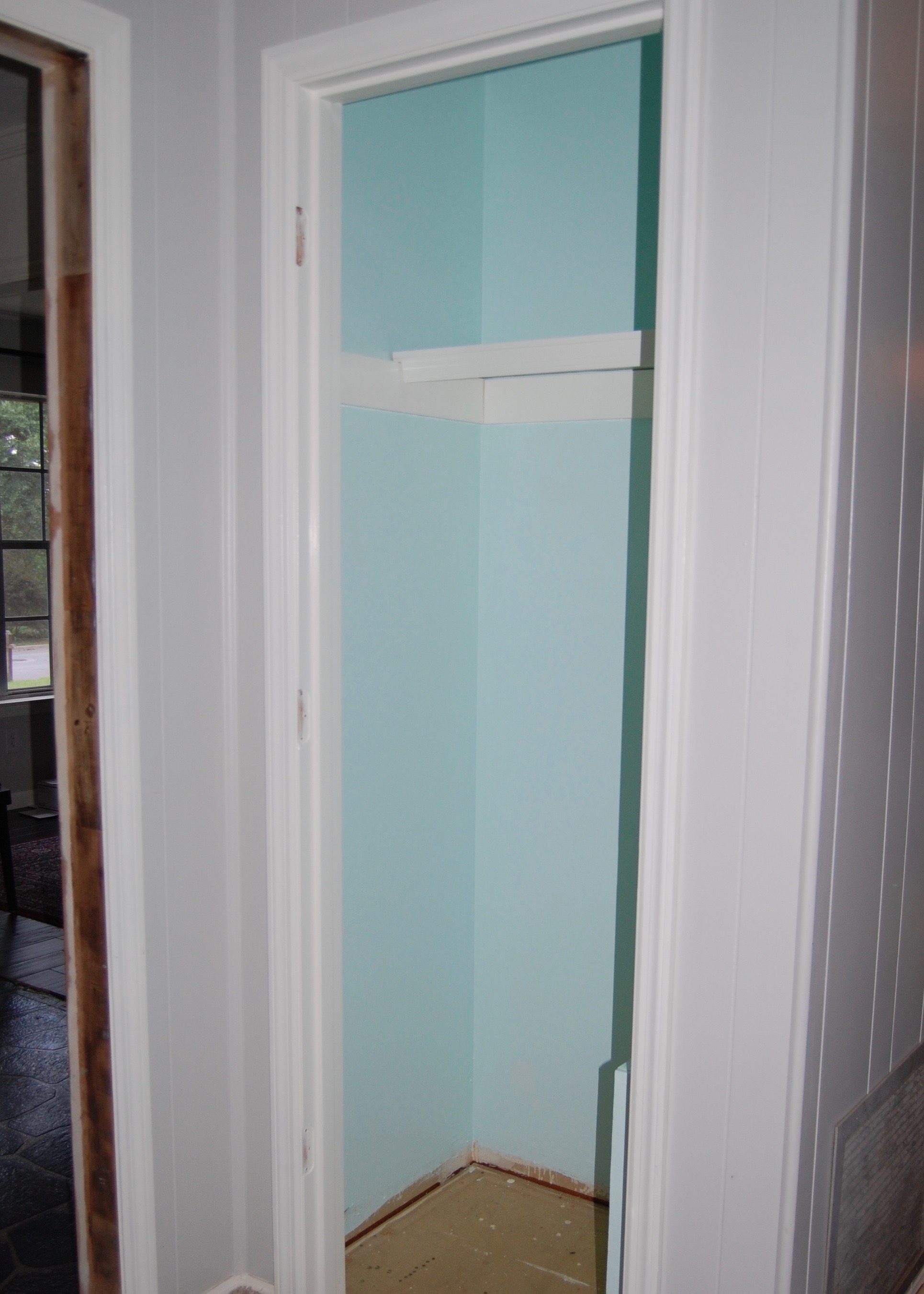
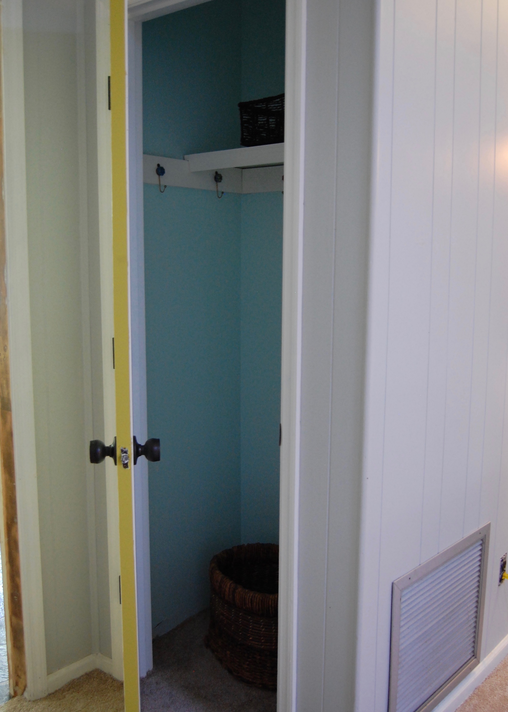
In a tiny hallway type area, just off our foyer we have a small coat closet.  It is about 24 inches by 34 inches with 8 foot tall ceilings.  On the right side of the closet there is a large wooden box in the closet that forms a low shelf.   It houses our A/C intake vent and cannot be removed.  Prior to this mini makeover, the closet had a single hanging bar for coats, and a shelf that was so deep only Firebeard could reach things on the back of the shelf without a step stool.  Soon after moving into this house the closet was regulated to storage closet status, because it was so impractical to use, and I began to research alternatives.

In a previous post I shared the inspiration for our hall closet makeover.  We were inspired by several of the beautiful and functional coat closet makeovers on pinterest, particularly those that used hooks for hanging coats and bags rather than hangers.  We put that inspiration to use, and here is the result.


What was involved in the transformation?

Preparing the flooring for hardwood

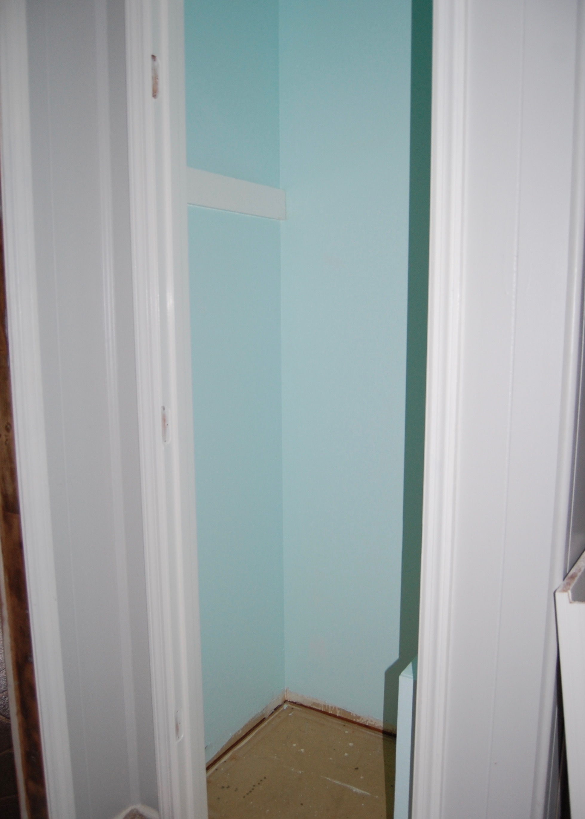
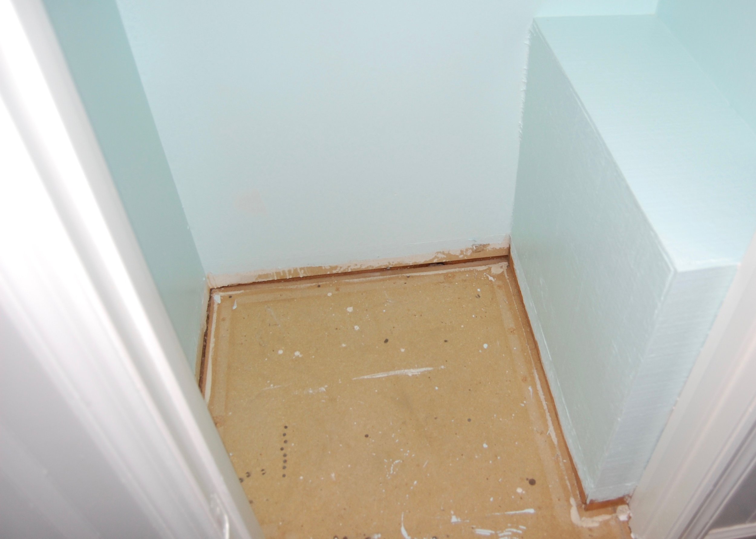
We are slowly replacing the flooring in most of the house with engineered hardwood, so we decided that since we were already doing some work in the closet we would do some of the prep work for the new flooring.  We pulled up the carpet (but didn't cut it out), removed the tack strips and baseboards, and cleaned the sub floor.  The carpet stayed peeled up while we painted and was laid back in the closet when we were done to help protect the subfloor from wear and tear until we can install the new flooring.  We decided not to reinstall the baseboards since we would need to pull them back out when it was time for the new flooring.

Painting

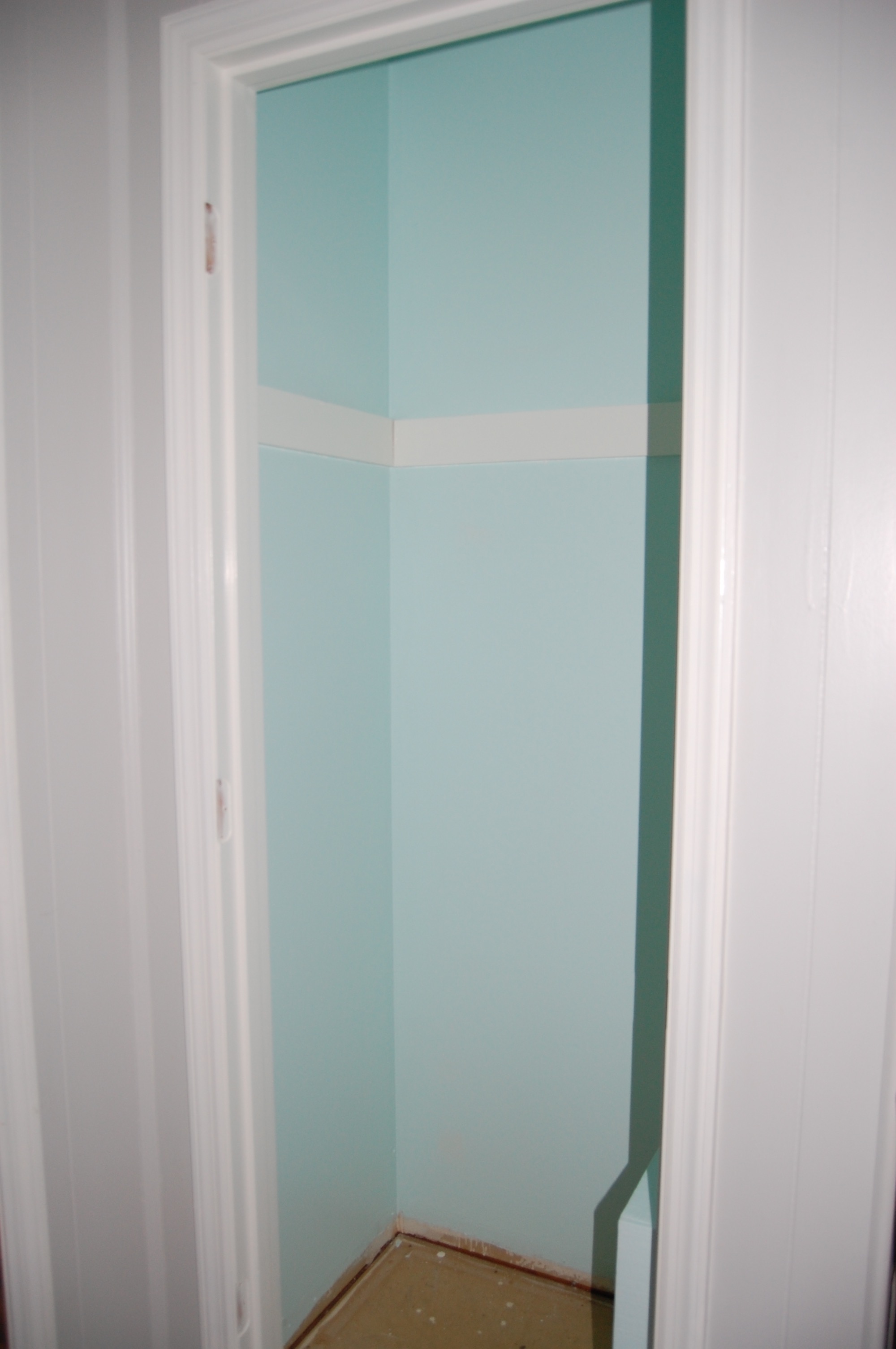
We tried a couple of different colors in the closet before settling on Soft Mint by Behr.  In the tiny dark closet most of the mints we tried looked too dark.  Soft Mint is a really pale mint, but in the dark closet it looks much more vibrant than it does on the paint sample.

All of the trim, the shelf, and the ceiling is painted in BM Simply White.

Adding Support and Reducing the Shelf Depth

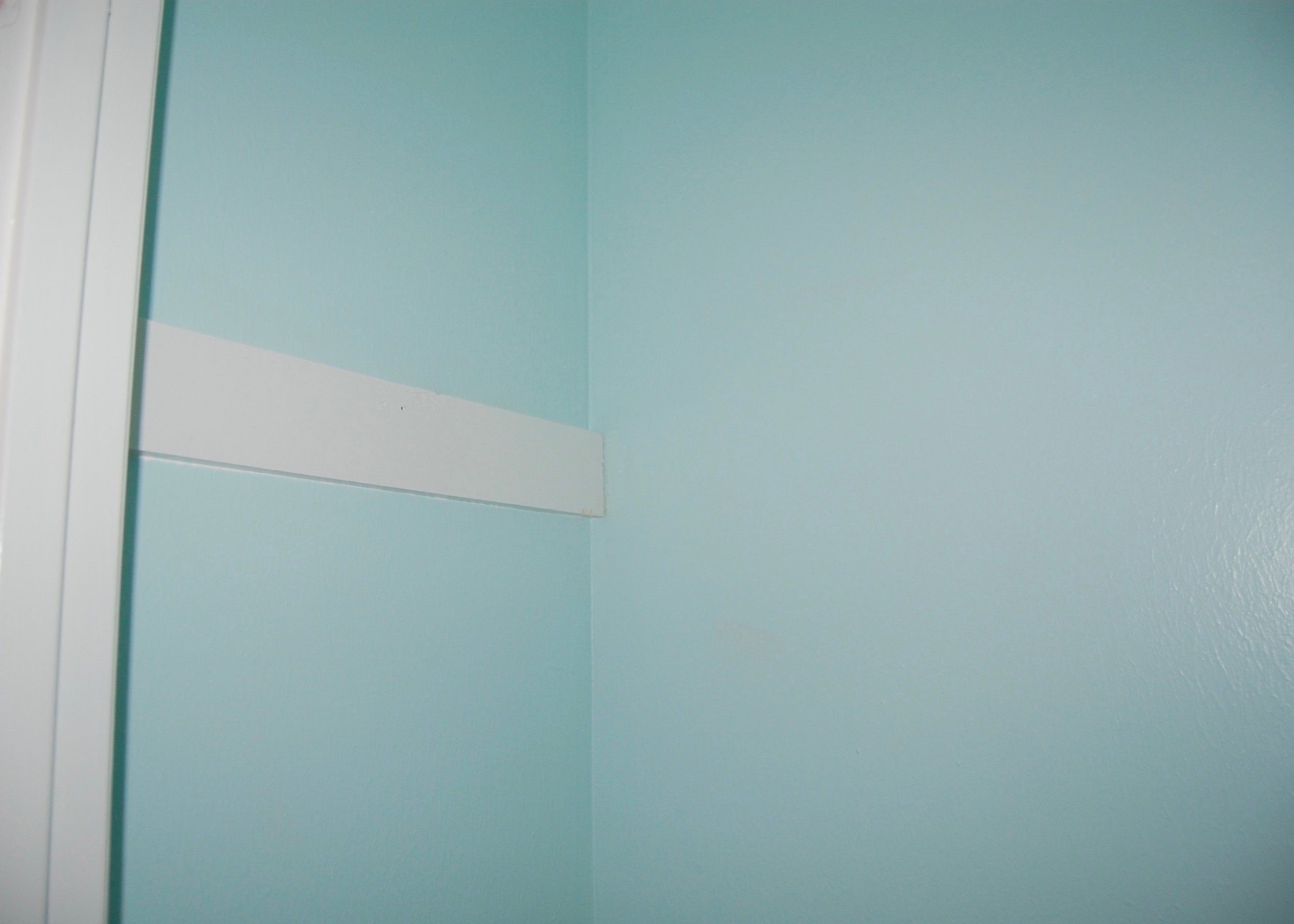
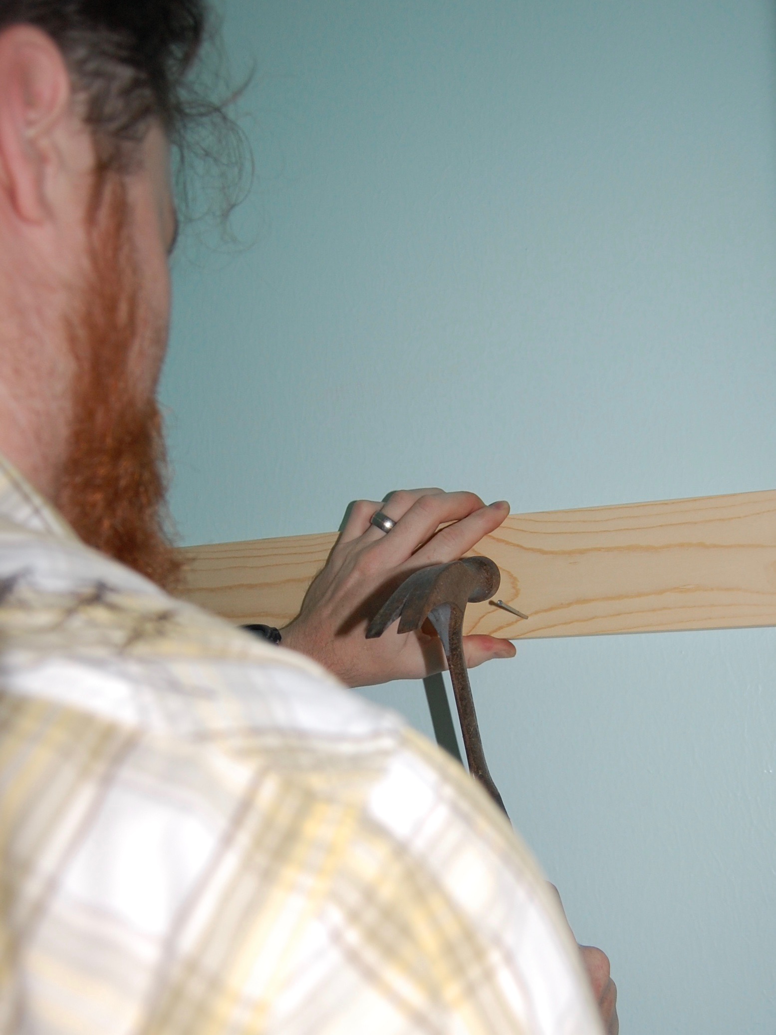
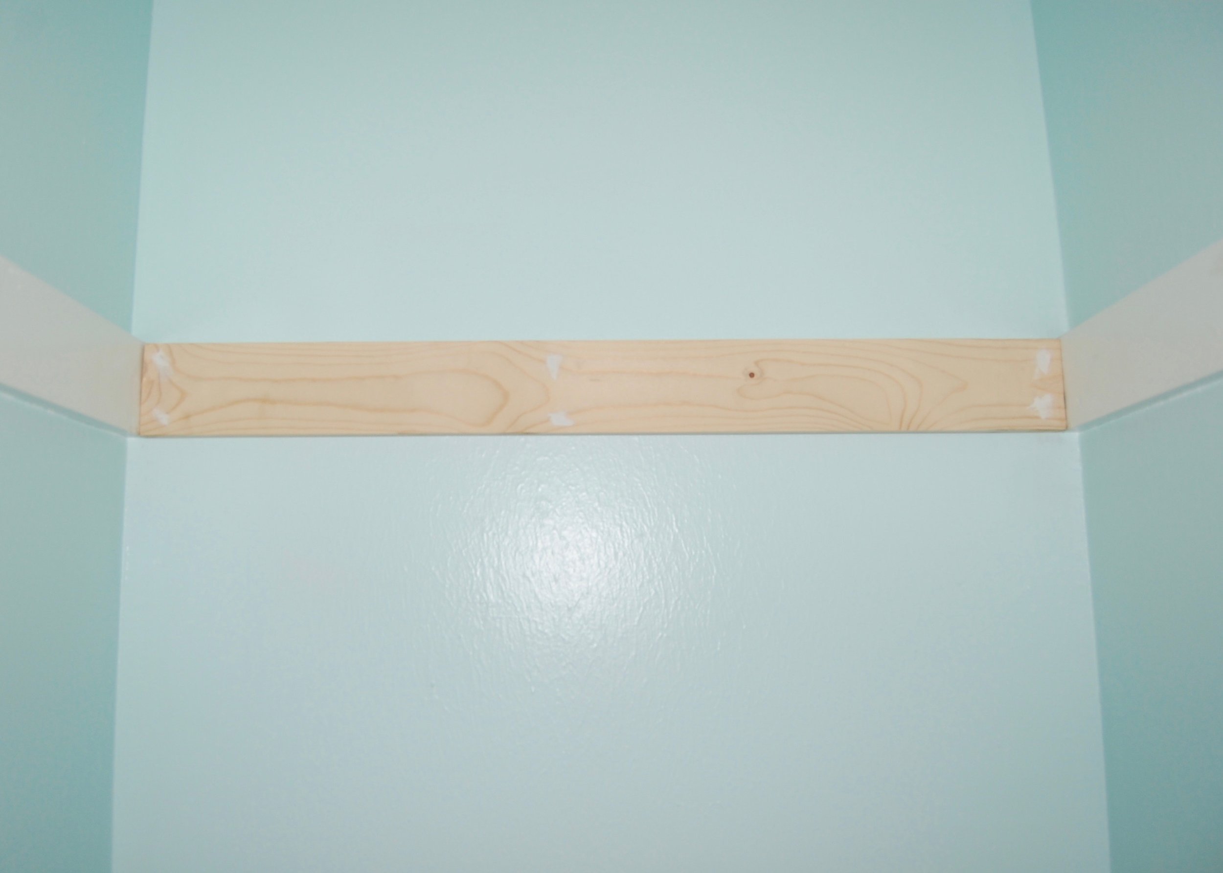
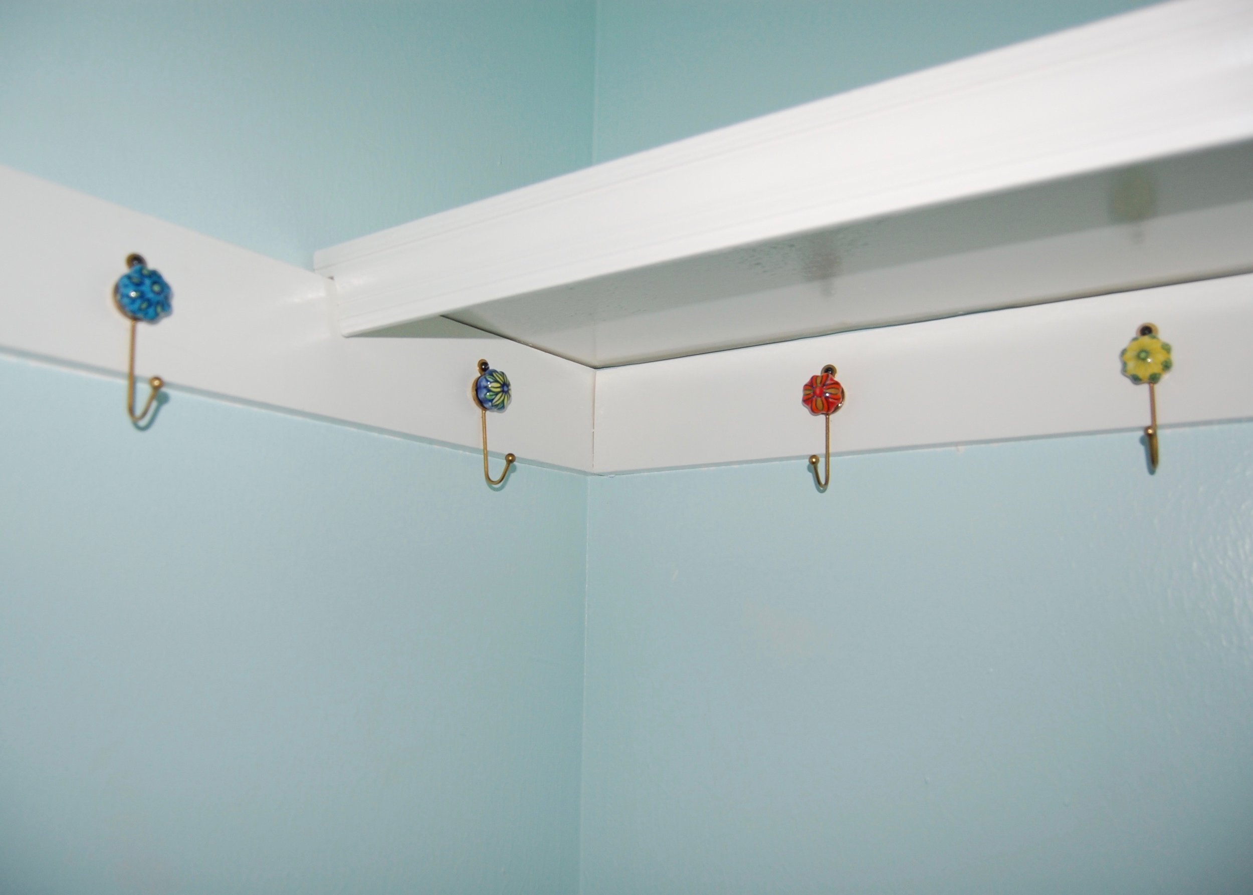
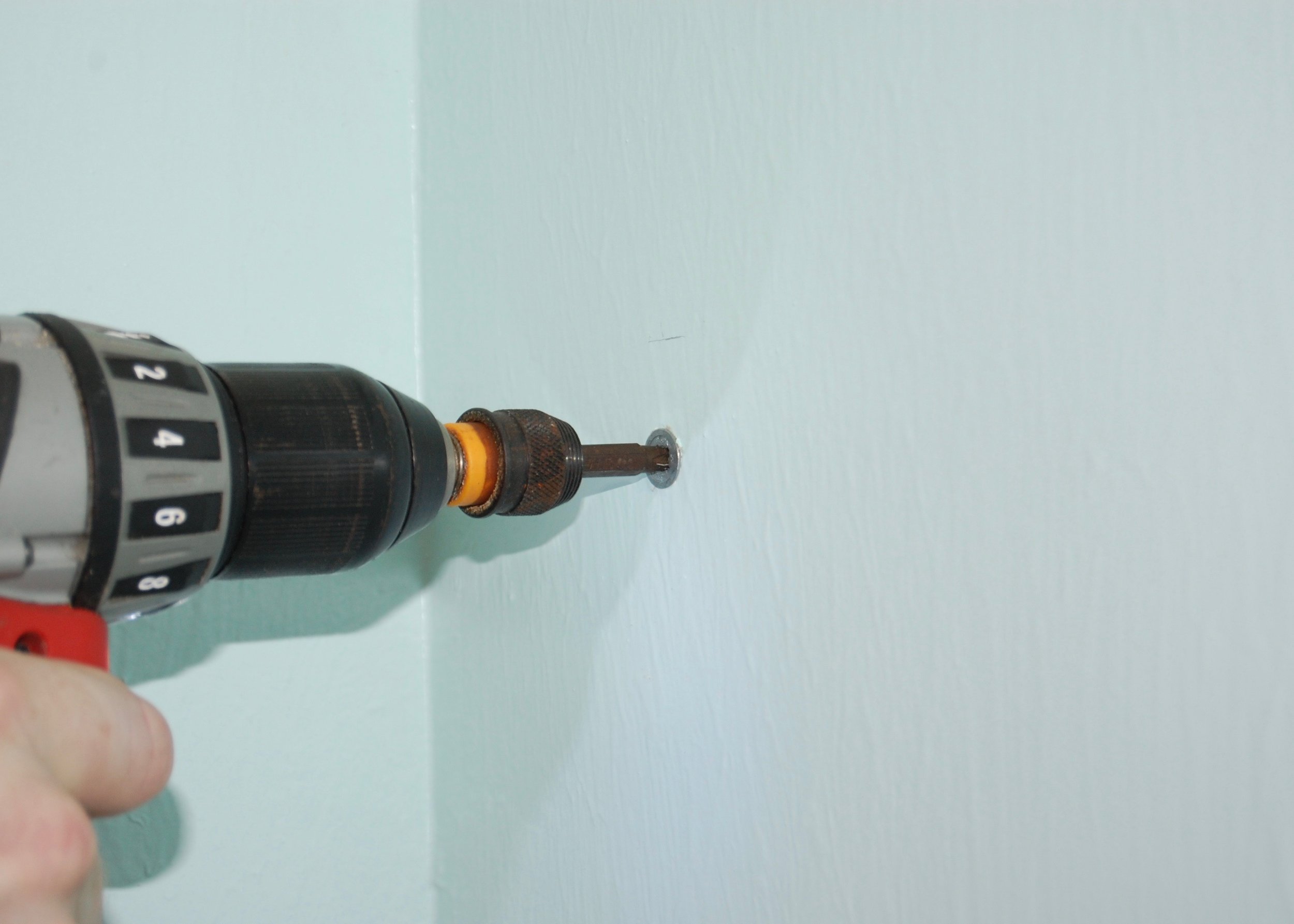
I wanted hooks installed along two walls in the closet, so we added an extra board along the back wall to screw the hooks into.  We were able to nail the additional board into the studs, so the hooks, being screwed into the board, will be able to hold more weight than if we had simply used a molly to screw them into the drywall.  It also adds an additional measure of support for the shelf.

We reduced the depth of the shelf by about 6 inches, so that I could reach the back of it.  It also makes it easier to step into the closet to hang things up.

Installing Hooks

The hooks, which are gold colored metal with a pretty decorated ceramic ball at the top, were from World Market.  I found them for only $2 a piece.

We decided to install the hooks on only two sides of the closet, leaving the right side of the closet (where the box for the air vent juts into the closet) free.  This gave us room for 5 hooks, each spaced about 6 inches apart.

Adding Mini Shelves

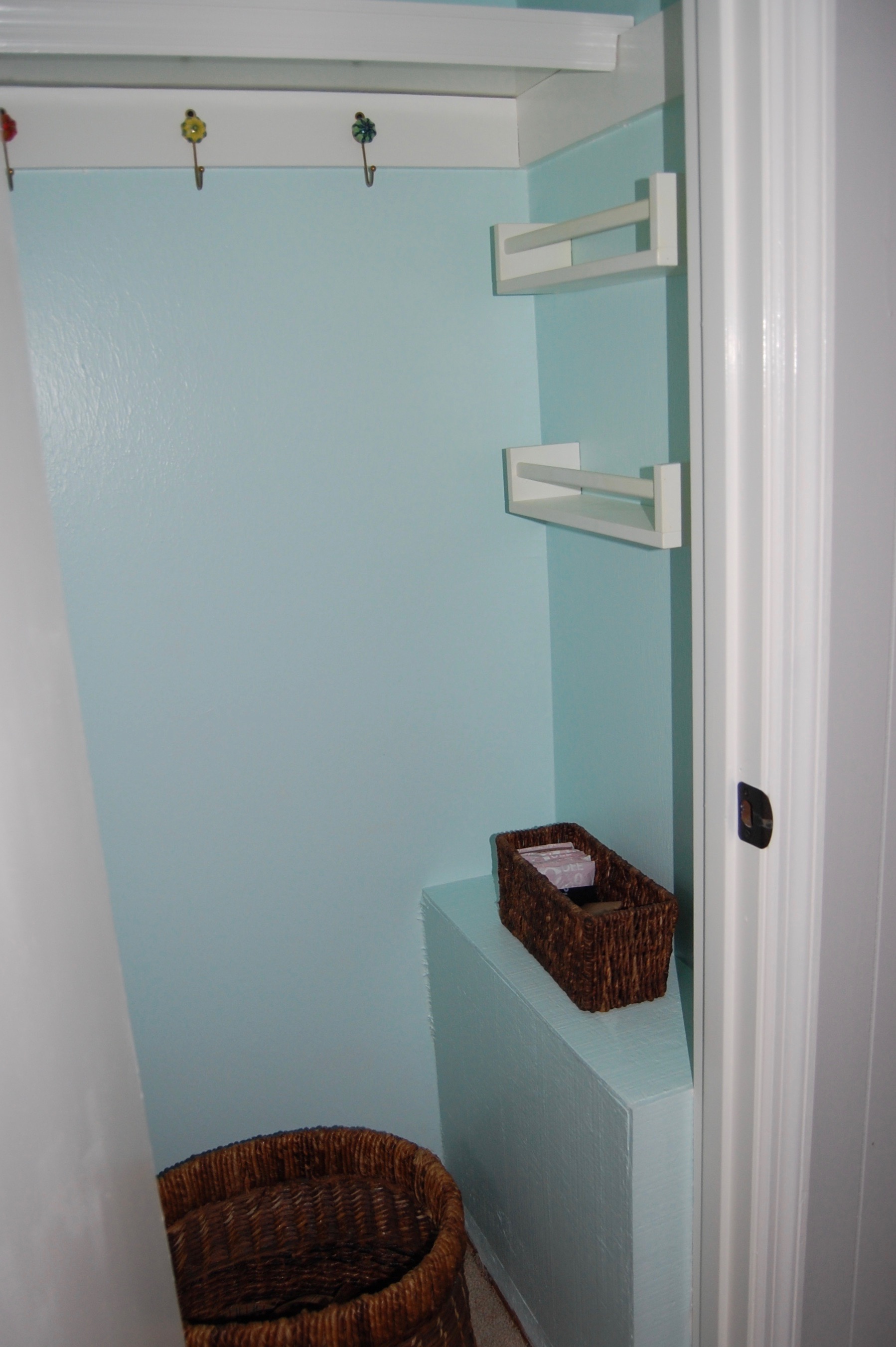
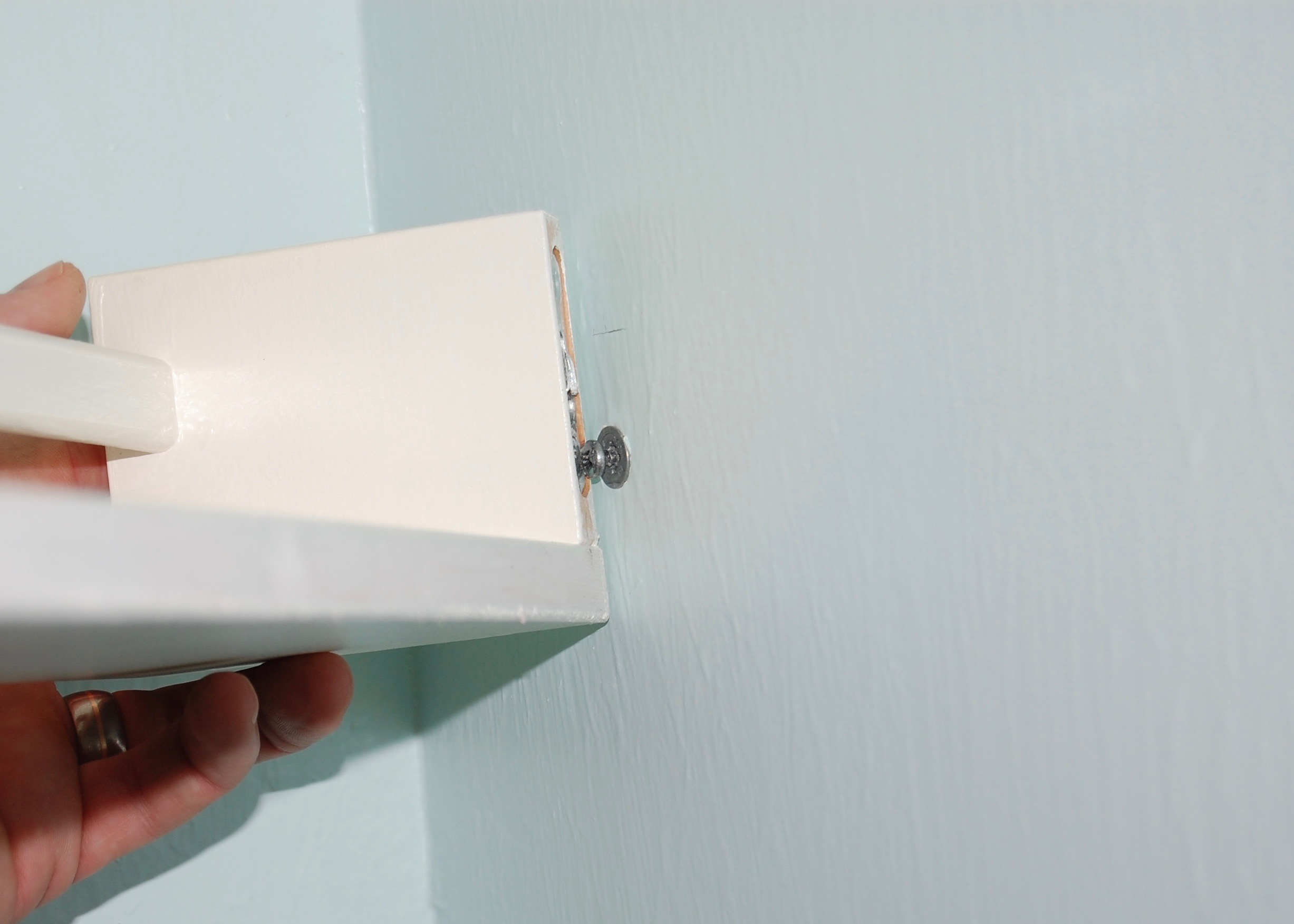
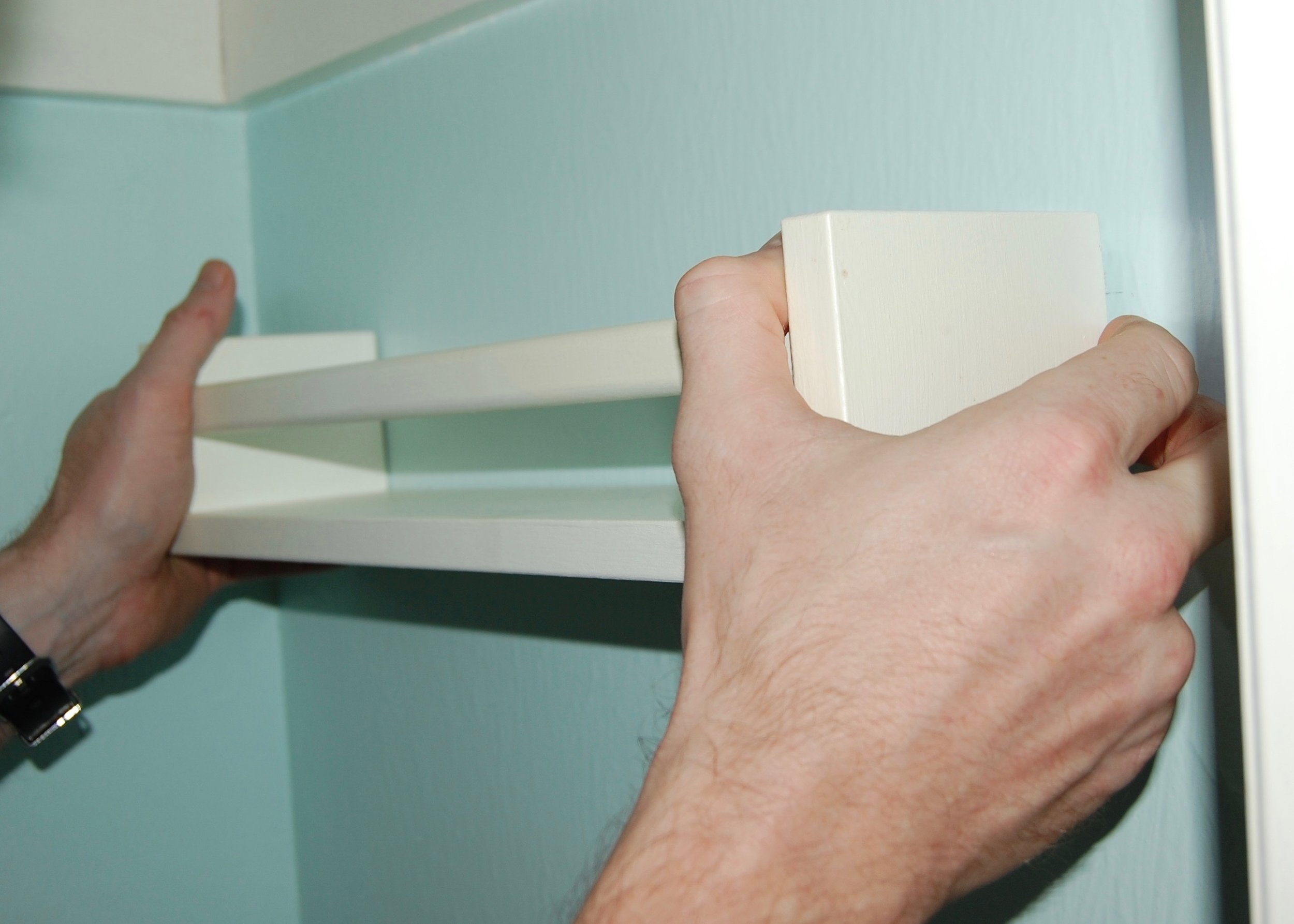
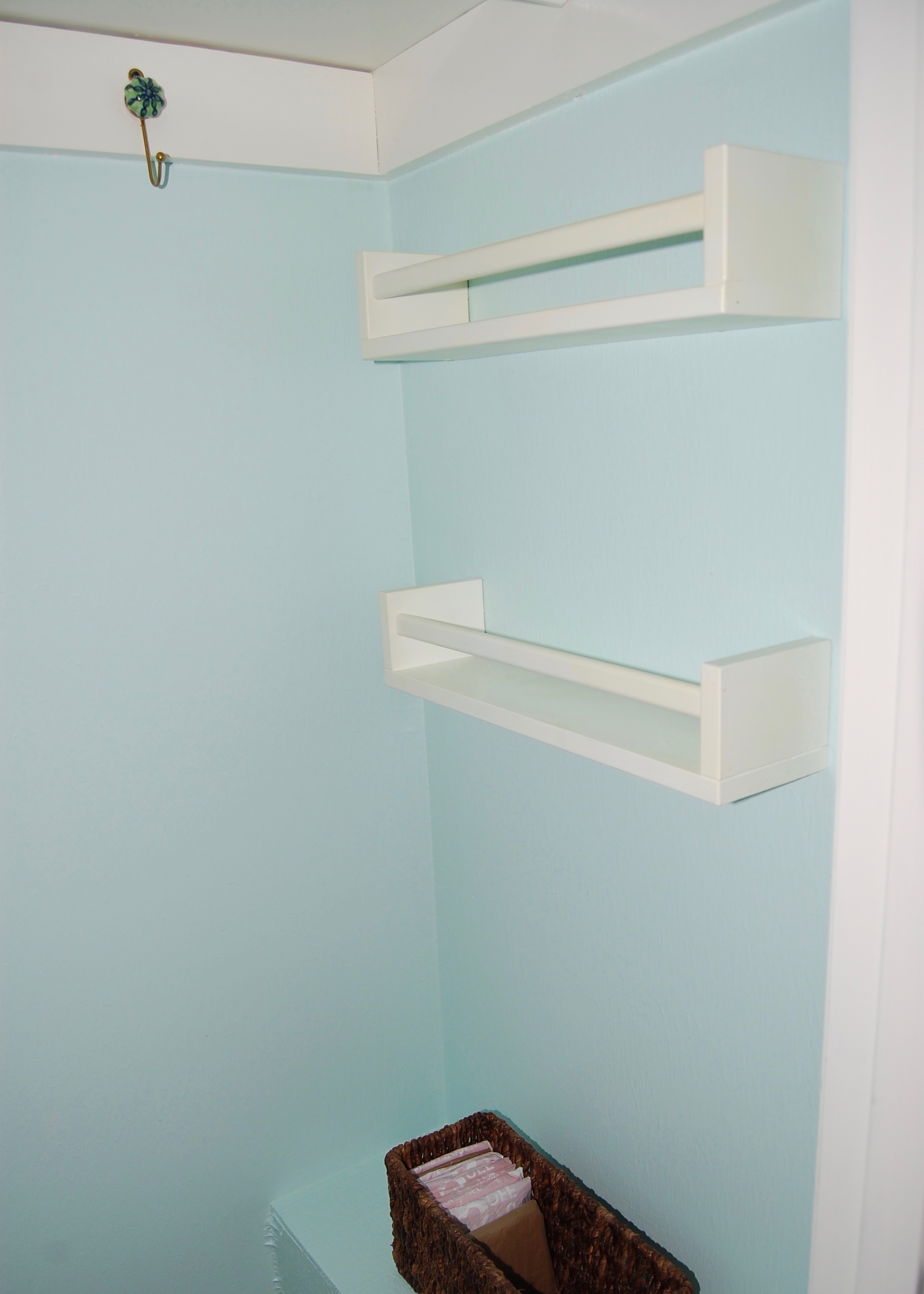
On the right side, above the air vent box we decided to install mini shelves to hold small items like sunglasses, and mail.  We used Ikea's Bekvam Spice Racks ($4 a piece), which we had originally gotten for a different project, but didn't end up using.  They were a great size for the closet, because they are only about 4 inches deep and don't project very far into the tiny room.  We painted them BM Simply White to match the rest of the trim in the closet.

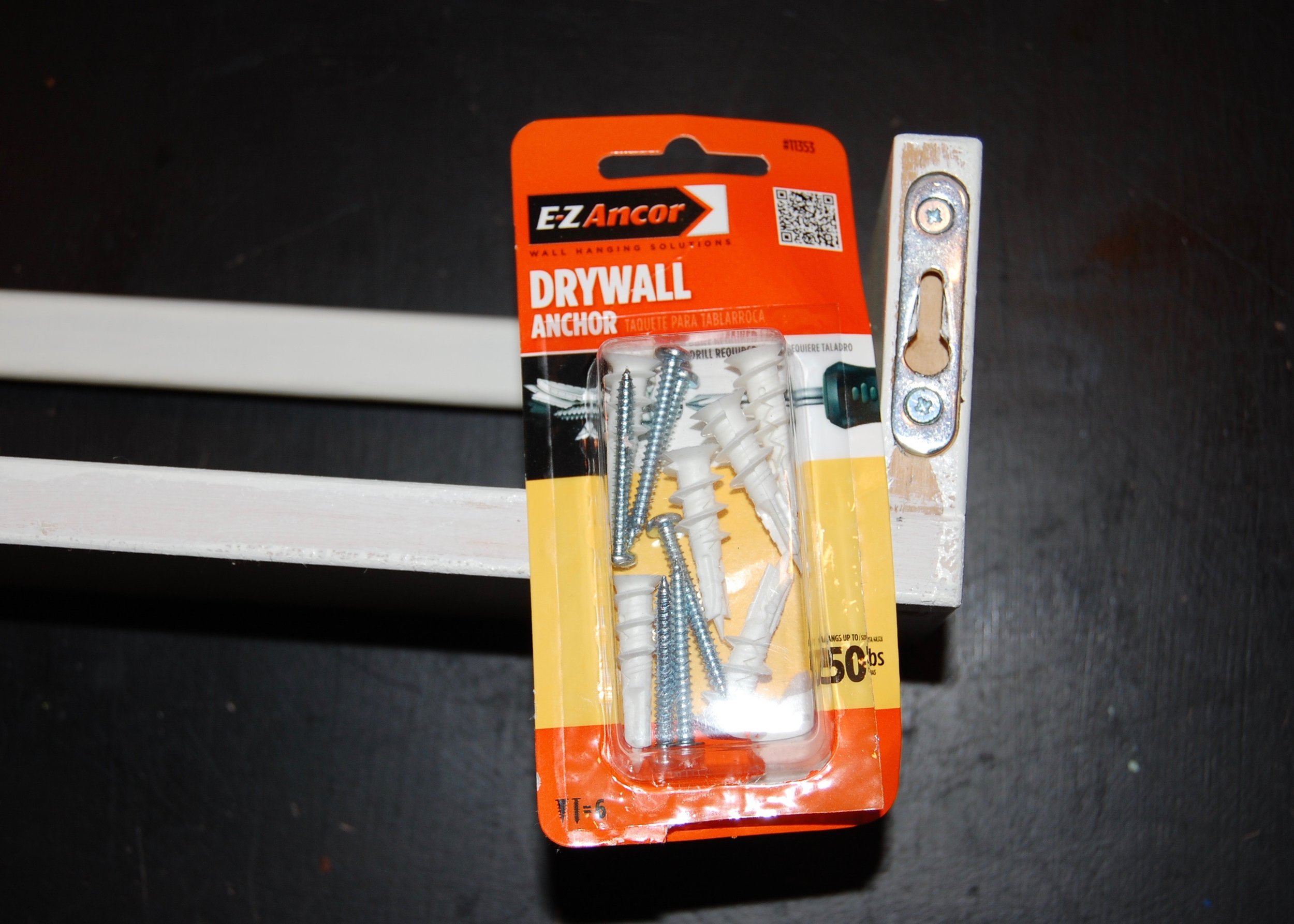
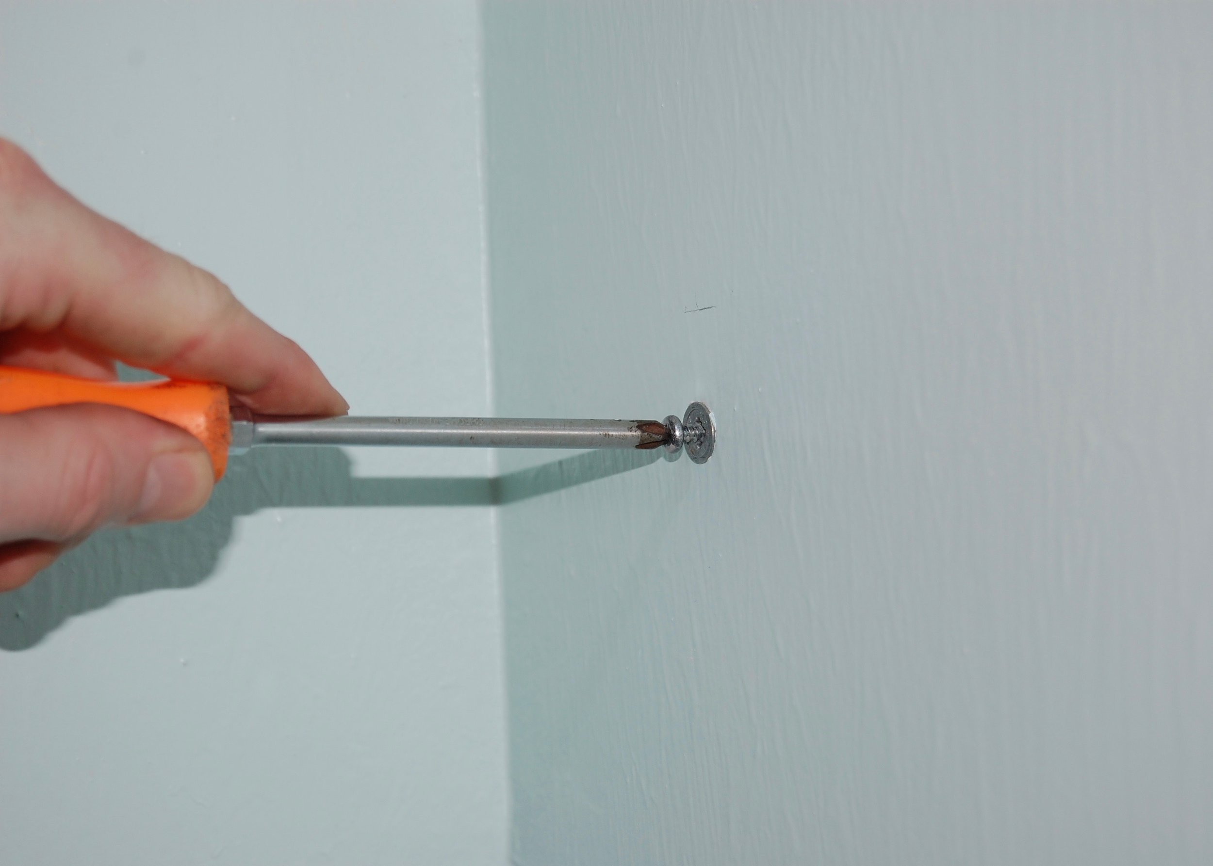
We had a hard time finding anchors that would fit the built in hangers on the back of the spice rack.  We finally found that 50 pound EZ Anchor drywall anchors fit perfectly.

The Door

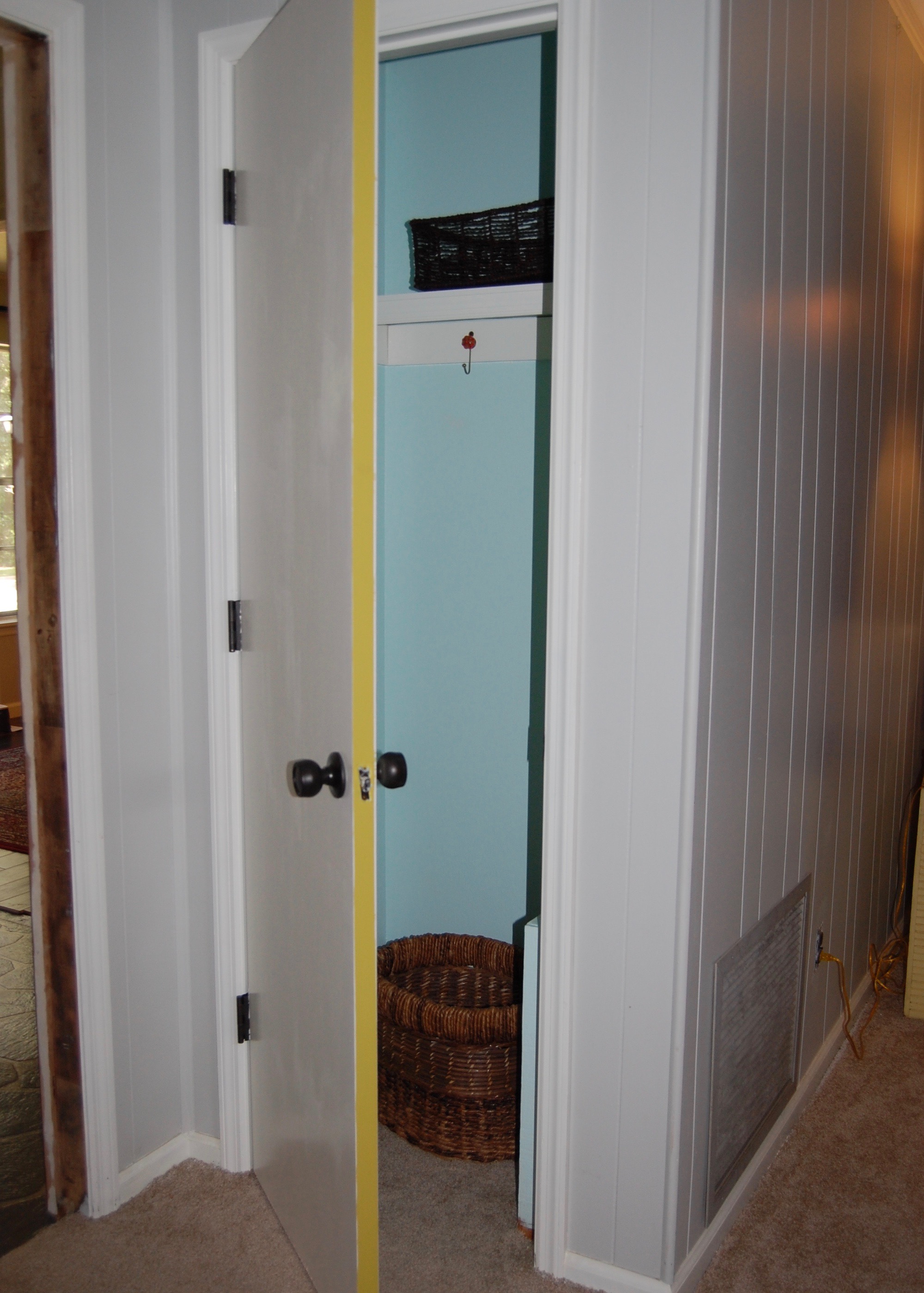
We decided to add a few special touches to the door as well.  The edge of the door was painted in Folk Art Chalk Paint in Vintage Mustard.  I love the little peek of color when we open the door.

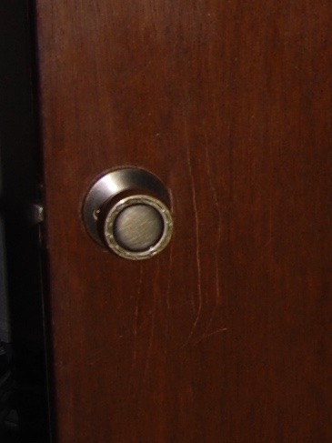
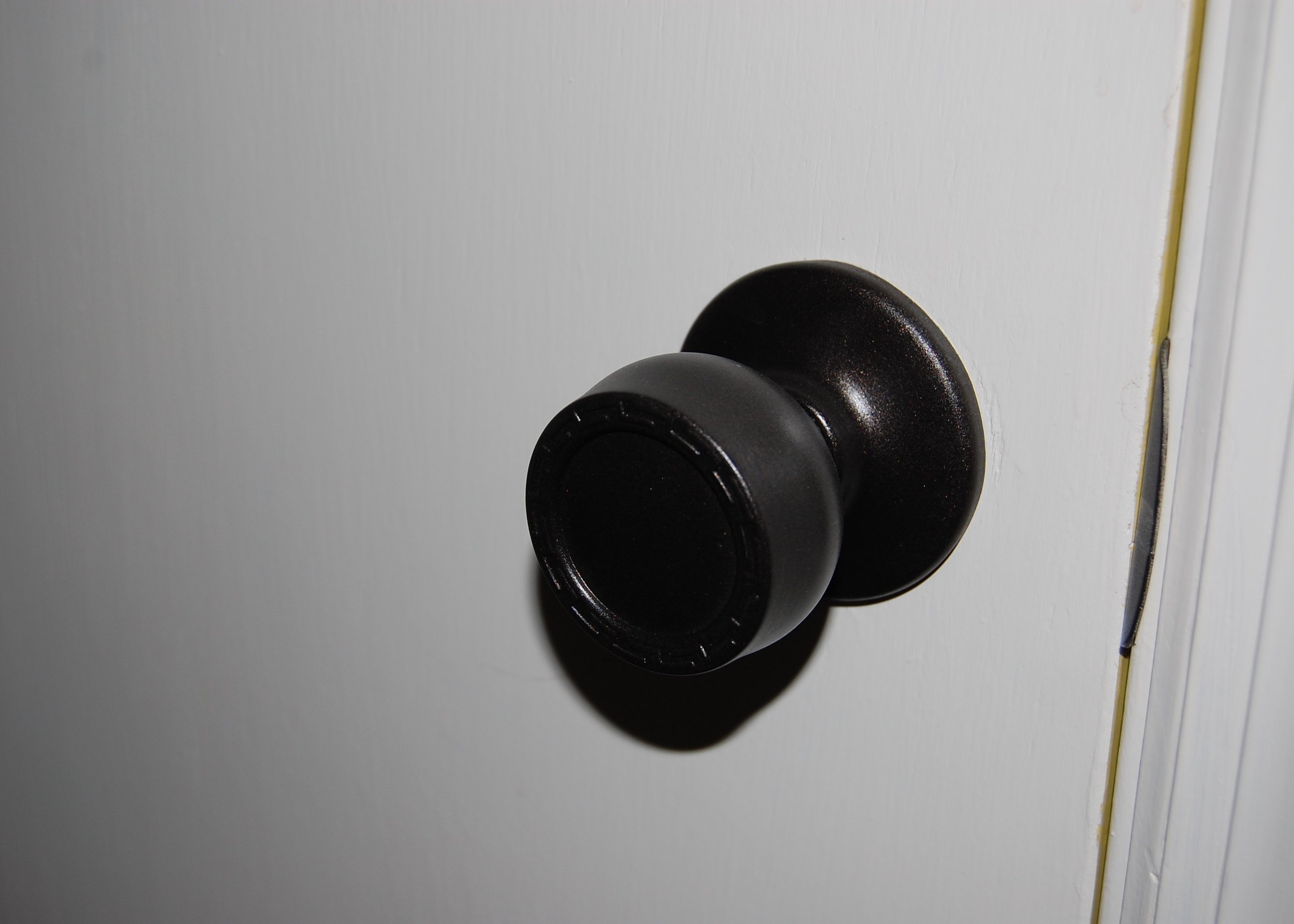
We also decided to try our hand at painting the hardware rather than replacing it.  We used Rust-Oleum Universal spray paint in oil rubbed bronze.  If the finish holds up pretty well, we will use the same technique for the hardware in our hallway, and I will create a tutorial.

Finishing Touches

Now:  Clean, neat, and a place for everything.

Now:  Clean, neat, and a place for everything.

We added a basket for shoes at the bottom of the closet, and a small basket for dog things on the "shelf" formed by the air vent's box.

At the moment we have a small basket on the upper shelf holding umbrellas and rain jackets.  I'm hoping to find two taller baskets that can fit in the closet side by side to make better use of the space.

We have left the baseboards out of the closet for now, since the new flooring will be going in soon.


Let me know what you think in the comments.

Miracle Grout Renewal

When we first started our mini bathroom remodel we decided not to replace the flooring.  Retiling an entire bathroom, even a small one, isn’t really in keeping with a “mini” remodel.  For the most part I have been pretty happy with that decision.  Our tile is white, so it actually goes with our new décor pretty well (even if the scale of the tile is way too big for the small bathroom).  The one thing about the floor that has been nagging at me is the state of the grout.  Next to all of our clean white surfaces, the grout was looking pretty dingy.

Before:  Clean but stained and dingy looking

Before:  Clean but stained and dingy looking

At first I tried to clean the grout with standard floor cleaner.  When that didn’t work I switched to bleach.  When that didn’t work I switched to serious scrubbing with abrasive cleanser and a toothbrush.  I tried everything, but the very clean grout remained stubbornly stained.  Finally I gave up on removing the stains, and moved on to covering them up.  There are several methods and products available to cover grout stains, some with better reviews than others.  I decided to go with a product that had both rave reviews and a reasonable price tag, Polyblend Grout Renew.

Polyblend Grout Renew is an epoxy stain and sealer made specifically for grout.  I got it at my local Home Depot for about $13.  It looks a lot like paint, smells a lot like paint, and can be applied like paint.  The directions recommend using a toothbrush to apply product to the grout, but most of the reviews I read recommended a small paint brush, so that is what I used.  The difference in the color of the grout before and after the Grout Renew was applied was like night and day.  After just one coat there was a significant improvement, and after the 2nd coat it looked brand new.  It took me about an hour per coat, and when I was done I had enough product left over to do at least one more bathroom of the same size.

Before:  20+ years of discoloration 

Before:  20+ years of discoloration 

Half way through the application of the first coat.  The difference is startling. 

Half way through the application of the first coat.  The difference is startling. 

Polyblend Grout Renew comes in about 35 colors.  The color I used was Snow White, which dries a very light grey, but when wet was almost exactly the same color as my tile.  Despite my best efforts to get the product on only the grout, and trying very hard to remove all that I got on the tile immediately with a wet rag, the fact that I couldn’t see the product on the tile while it was wet means that I missed a bunch of it.  When it dried it became visible on the tile, and looked pretty messy.  I was able to get it off my hard slick tile with two Mr. Clean Magic Erasers and a lot of scrubbing , but I don’t think it would come off of porous tile as easily (this is your warning). 

Grout Renew dried on the edges of the tile.

Grout Renew dried on the edges of the tile.

After the tile clean up, looking brand new!

After the tile clean up, looking brand new!
Bottom-line, would I do it again?  In a heartbeat!  I got grout that looks brand new for $13 and a couple of hours of work.  I would recommend it to anyone that has stained or discolored grout that is otherwise in good shape.

After:  The grout looks brand new!

After:  The grout looks brand new!

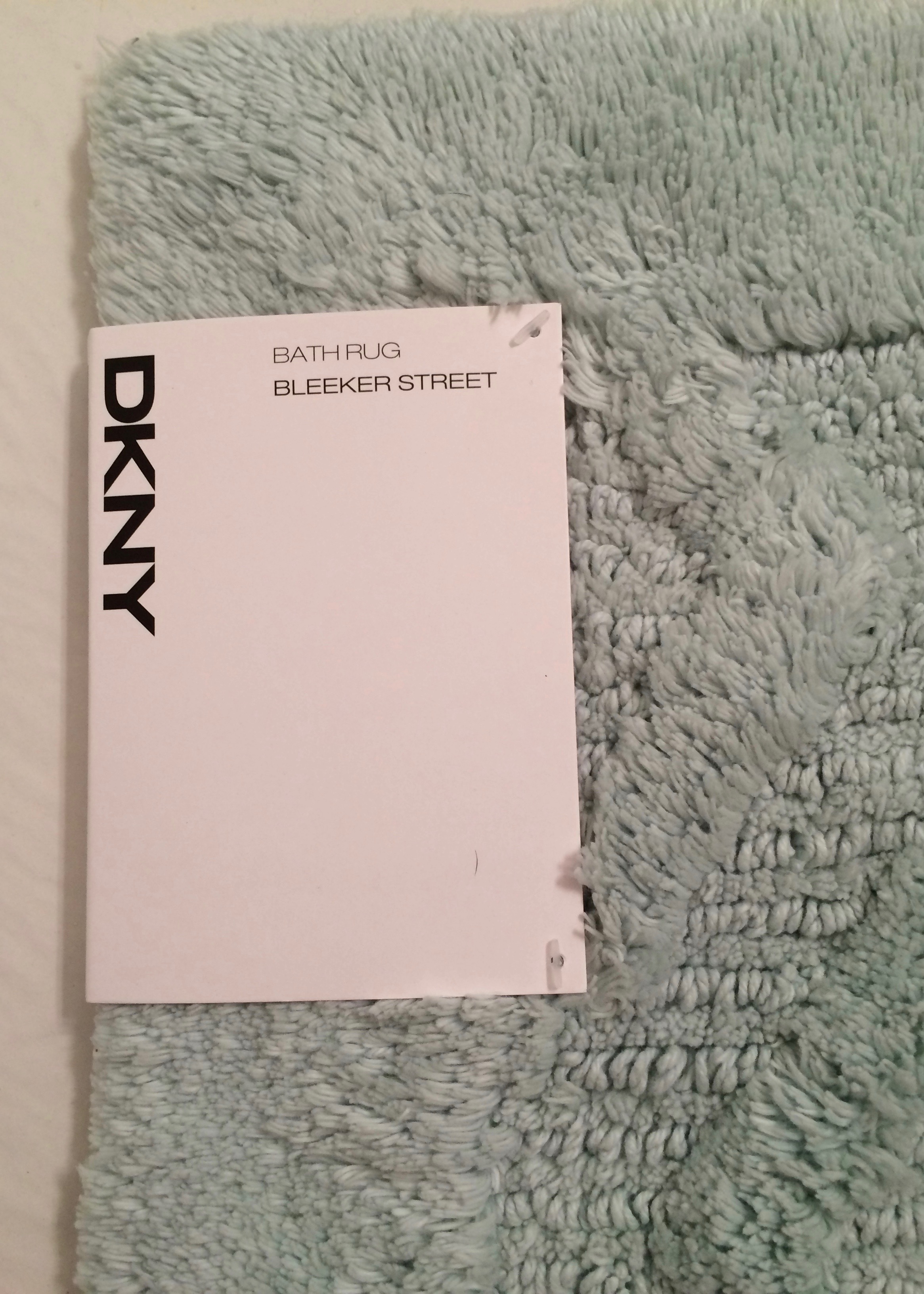
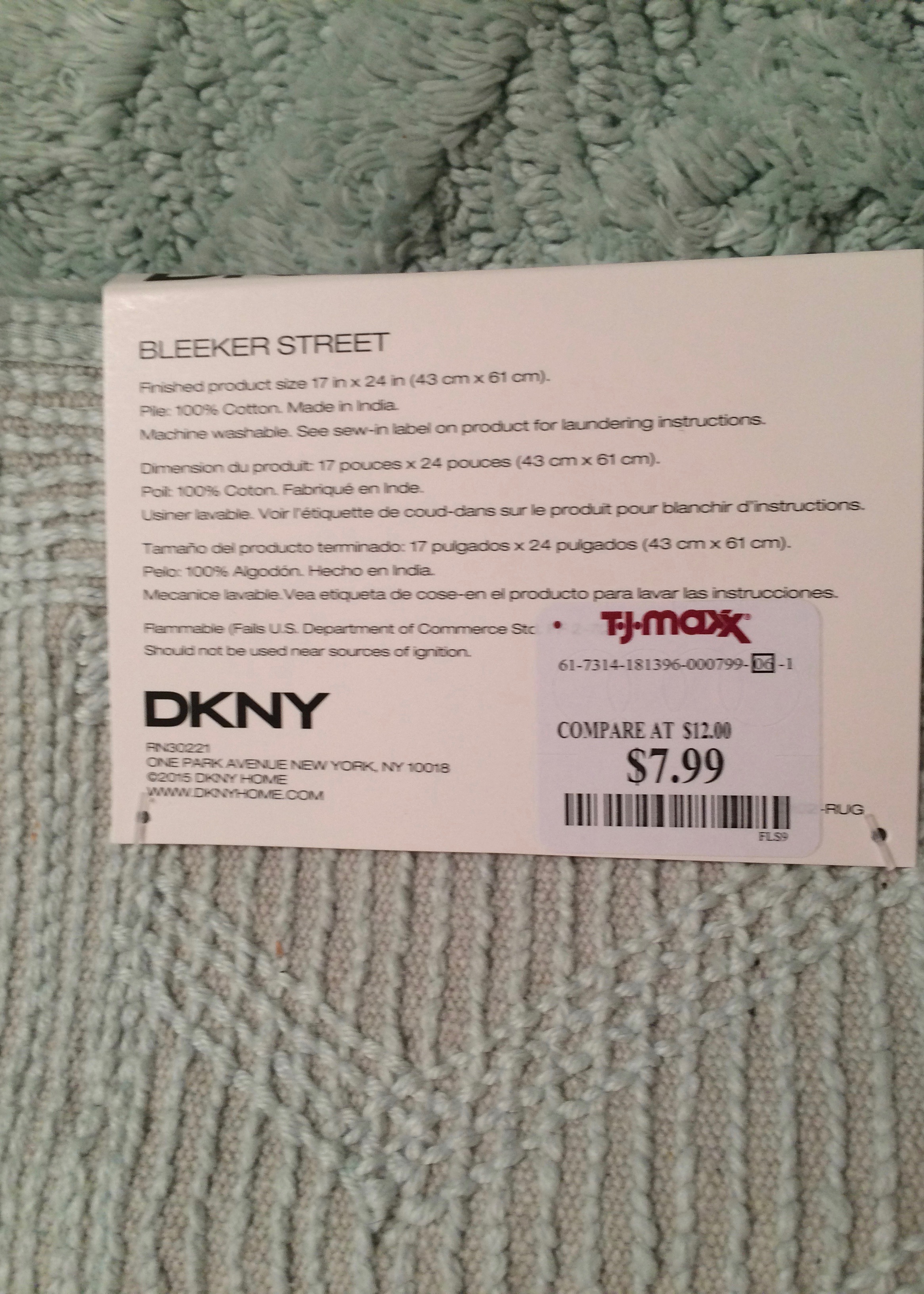
As a finishing touch, we added a new bath rug.  We found this one for only $8 at TJ Maxx.

This post contains affiliate links.  All opinions are my own.

Unappreciated Details: Cabinet Interior

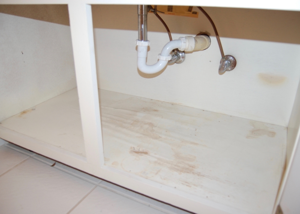
After we finished making the outside of our bathroom cabinet beautiful the inside looked a little, well, gross.  The paint was yellow, there were stains, and the floor of the cabinet had some previous water damage.  So we decided to give the inside a makeover as well.  

Before:  Yellow, stained, and water damaged

Before:  Yellow, stained, and water damaged

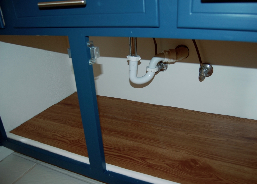
After:  Clean and Bright

After:  Clean and Bright

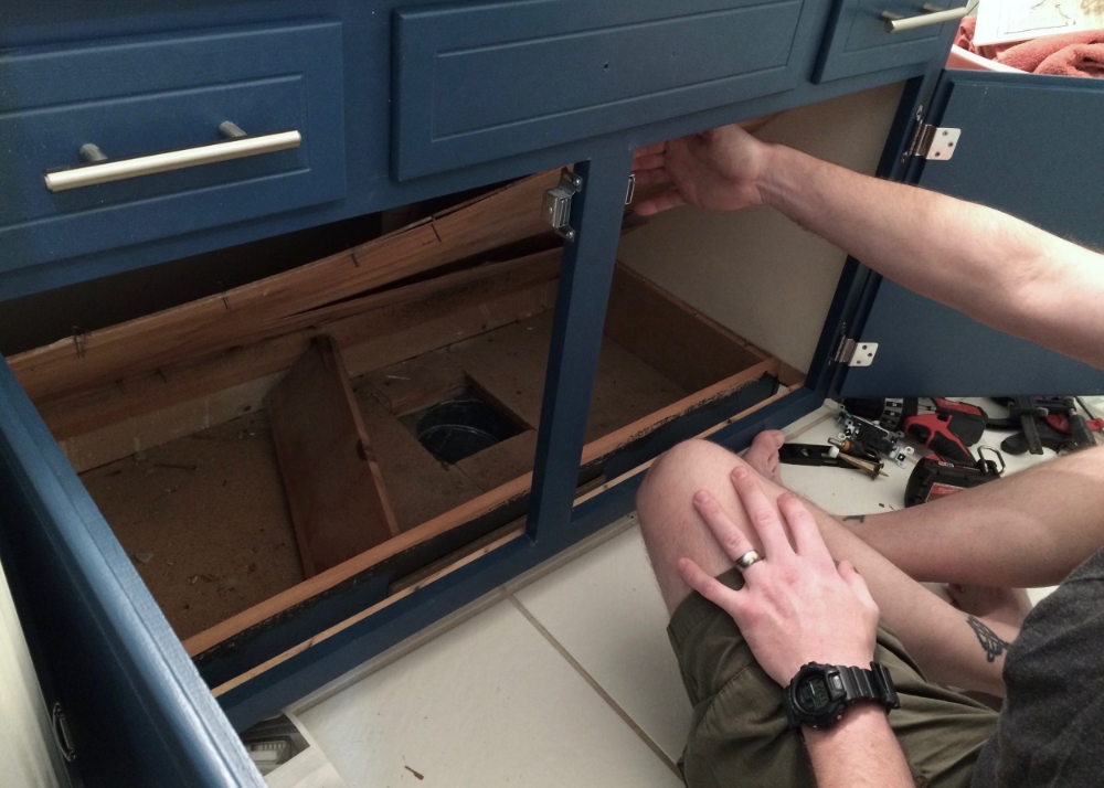
First we pulled up the water damaged floor of the cabinet, and discovered that the AC duct simply let out under the cabinet.  The air wasn’t shunted toward the vent at the front of the cabinet at all.    The floor of the cabinet also had VERY little support from underneath.  Firebeard fixed both of those problems by installing floor supports on either side of the open duct and vent, reducing the space that the air could fan out.

Removing the floor of the cabinet 

Removing the floor of the cabinet 

Discovering the open duct and lack of floor support

Discovering the open duct and lack of floor support

We decided to replace the very thin floor with slightly thicker plywood, but that gave us another problem.  The new thicker flooring didn’t bend.  We had to cut it into 3 pieces to fit it into the cabinet.  Fortunately we had already planned to cover up the plywood flooring with vinyl, click together “wood” flooring that would protect from future minor water leaks better than wood alone.  My parents had given us some or their left over vinyl flooring so this part was free.  Since the new plywood floor and vinyl flooring was thicker than the previous flooring the cabinet lip no longer covered it.  We installed some quarter round shoe molding to take up the additional space.  We also painted the inside of the cabinet to freshen it up, and cover a few stains.  

Installing the New Cabinet Floor

Installing the New Cabinet Floor

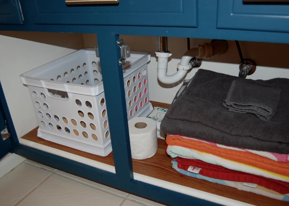
Since we don’t have a lot of floor space in this bathroom, I placed a small laundry basket inside the cabinet to collect clothes after bath time, and I still had enough room under the cabinet for extra towels and a few supplies.  I will admit I had to get rid of a lot of older towels to make everything fit, but it was worth it.   If you are looking for a place to donate your gently used towels, shelters (either human or animal) are often in need of them.

Stocked with Supplies

Stocked with Supplies

Converting a False Drawer Front

Over a month ago we started to give the cabinet a little facelift.  We planned to paint it, and change out the hardware- nothing serious.  It should have been a weekend’s work at the most, and had we stopped there it would have been, but instead, we decided to be clever.

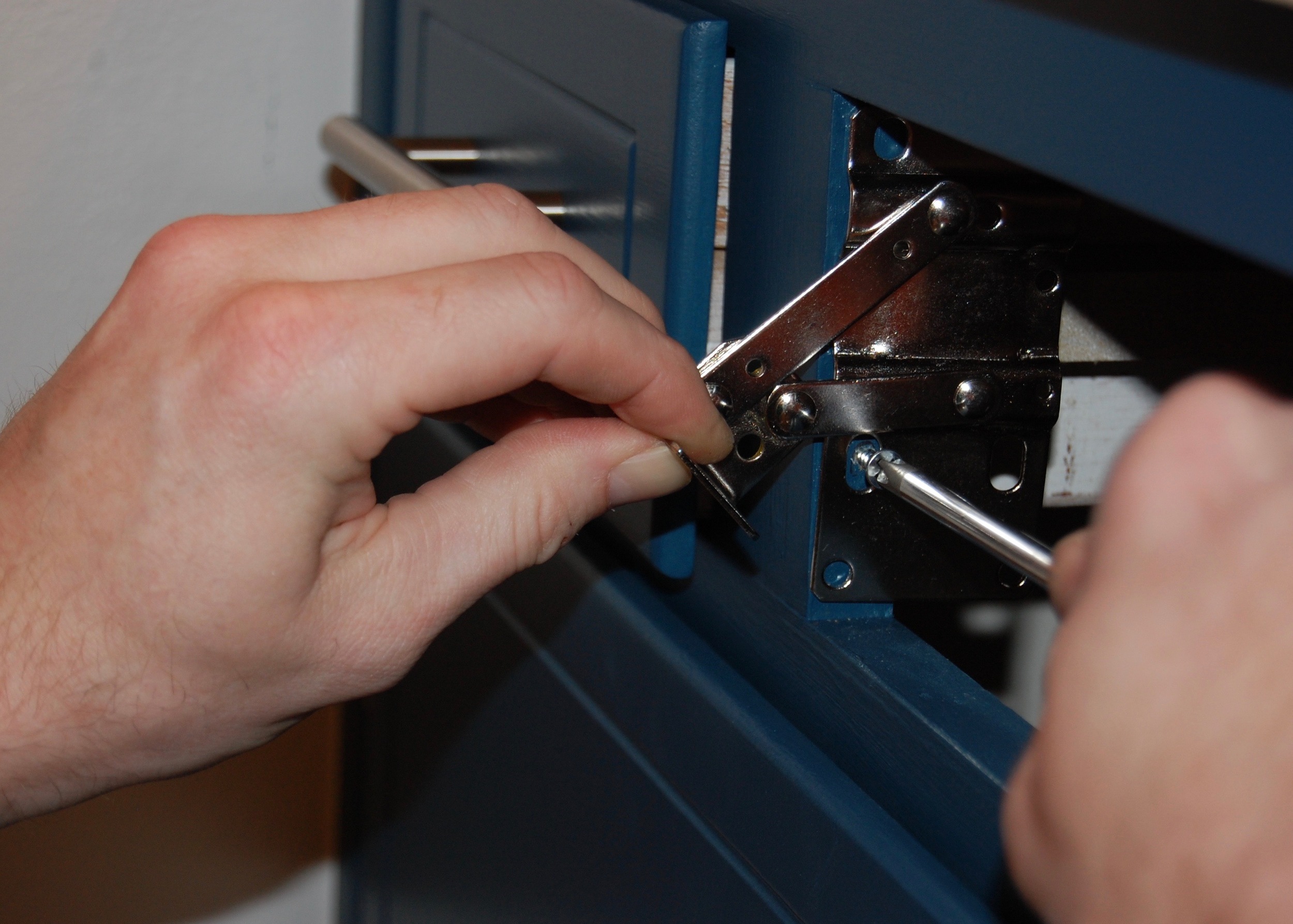
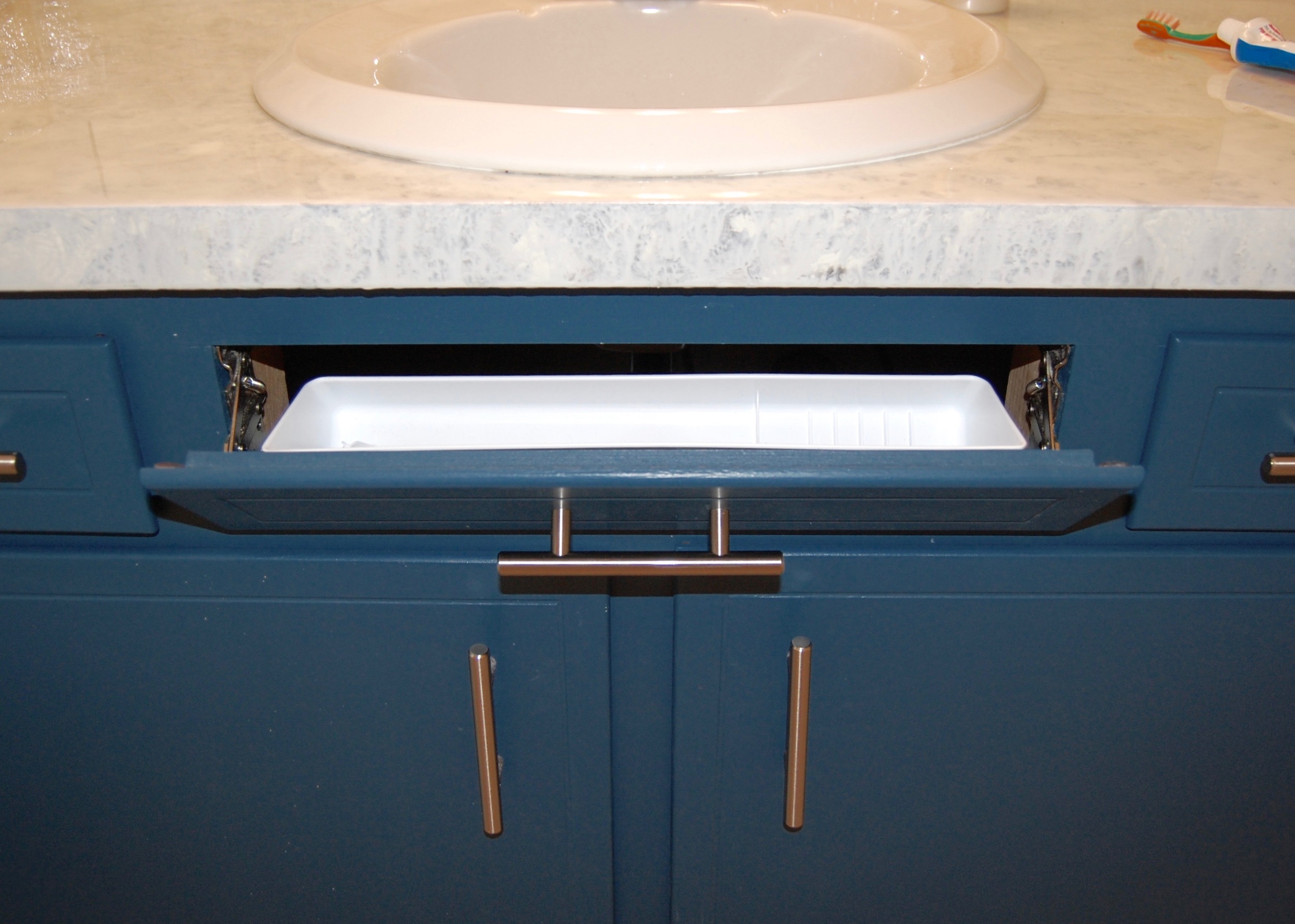
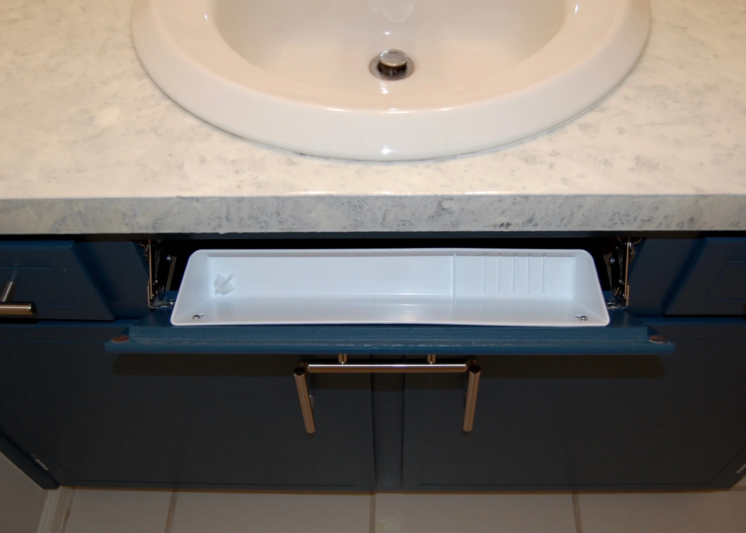
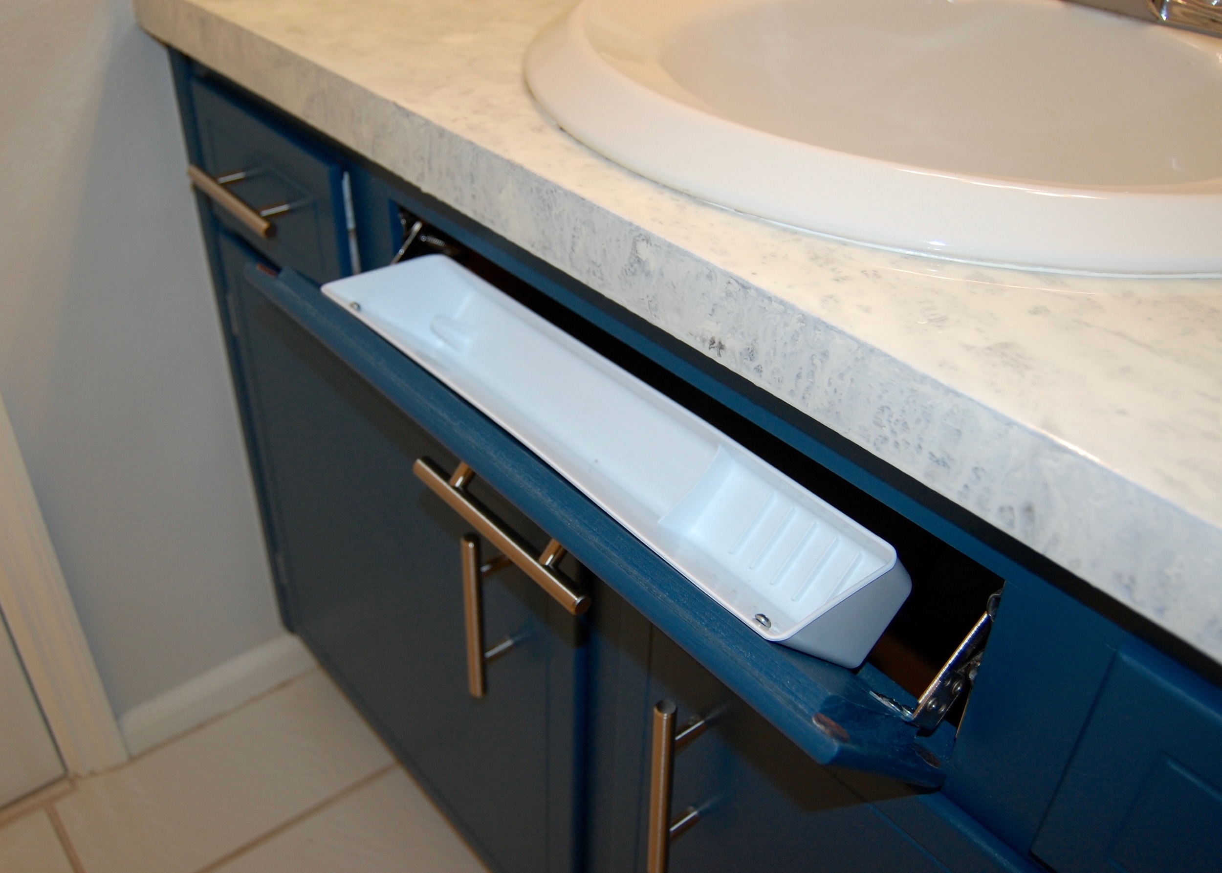
When I was little, my sister and I shared a fairly small bathroom with very little countertop space, and no drawers.  At some point my Dad installed a tilt out drawer behind the false drawer front in front of the sink to add a bit of storage, and since then, every time I see a false drawer front (like the large one on the kid’s bathroom vanity)  I feel like it is a waste of valuable storage space.  It seemed like an ideal time to remedy the wasted false drawer front space when we began working on the bathroom vanity.  We bought a kit by Rev-A-Shelf on Amazon that could convert false drawer fronts into tilt out drawers for $20 (enough for two), and that is where the trouble began. 

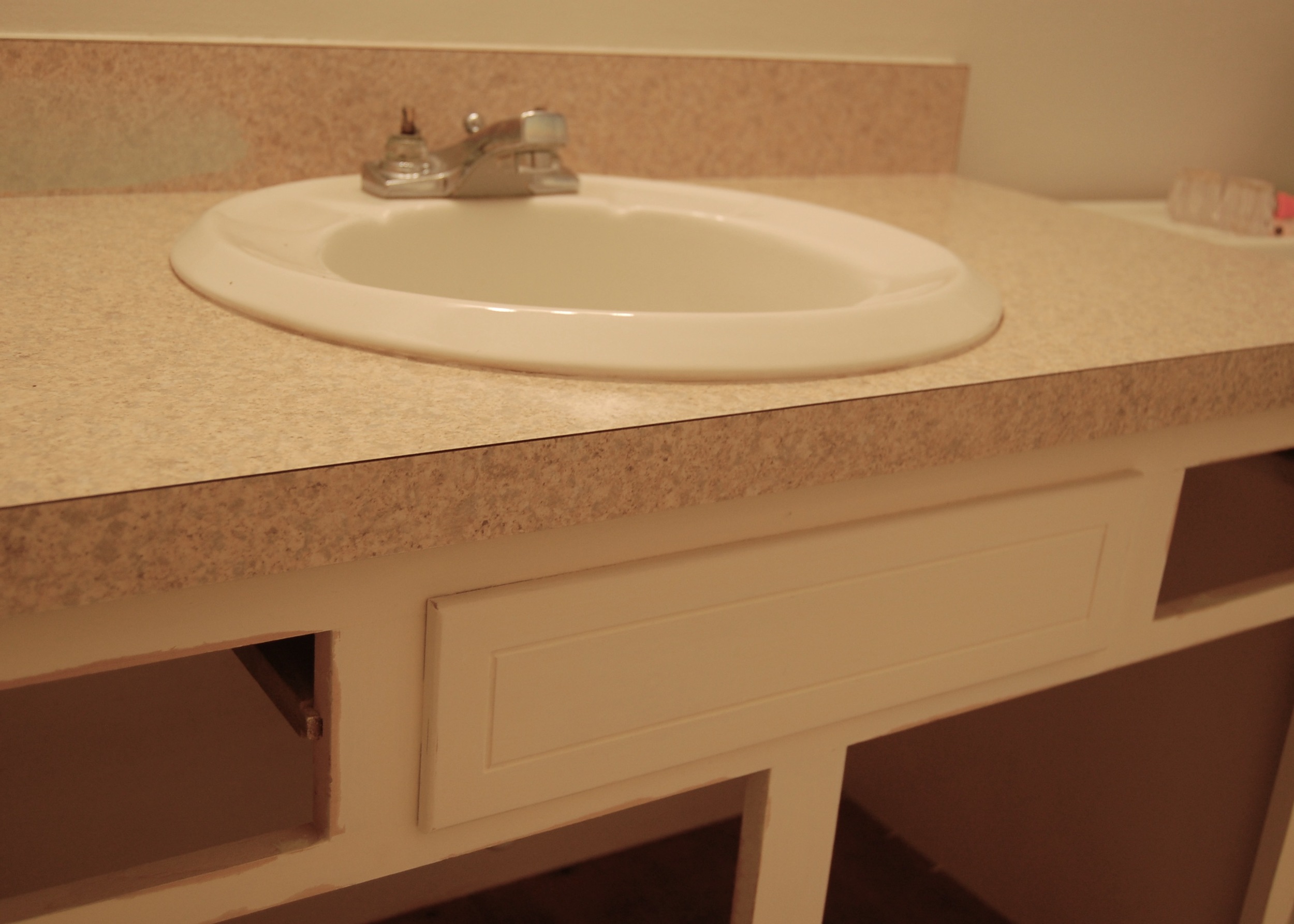
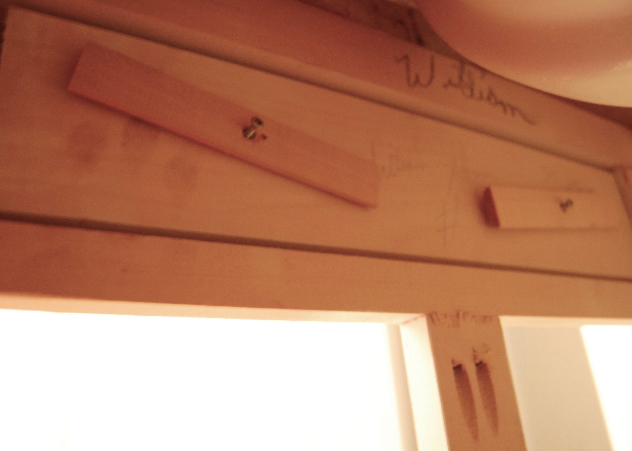
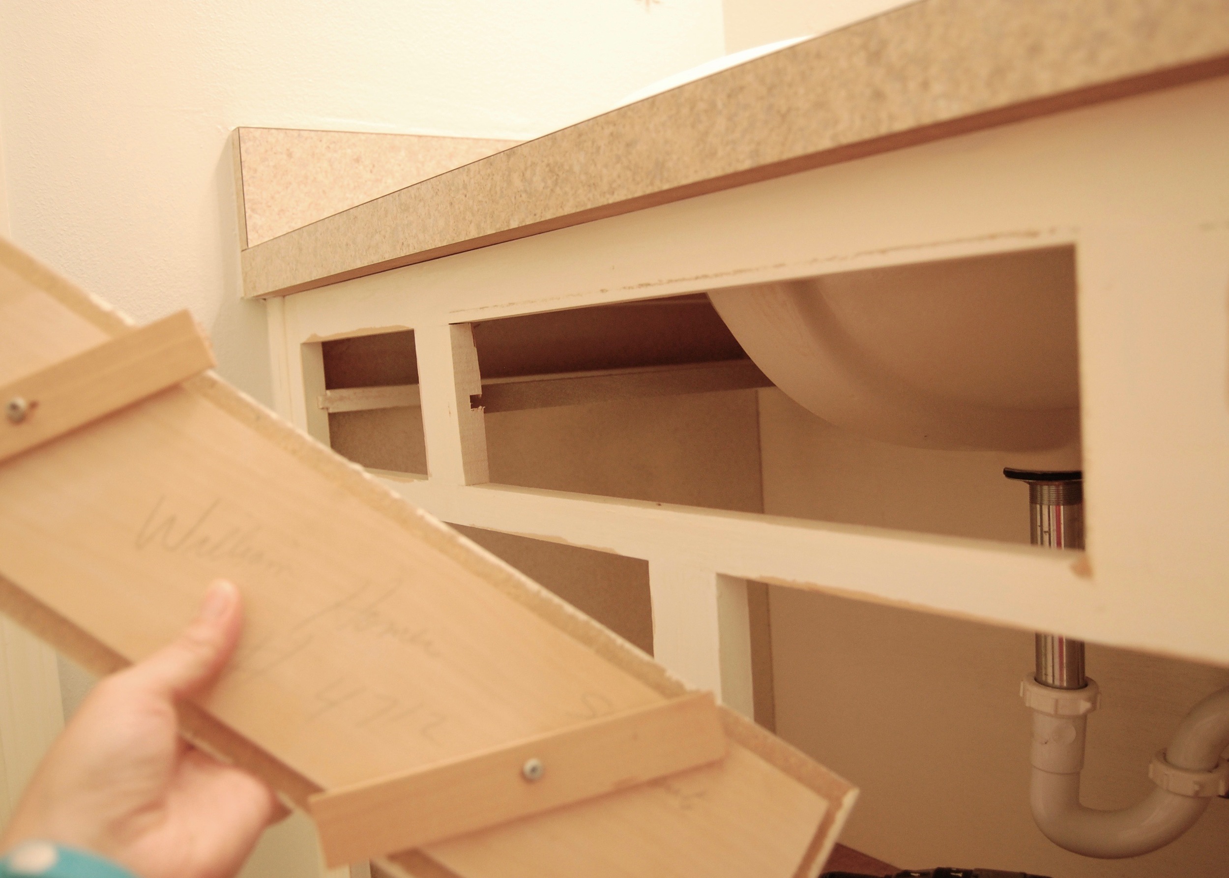
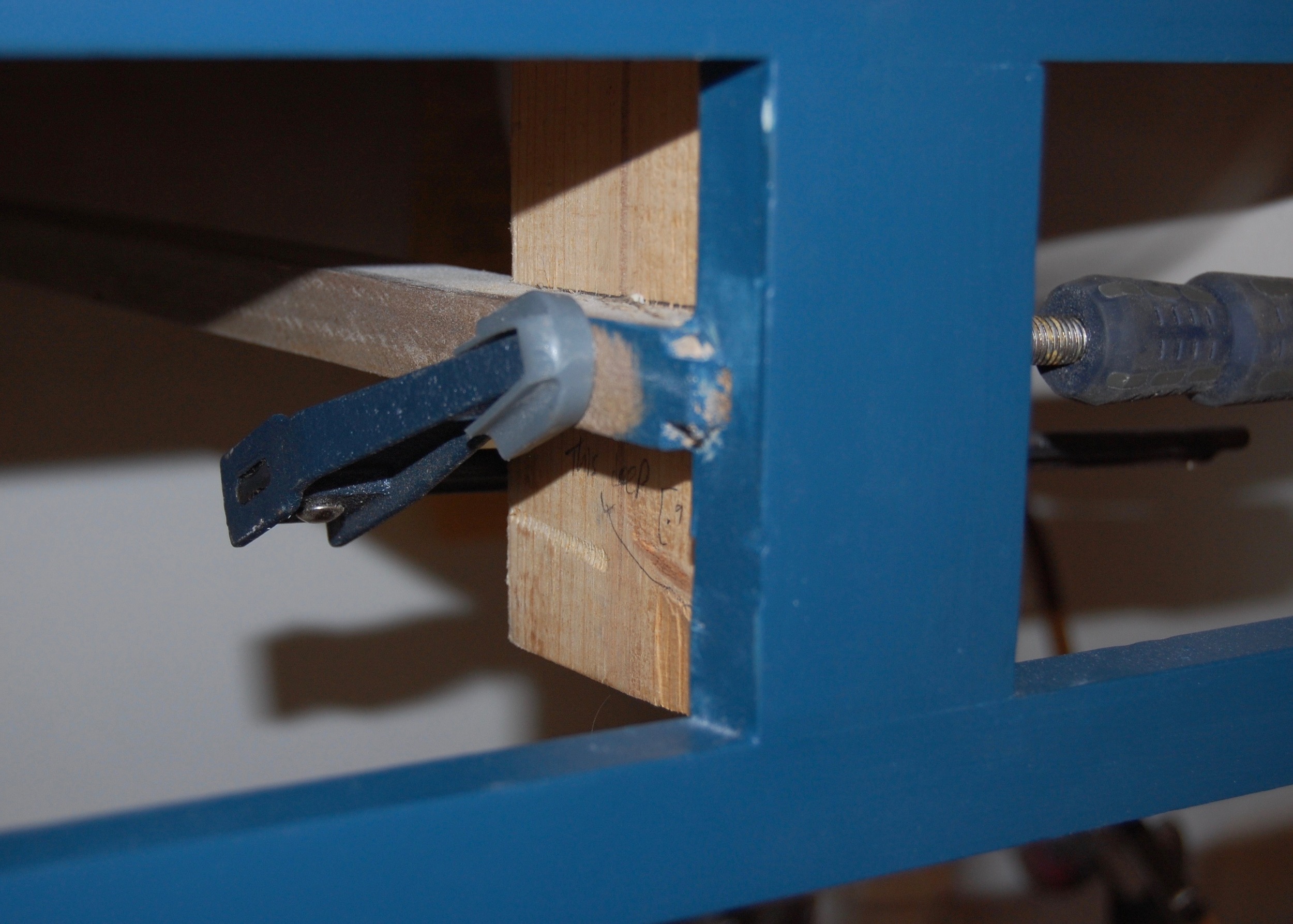
While we were waiting for the kit to arrive we got ready  for it.  Removing the false drawer front from the cabinet was surprisingly easy.  I expected it to be securely attached to the vanity, but when I got under there  wasn’t much holding it in at all, just a couple of pieces of wood screwed to false front that fit snugly against the cabinet frame.  The wood swiveled out of the way releasing the front.

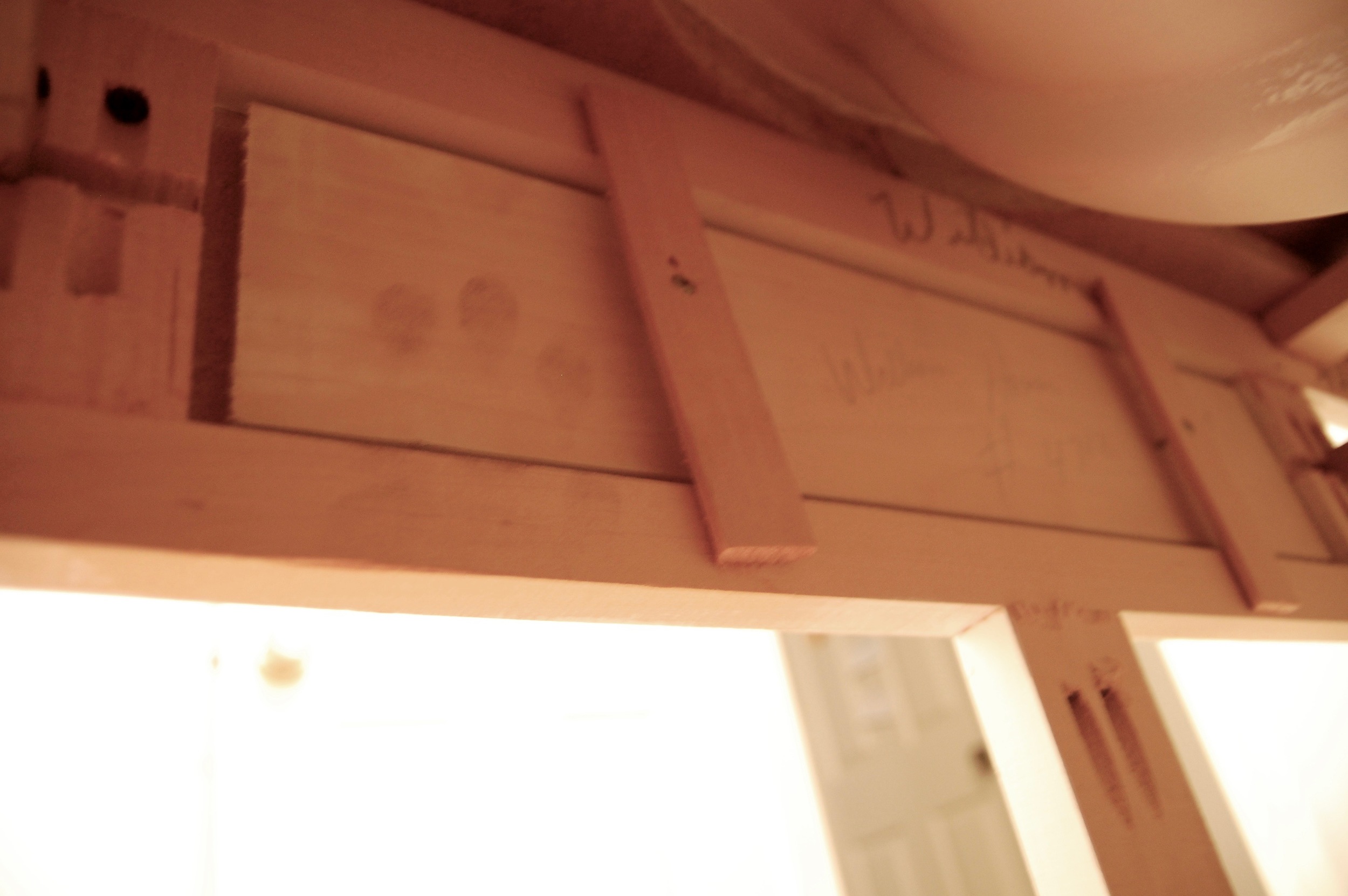
The false front had been painted to the front of the cabinet at some point, so I also had to use a razor blade to separate the false front’s paint from the rest of the cabinet.  Then the front popped off – easy as pie.  Note the raised bit of wood on the back of the false front, that will become important later.

When the tilt out drawer kit arrived the cabinet was otherwise ready to go.  We thought it would take 30 minutes to an hour to install the kit, and then we would be done.  Hubris, pure hubris. 

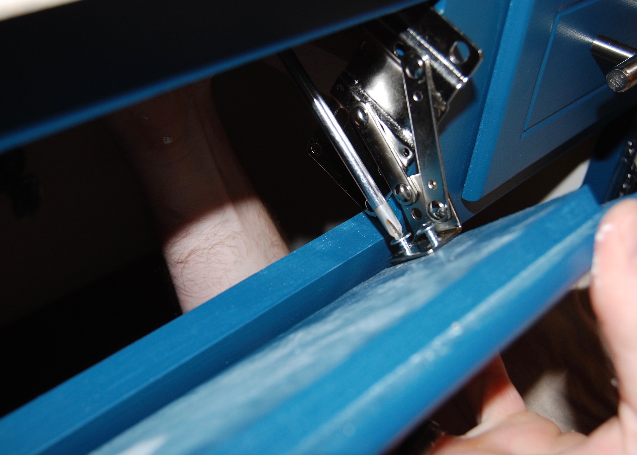
I calculated the placement of the tilt out hinges to within 1/32 of an inch based on the instructions provided with the kit, then, being very confident of my measurements, we quickly screwed everything in and closed the door ready to start on our next project.  The drawer front was too high, much too high.  We were a full 1/4 of an inch off (enough that it was noticeable), despite very careful measurement and direction following.

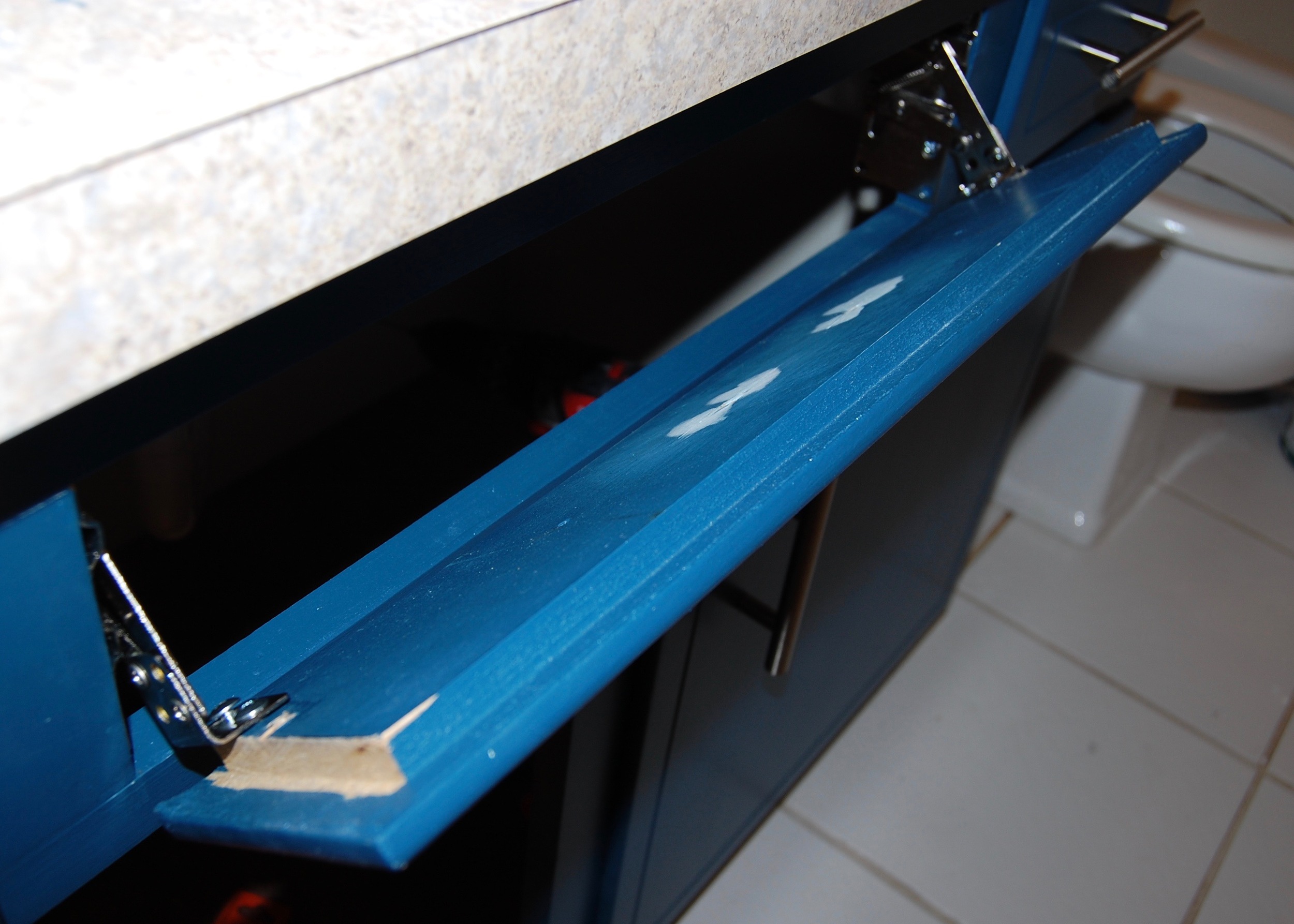
We took everything off, repositioned, reinstalled, and reclosed.  This time the drawer front was the correct height, but the raised piece of wood on the drawer front hit the cabinet frame before it closed.  The next time the hinges hit the raised piece of wood on the back of the drawer front.  We had to cut off a chunk of the raised portion to make the hinges fit correctly.  After several more attempts our cabinet was doing a very good impression of Swiss cheese, and the drawer front was no longer hitting the frame, the hinges were no longer hitting the drawer front, and everything was at the correct height, but the drawer did not close all of the way, it stood out from the cabinet about as far as the raised portion on the back of the drawer front was thick.

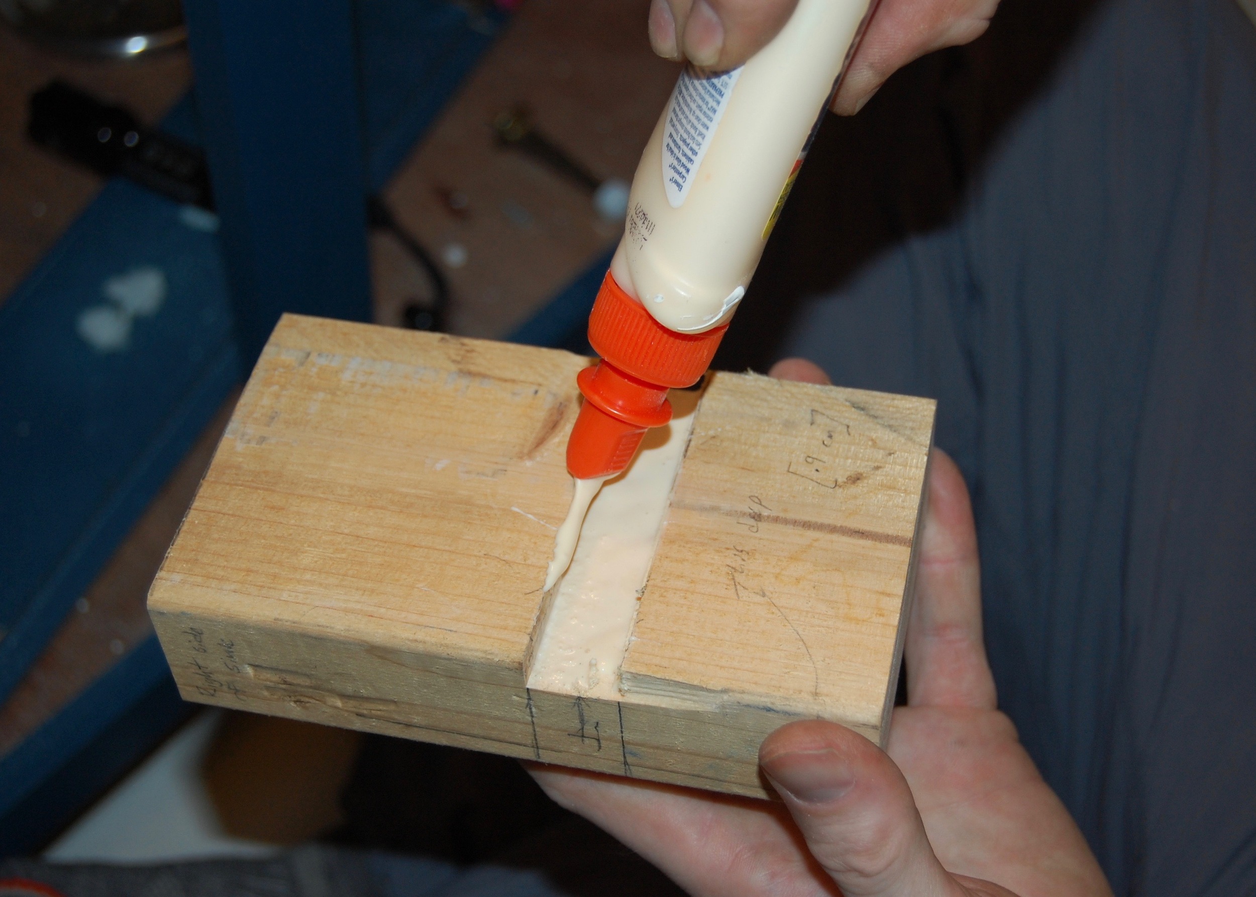
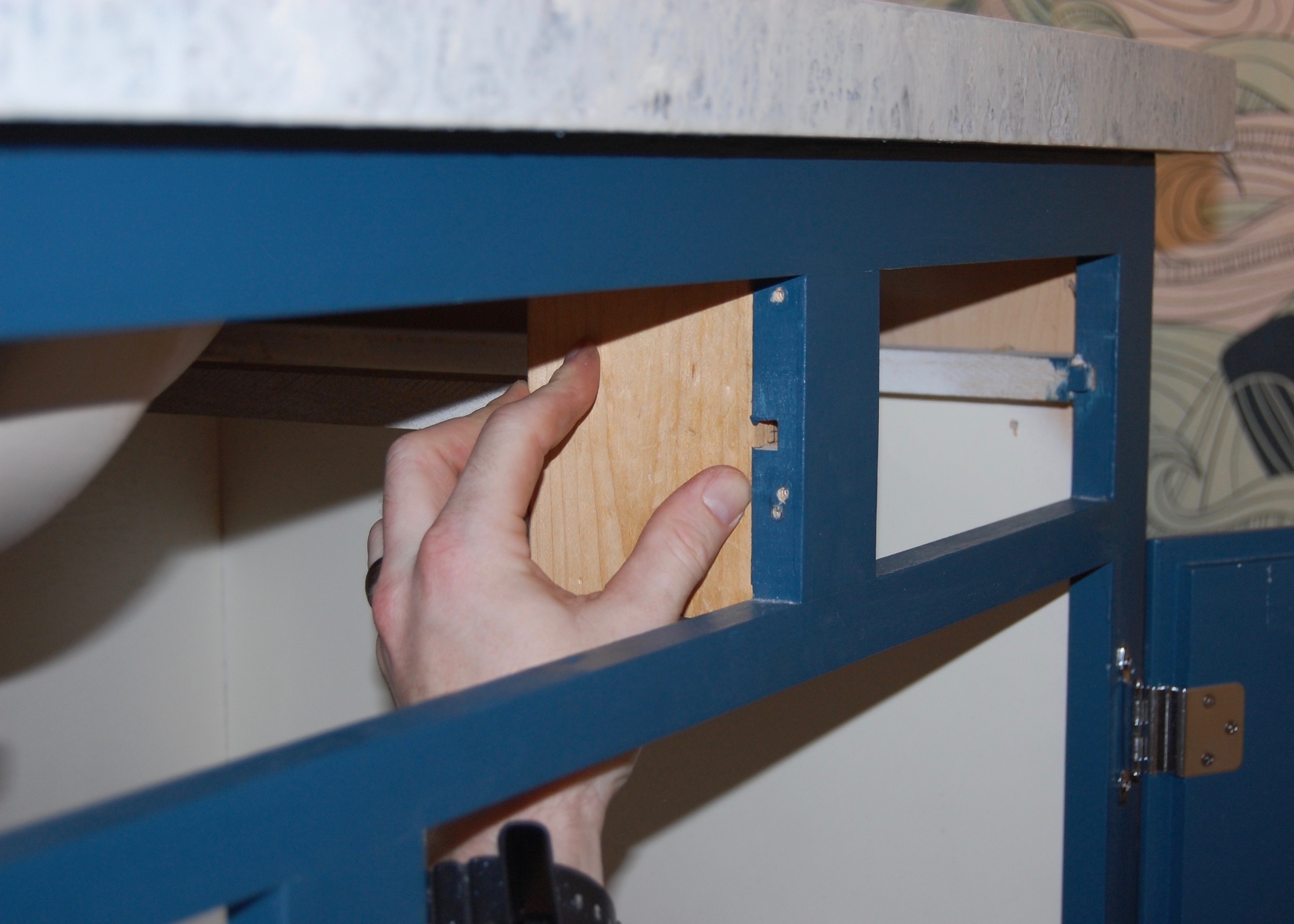
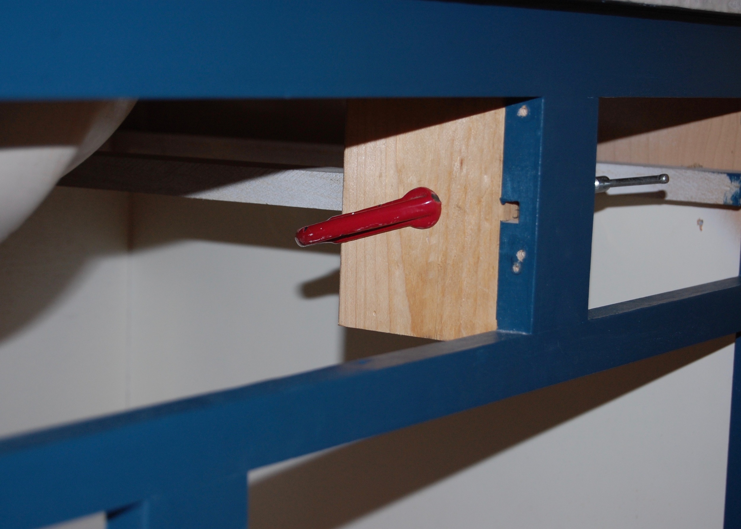
It was now obvious that the makers of this kit had assumed that the false drawer front that the hinges are attached to would be flat.  To compensate for the raised portion of our cabinet front we needed to install the hinges father back in our cabinet than the instructions indicated.  However, there was no space to install them further back, so we had to improvise.  I came up with the plan, and Firebeard implemented it.  The basic idea was to attach additional blocks of wood to the drawer glides to either side of the tilt drawer opening that could then be used to screw the hinges in place.  We got two lengths of 2x4, approximately 6 inches long, routered out a channel on the backs of each block that would fit over the drawer glides (and still allow the drawers to slide in and out) and allow the wood to sit flush with the cabinet opening, and then glued (and Screwed) the wood blocks in place.  We were then able to install the hinges farther back in the cabinet, allowing the drawer to close all of the way.

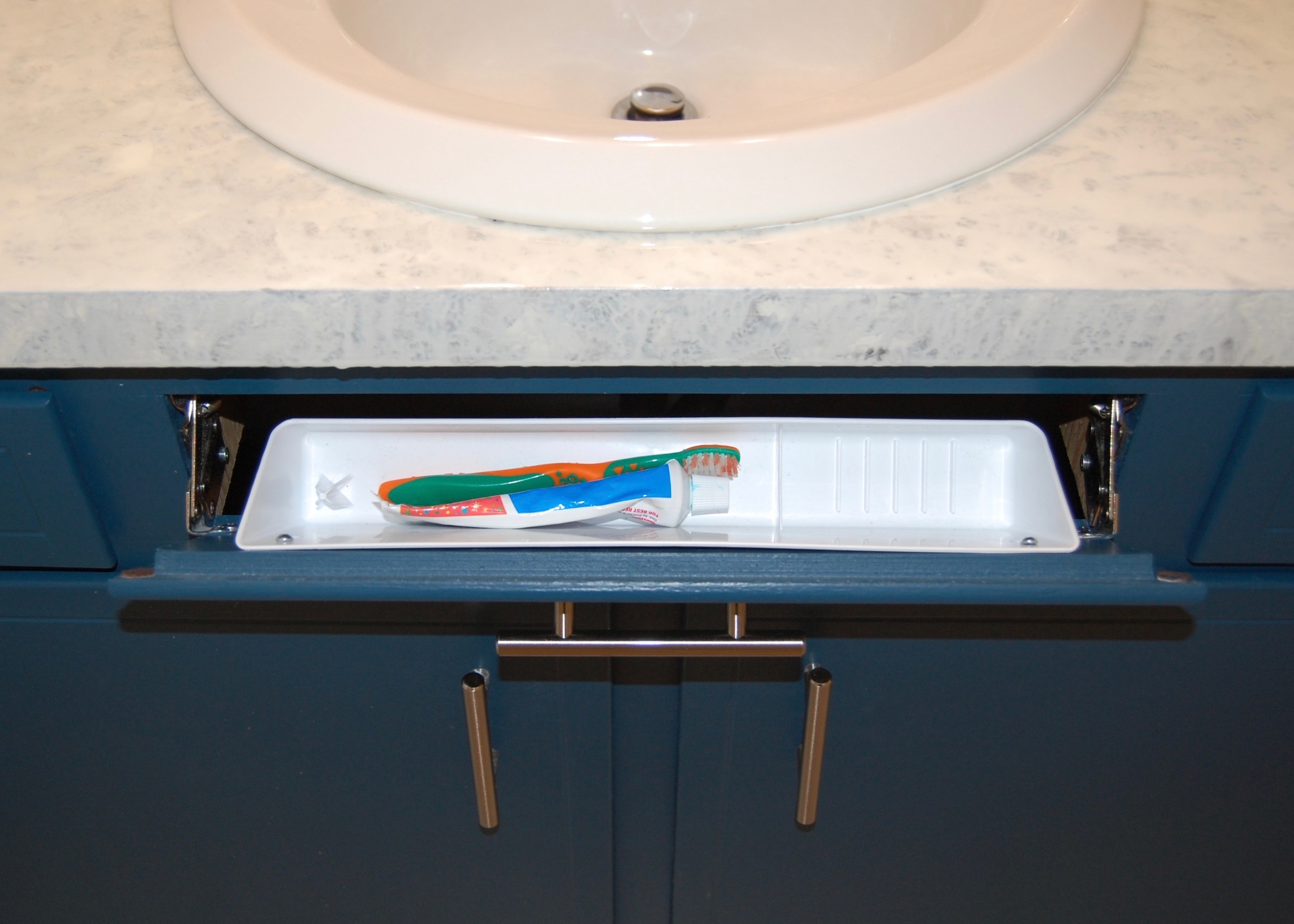
So now we finally have the new tilt drawer in place, and I will admit I really like having it.  It is a great place to hide the toothpaste and toothbrushes, it can be taken out easily and washed, and the countertop is less cluttered as a result.  Would I put another one in?  Even though I have another kit ready to be installed I haven’t decided if I will actually install it yet.  It was just such a giant waste of time and energy that I am not sure if it was worth it.  If you decide to put one in yourself, here is my advice;

  • Use the instructions to get a general idea of how everything is installed and where everything should go
  • Don’t use the actual measurements in the instructions, there is just too much variations in cabinets for the measurements to be completely accurate
  • Get a helper (or two) to hold things in place while you mark where all the holes need to go
  • Expect to install the hinges more than once, and for the installation to be a far bigger pain in the butt than the helpful kit indicates

If you have any helpful tilt drawer installation tips, or just want to share an installation horror story tell me about it in the comments.

This post contains affiliate links.  All opinions are my own.

Adding a Pop of Color

Despite my love of a clean, refined white room I could never have a completely white room in my own house (even if I didn't have kids, and a dog tracking dirt in the house).  While white rooms can feel beautiful and serene, they too often feel drab and cold.  Colorful rooms on the other hand feel energetic and warm, but too colorful rooms can feel overwhelming and claustrophobic.  In my own house I like to marry the clean look of a white room with eclectic pieces and pops of color that give a room energy and personality.

Adding Color to the edge of a door  - inspiration from Apartment Therapy

Adding Color to the edge of a door  - inspiration from Apartment Therapy

I was looking for ways to add pops of color to my mostly white hall bathroom when I came across this article from Apartment Therapy.  It details several ways to add color by painting the edges of objects a color that contrasts with the color of the rest of the object.  When I saw the above picture of the edge of a door painted neon orange, I knew I had to do this to my own room.

Here is the result:

A subtle hint of color from the now dark hallway.

A subtle hint of color from the now dark hallway.

I painted the edge of the door  Seaside Villa, in Home Decor Chalk Paint by Folk Art because I had it on hand and it was the perfect color.  Chalk paint tends to be a bit softer and more prone to scratching than traditional acrylic paint, so I am a bit concerned that it will not hold up over time.  I used Folk Art Home Decor Clear Wax over the paint to protect the finish, and I have had good luck with the durability of this paint previously, but only time will tell how well it will do for this application.   The door (and the rest of the trim), is painted in Simply White by Benjamin Moore, a slightly warm white that contrasts nicely with the cooler Seaside Villa.

This mini project really gave me a lot of bang for my buck.  The only cost to me was a little time, but the impact of this small change is surprisingly big.  It is hard to describe the difference this small change made, but I can say that somehow the room now feels more playful, and complete, and like details are a priority.

If you have done any surprisingly impactful small projects, or know a clever way to add a pop of color to a room, let me know about it in the comments.


DIY Countertop Refinishing

Regular Readers know that so far our mini bathroom remodel has not been as mini as we had anticipated.  Things have cost more than we planned, taken longer than we planned, or just not gone to plan.  But the way our bathroom countertop looks now makes me feel like it was all worthwhile.  It was the kind of project that I need every once in a while to restore my faith in DIY – a quick win. 

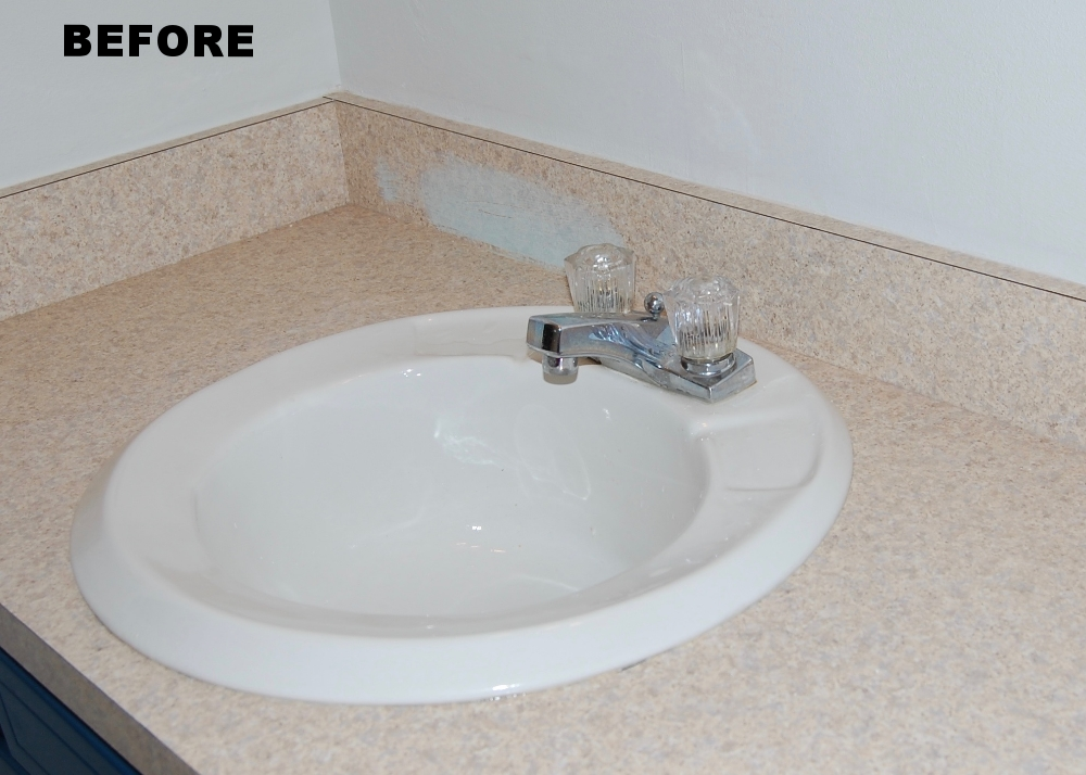
Before - Unattractive Laminate

Before - Unattractive Laminate

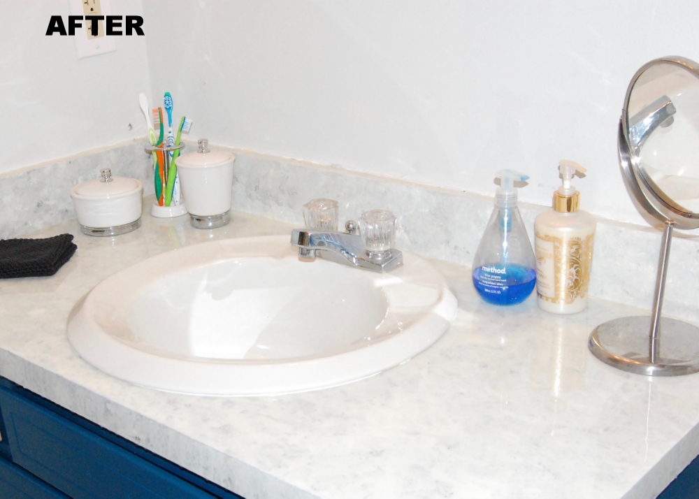
After -  my Mom Thought we installed marble 

After -  my Mom Thought we installed marble 

I really am incredibly happy with our new bathroom countertop, and really excited to share it with you all, so let’s get started, by taking it from the beginning;

One of the things that I knew I wanted to do when we started this mini bathroom remodel was update the countertop.  The old countertop was a sandy colored laminate.  It was in good shape, but it added nothing to the space.  Initially I had visions of granite and marble dancing in my head, but a limited budget put the cabash on that pretty quick.  I considered a lot of refinishing options, from using a countertop restoration kit, to building a new one out of planks, to covering the existing countertop in concrete.  I also considered faux marble, which looks beautiful when done correctly, and pretty terribly when done poorly, and decided that my artistic skills were not quite up for it.  I finally came across what looked like a pretty simple countertop painting and sealing technique on Designing Dawn.  The technique basically involved sponge painting a variety of colors in layers (true artistic talent not required), and pouring on a thick sealant called Envirotex Lite.  Her results looked pretty amazing, and she even had a follow up post showing how well it had held up over time (very well).  I was sold.

The entire process started by taping off the area that would be painted, and draping everything the Envirotev could drip on in plastic so I wouldn’t have a giant mess to clean up later (since I am messy and couldn’t drape the entire room in plastic I still had a bit to clean up – it doesn’t come off of things easily).  Then we sanded and primed the existing laminate countertop.  We started with a general purpose primer which was a complete disaster (you can read more about here), but the second primer we used (Zinnser Bin) worked like a charm.  For the record, my primer recommendation for this project is Zinnser Bin, but Primers should always be selected with the surface they are priming and the medium that will cover them in mind. I would also recommend sanding prior to taping, because the sanding dust gets caught in the tape.  This wasn’t a problem for us since we had to re-tape everything anyway (see priming post).  We also ended up removing the sink entirely even though we didn't originally intend to (again see the priming post).  I would remove the sink from the start if I was doing this over again.  The sink really isn't hard to remove (or put back on), and it makes the surface much easier to work on.

1st Disastrous Priming Attempt while the sink was still in place - Looking pretty sad

1st Disastrous Priming Attempt while the sink was still in place - Looking pretty sad

After the 2nd Primer Attempt and removal of the sink - Looking much Better

After the 2nd Primer Attempt and removal of the sink - Looking much Better

Next was the artistic painting which I was most nervous about.  Once the primer was fully cured I laid down 3 coats of my base color, Benjamin Moore Simply White in Satin.  I waited the recommended recoat time between coats, so this took a while. 

Three Layers of of Base Color Applied.

Three Layers of of Base Color Applied.

Then it was time to let my inner artist free.  I put a bit of each of my 3 paint colors in a plastic container and added a bit of water to thin them out.  Then I dampened my sponges before dunking them in my thinned out paint. 

Paint Colors Used to Create the Faux Stone Look.  Clockwise from the upper left BM Moonshine, BM Simply White, and Grey Craft Paint.

Paint Colors Used to Create the Faux Stone Look.  Clockwise from the upper left BM Moonshine, BM Simply White, and Grey Craft Paint.

To make my pattern I started with my darkest color and basically dabbed it all over the countertop using the kitchen sponge.  Then I did the same with the medium paint, and the base color paint, letting some of the color that went before peek through each time.  I didn’t let the paint dry between the colors so they ran together a bit, which I felt made it look even more natural. 

The first of my 3 colors applied, and not looking super promising.

The first of my 3 colors applied, and not looking super promising.

While the paint was still wet I sprinkled super fine glitter over the countertop to give the finished product a bit of depth, like real stone.  I was pretty reluctant to bring glitter into my house because, as my sister’s friend says “Glitter is the Herpes of the craft world – once you get it you can’t get rid of it,” but it made the finished product look so good that it was worth it (even if I keep finding glitter around the house for the next 3 months).  Then I let everything dry.

All three paint colors and glitter applied - starting to look pretty nice.

All three paint colors and glitter applied - starting to look pretty nice.

Confession time:  The next morning after painting I decided that the left side of the countertop was too lite and I did a bit of touch up painting.  This was a mistake.  The newly applied paint just didn’t blend well with the previously applied paint.  I should have left it the way it was, and now I regret touching it up.  If you do this yourself reconsider touch up painting.  Maybe wait a day or sleep on your touch up painting decision.  If you do decide to do some touch up painting keep in mind that the newly applied paint probably won’t blend perfectly with the initially applied paint and make sure you are ok with that.

Ok, so everything is taped, draped in plastic, and artistically painted – now it is time for the magic sealing ingrediant - Envirotex Lite.  Envirotex Lite is a two part reactive polymer compound (a resin and a hardener) that is mixed in two stages, then poured on top of whatever you are sealing.  Basically you pour equal amounts of the resin and hardener in a mixing container, mix for the prescribed period of time, pour it into a new mixing container, and mix it again for the prescribed period of time, then pour it on whatever you are sealing and spread it out so that it covers the whole surface.  We found some of the directions for this product kind of insane, but we followed them to the letter, including timing the mixing, switching containers, the whole nine yards, and we had absolutely no issues with the product hardening properly and found it relatively easy to apply, so at least they work. 

To use the Envirotex Lite, you mix it up per the directions, pour it on, then spread it out (we used cheap plastic putty knives which we have been able to reuse).  It was pretty easy to spread out with the putty knives, but it doesn't easily flow over the surface you are covering.  It is more like moving corn syrup than water.  You also have to work pretty fast because the mix starts setting up pretty fast, and once it starts to set you shouldn't move it any more (more on that below).

Amazingly Smooth Glassy Horizontal Surface actually reflecting!

Amazingly Smooth Glassy Horizontal Surface actually reflecting!

Since Envirotex lite is really made for horizontal surfaces, the vertical surfaces we needed to cover were a bit more of a challenge.  When we poured the mix onto the countertop we poured a bit extra near the vertical surfaces then used our putty knives to lift and spread the mix onto the vertical surfaces like we were icing a cake with really thin sticky icing.  The result was very well covered vertical surfaces, but unlike the perfectly smooth glassy horizontal surfaces the vertical surfaces are a bit textured.  This really isn't a big deal.  I had to try very hard to get this texture to show up in a picture as it is pretty hard to see.  The pic below shows the texture in literally the worst possible light.

Vertical Surfaces are textured.

Vertical Surfaces are textured.

When the Envirotex starts to set up bubbles will form that need to be popped.  According to the  directions you can use a blow torch to pop the bubbles or blow on them.  We got a blow torch for this purpose, but ended up just blowing on them and it worked fine on our relatively small application.  If I were using the Envirotex on something larger I would go the blow torch route.

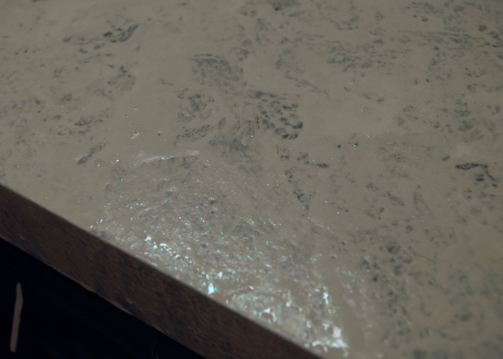
One thing that we learned while attempting to pop bubbles is that you should not touch them - AT ALL.  This is what happens if you do;

Be warned - DON'T TOUCH THE BUBBLES or THIS will happen!

Be warned - DON'T TOUCH THE BUBBLES or THIS will happen!

Our bubble touching mess was so bad that we ended up putting on a second coat of the Envirotex the next day right on top of the first.  The second coat looks fantastic.

The Finished Countertop!

The Finished Countertop!

Want to know exactly what we used to make this happen?  Here are the details;

  • Paint:
    • Primer:  Zinnser Bin
    • Base Color:  Benjamin More Simply White
    • Medium Grey:  Benjamin Moore Moonshine (similar to, but slightly darker than our wall color)
    • Dark Grey: Anita's All Purpose Acrylic Craft Paint in Grey
  • Painting Supplies:
    • Paint Brush- To Lay down the base coat and primer
    • 3 Clean kitchen sponges – To Layer my paint colors (in retrospect natural sea sponges would have probably been easier to work with)
    • 3 Disposable plastic containers to hold paint (something clean from the recycling bin works great)
    • Water to thin the paint
    • Painters Tape
    • Plastic Tarps (we used cut up garbage bags)
  • Finishing Touches:
    • Tree House Studios Extra Fine glitter:  Super small glitter used to add a bit of depth and sparkle like you see in real stone
  • Sealing Supplies:
    • 2 4 oz boxes of Envirotex Lite (we ending up doing 2 coats – 1 box per coat)
    • 4 flat bottomed cylinder plastic containers (2 per coat for mixing the Envirotex)
    • 4 wooden stiring sticks (2 per coat for mixing the Envirotex)
    • Cheap Plastic putty knives (for spreading the Envirotex over the countertop)
    • Hot Breath for popping bubbles

Let me know what you think, and if you would consider doing it yourself in the comments.

(This post contains affiliate links, but I was not paid to review or use any of the products mentioned.)

Caulk Up

I finally caulked the bath tub, and it looks pretty good if I do say so myself.

Newly Caulked Bathtub looking mighty fine!  Tub spout not fully installed.

Newly Caulked Bathtub looking mighty fine!  Tub spout not fully installed.

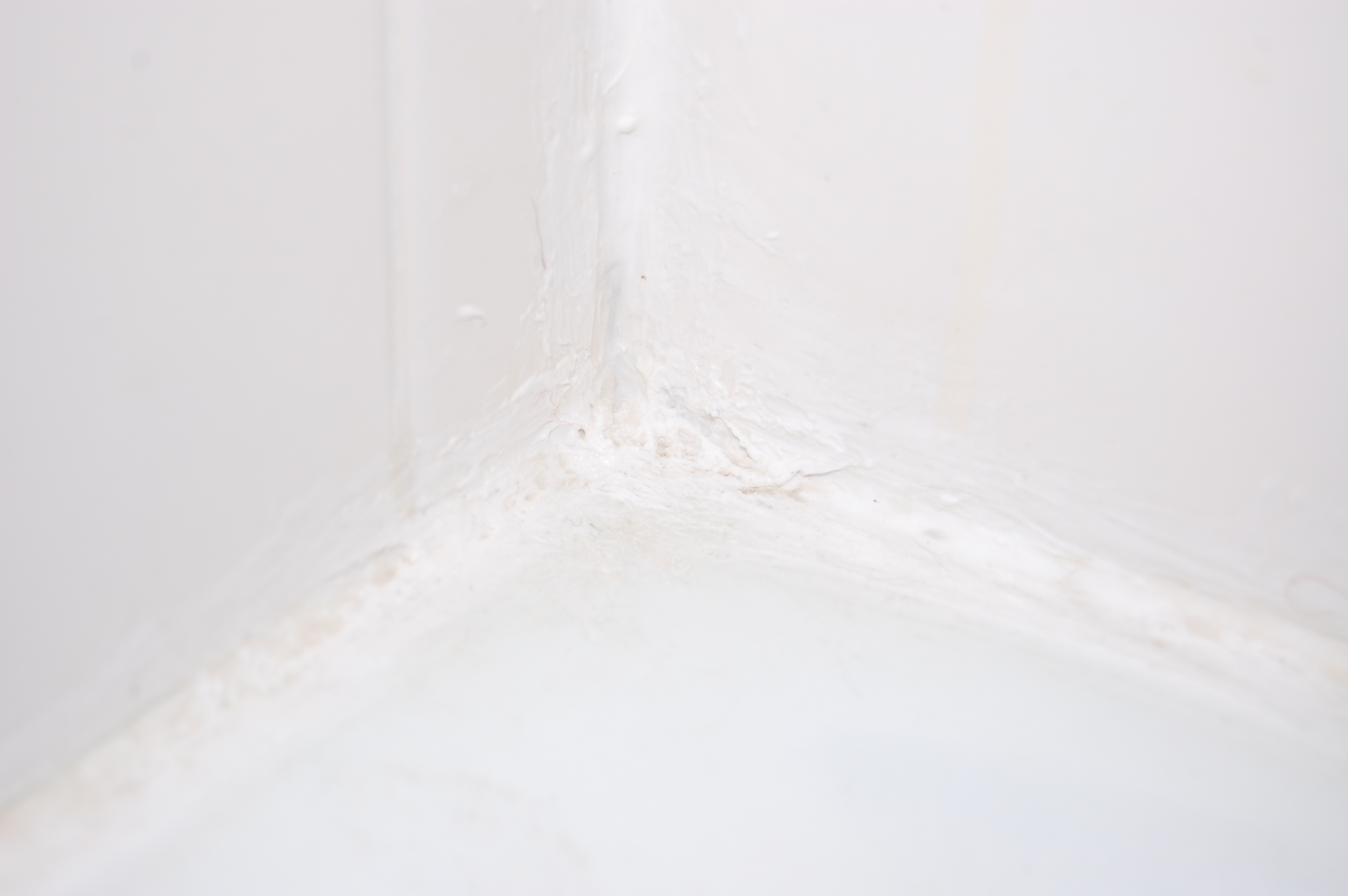
This was actually my first time caulking a bathtub, so I am not going to give you a play by play on my caulking technique (it was pretty bad).  I am however going to tell you why my bathroom caulk looks good now despite my poor technique, and a few lessons I learned along the way.

Before I took the plunge I read a LOT of tutorials on how to caulk a bathroom.  Here are a few:

There are a few things that nearly all of the tutorials seem to agree on, like using painters tape, and caulk that is supposed to be used in a bathroom, and there are a few things that the tutorials seemed to disagree about, like the angle the tube of caulk should be cut at, and angle that the caulk should be applied.  I decided to use the advice that the tutorials all agreed on, and do what felt right for the rest of it.

To angle or not to angle that is the question.  Also - Check out our mad graphic design skills :)

To angle or not to angle that is the question.  Also - Check out our mad graphic design skills :)

Here is what I learned:

1.  Initially you should cut the smallest possible hole in the tube of caulk – you can always cut it larger.

I cut the hole on the tube of caulk too big, and as a result the caulk came out MUCH faster and thicker than I had anticipated.  It was a bit of a mess.

Hole cut MUCH too large.

Hole cut MUCH too large.

2.  Use painters tape to define your caulk lines (and protect you from excess caulk).

This SAVED me.  If I had not done this the caulk that I applied would have looked SOOOO much worse than it did before I removed the horrible preexisting stuff.  As I said previously, I used too much caulk, WAY too much caulk.  As I was smoothing the caulk into the grooves it belongs in, the excess caulk built up on the sides of the tape.  Since the tape was easily removed, this was not a problem at all.  Had I not used the tape, all of that excess caulk would have gotten all over my tile.

Defining those caulk lines

Defining those caulk lines

3.  Wide painters tape is better than narrow painter’s tape.

I used thin painters tape, and it was amazing, but because I had so much excess caulk some of the excess still ended up on my tile.  Had I used wider tape I think all of the caulk would have stayed on the tape.

4.  Keep a wet rag nearby.

If you can get a wet rag on errant caulk as soon as possible it cleans up pretty easily.  Looking at my completed caulking job you would have no idea that wayward caulk got all over my bathtub.

5.  A finger is a surprisingly good caulk applicator.

I saw a lot of different tools recommended to smooth the caulk out once it was applied, from specially designed professional implements to plastic spoons to ice.  I just used my finger, and it turned out great.  I was able to tell how much pressure should be applied, and my hands were able to catch the caulk that didn’t pile up on the tape.

6.  Keep paper towels nearby – a lot of them.

All of the caulk that piled up in my hands (see #5) had to go somewhere.  Many paper towels were needed to contain it all.

7.  Work Quickly

While caulk is pretty fresh it is easy to manipulate, adjust, and correct.  As soon as it gets a “skin” you might as well leave the mistake, because trying to correct things will just make them worse.  The good news is that if you have all your supplies ready to go, caulking goes remarkably quickly.  I went from applying the tape to pulling it back off in under 30 minutes.

Check out that beautifully applied caulk.

Check out that beautifully applied caulk.

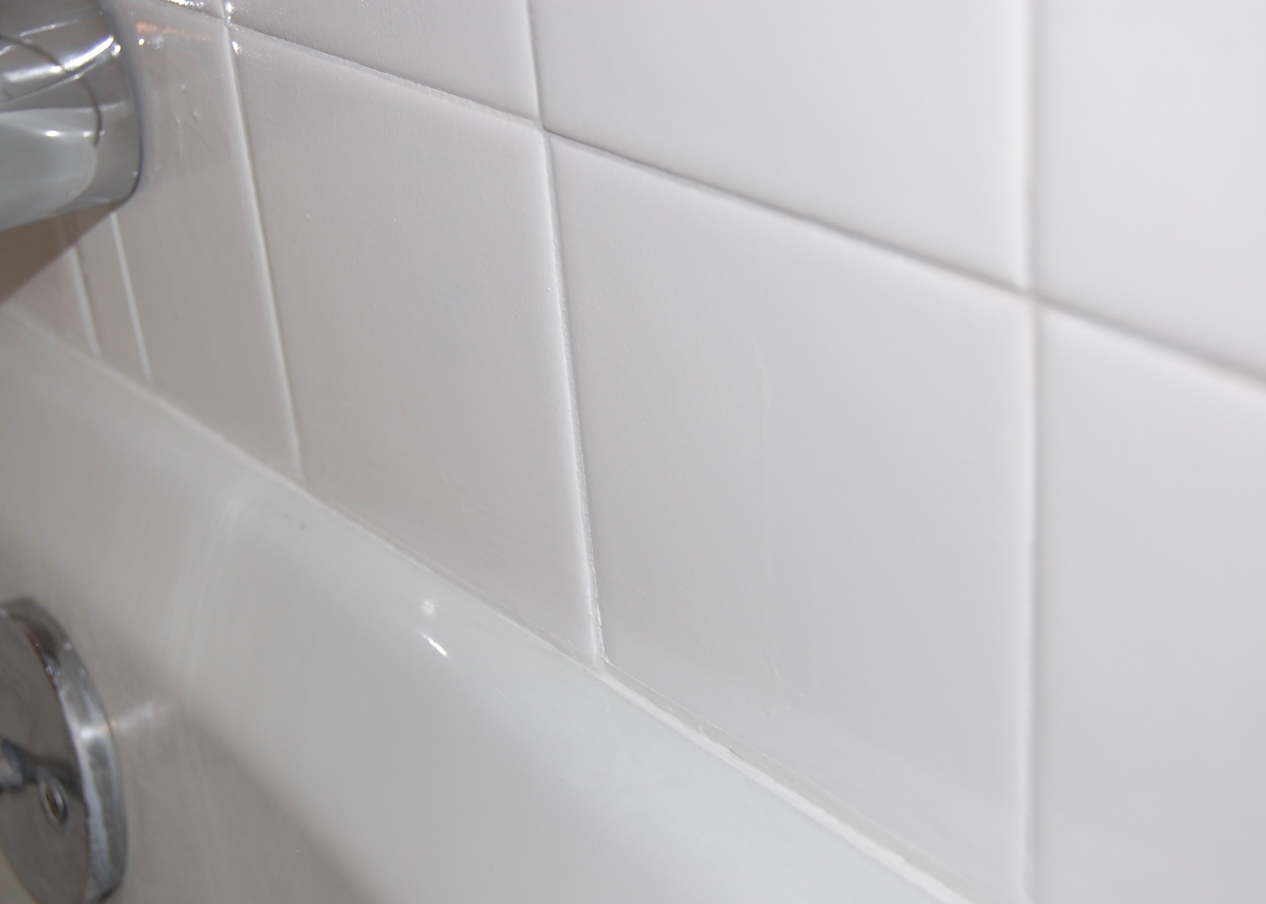
Finally, the hardest of all the lessons I learned.  Tape will pull epoxy paint off tile.

As frequent readers know we painted our bathroom tile with a Rust-Oleum Tub and Tile Refinishing Kit.  Despite waiting more than the prescribed 3 days to allow the paint to cure, and despite our excessive prep work, the painters tape used to apply the caulk removed the tile paint when it was pulled off.  This was REALLY upsetting to us.  The bare patches of tile were like emotional black holes, sucking all of the happy feelings out of the room and threatening a permanent fugue state.  Firebeard immediately mixed and applied more of the paint to keep us all from falling into pits of despair.  I didn’t get a picture first.

With the amount of work that we put into painting the tile, we had hoped that it would last for a least 2 or 3 years while we were doing work on the rest of the house.  Right now it doesn’t look like that is going to be likely.  But on a positive note, the caulk should last for many years to come.

Tile doesn't sand

If you have ever watched Supernatural, you know that the beginning of every show starts with backstory.  So much happens in each show that missing a couple of shows would leave you completely lost.  The backstory provides the context for the current insanity and makes it seem like the logical progression of events rather than a complete plot twist.  I feel like this post deserves backstory, so that you will know what brought us to this point.  We got to the current insanity through a logical progression of events.

We started out just a few weeks ago with the dream of a quick bathroom refresh.  A little paint here, some accessories there, and voila, a brand new bathroom.  Sure we wanted to fix a few small things along the way and remove those disgusting shower doors, but those were quick projects that wouldn’t take any time at all, right? 

Wrong!  We were wrong.  So far everything has taken about twice as long as we expected it to.  Well that was until we tried to deal with the tub surround tiles that looked pink after painting the bathroom.  This project was supposed to take a day of work, and 3 days of dry time.  So far  it has already taken 2 weeks, and we are all feeling a bit crazed.

So, what brought us to this point?  Here is the back story;

Sickly Beige Tile.

Sickly Beige Tile.

Next to our swatch of Paper White paint, our tiles looked sickly beige.  While I am not a fan of sickly beige, I felt like it wouldn’t stand out, and I could pretend that they were just slightly off white and I could live with it until we were able to do a full bathroom remodel in a couple of years. 

Tile looks pink after painting.

Tile looks pink after painting.

Once the Paper White covered the entire wall the tile no longer looked sickly beige.... it looked pink.  I will admit, I had been hoping that the slightly cool Paper White would tone down the yellow in the tile a little bit, but it worked a little too well.  The yellow undertones in the tile were nearly eliminated, but the red undertones were accentuated. 

After about a day of trying to convince myself that the pink tile didn’t bother me (and failing miserably), I started looking for a solution.  I had a couple of options;

  • Living with the pink tile until we could do a complete remodel, the pink grating on my aesthetic sensibilities every time I walked by the bathroom.
  • Getting one of those drop in plastic bathtub surrounds (I would rather live with the pink tile)
  • Tiling the bathtub surround (I seriously considered this option, but it was so far out of the budget that this really wasn’t a viable possibility)
  • Painting the tile

Painting the tile is not something I would have EVER considered prior to this, but suddenly it was an option that seemed filled with possibly.  Since we had already removed all of the caulk there wouldn't be that much prep work.  It would only take a couple of days from start to finish.  I wouldn't have to spend a fortune on new tile, and I could get the white tile I had wanted in the first place.  I could have my cake and eat it too.  In retrospect, painting the tile was too good to be true, and I should have seen this as a warning sign from the beginning.  

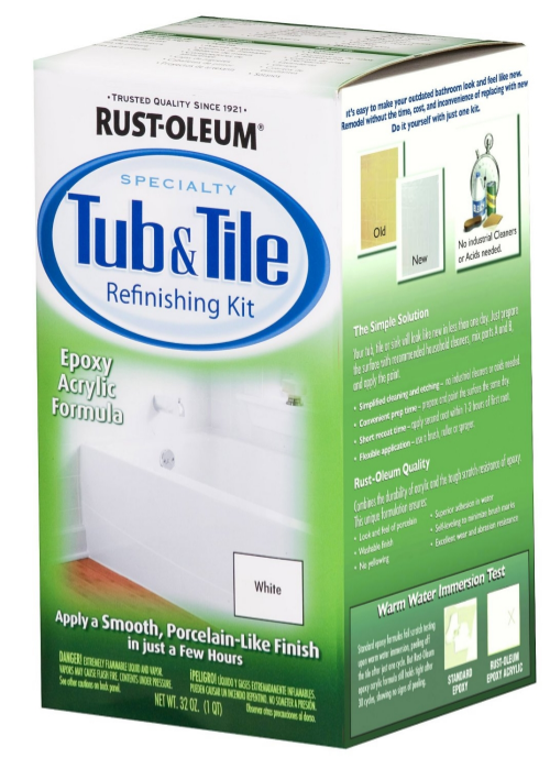
We decided to go with the Rust-oleum Tub and Tile refinishing kit.  It is a 2 part epoxy acrylic paint that can be rolled on like standard wall paint, but should hold up well under high humidity.  It was only $25 on Amazon when we bought it, and it had pretty great reviews.  The only warning we repeatedly saw from the Amazon reviewers was that the tile needed to be well prepared.  "No problem," we thought.  The kit would be delivered in two days (thanks Prime!), and we would do the prep while we were waiting on the kit and dive right into the painting when it arrived.  

What did the prep entail you ask?

  1. Removing all of the caulk from the tile that would be painted
  2. Sanding the tile. 

We had this in the bag.  We had already removed the caulk - step one done.  All we had left to do was sand the tile.  The Amazon reviewers really stressed this part.  The most knowledgeable (sounding) among them recommended that the shine be removed from the tile so that the paint would be able to grip the tile.  This made perfect sense (its what you do when you refinish wood), so this is what we set out to do.  

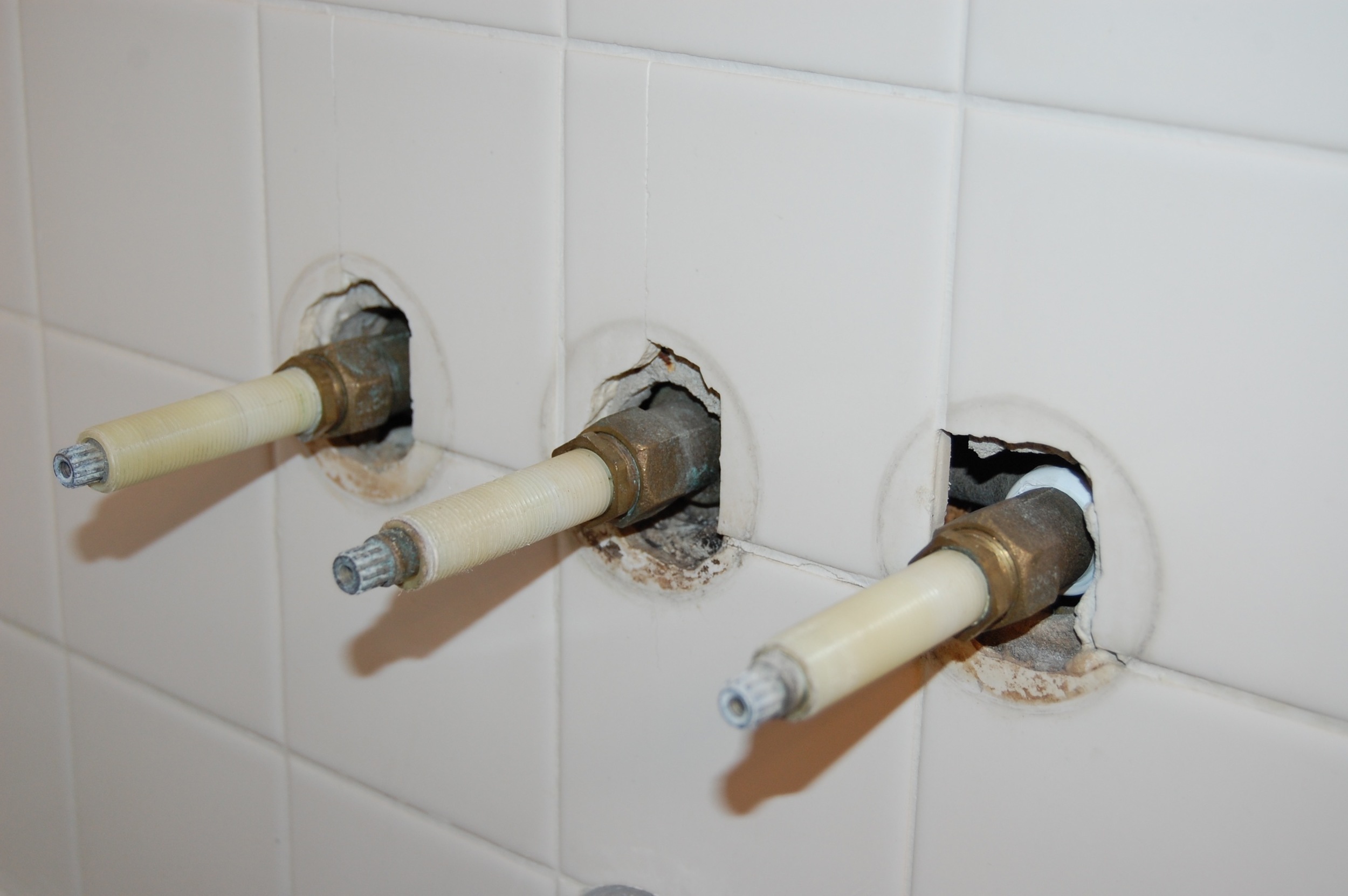
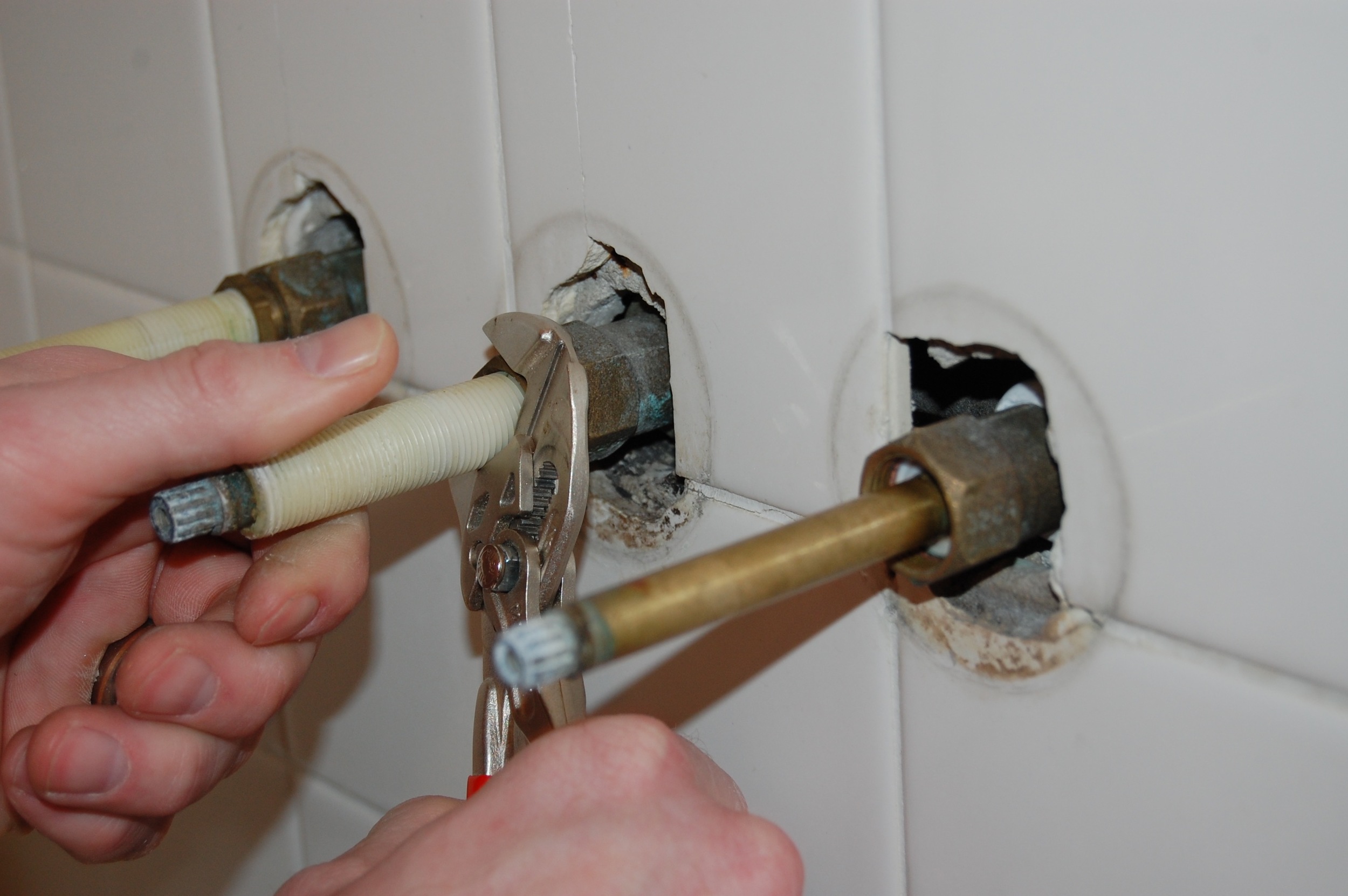
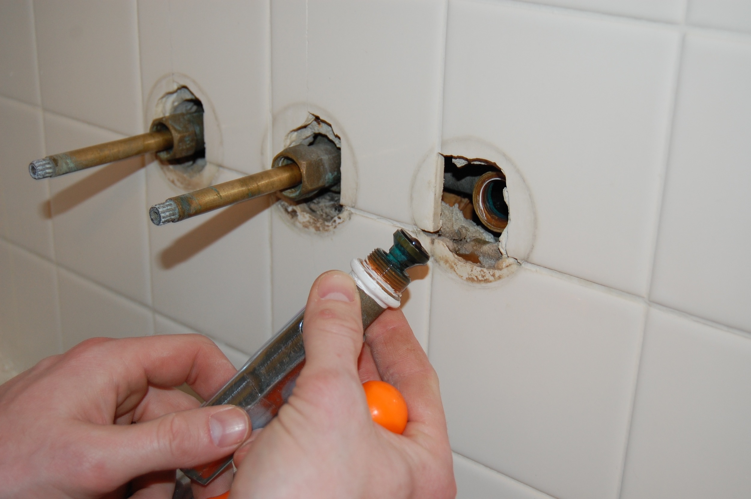
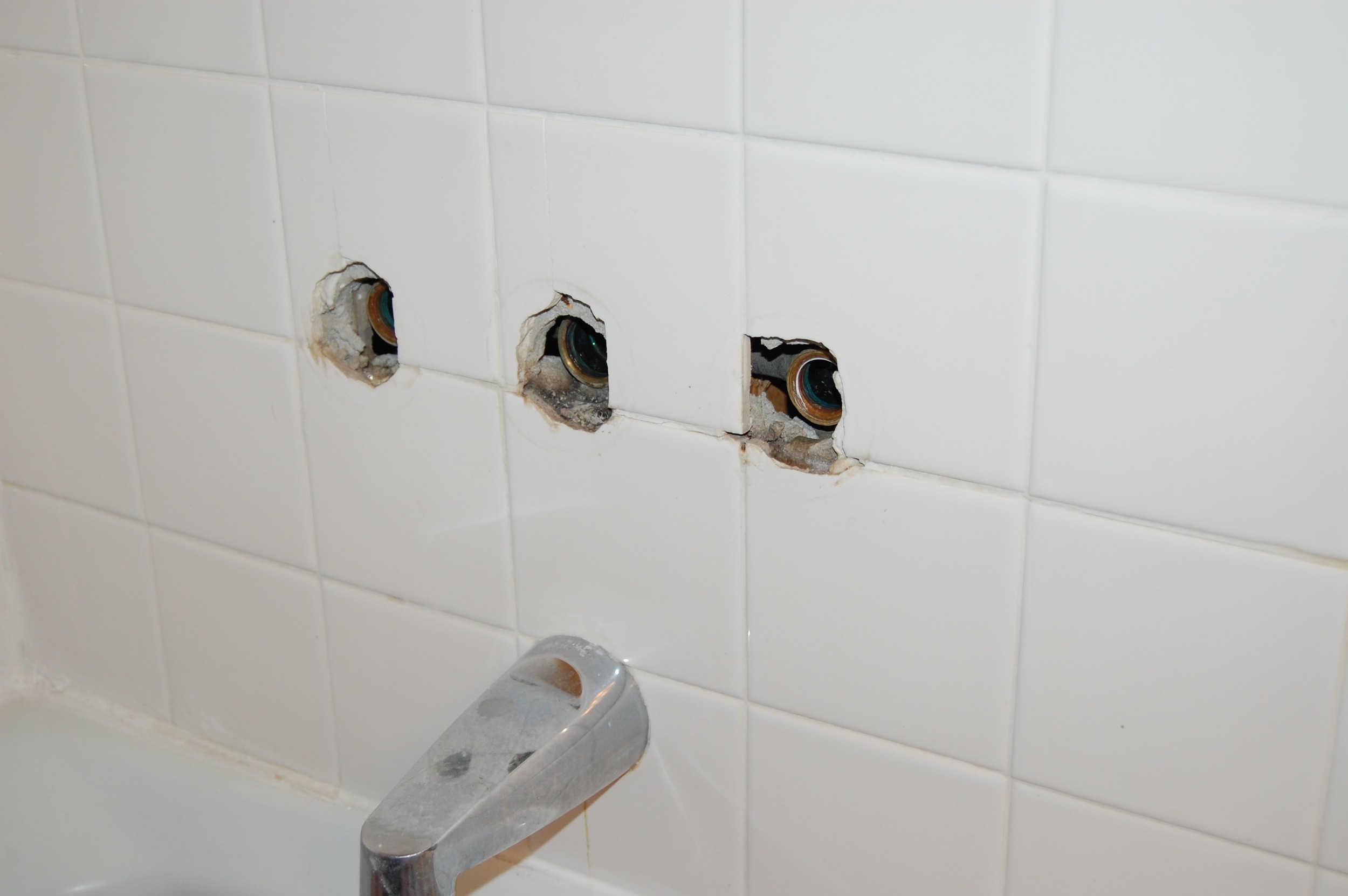
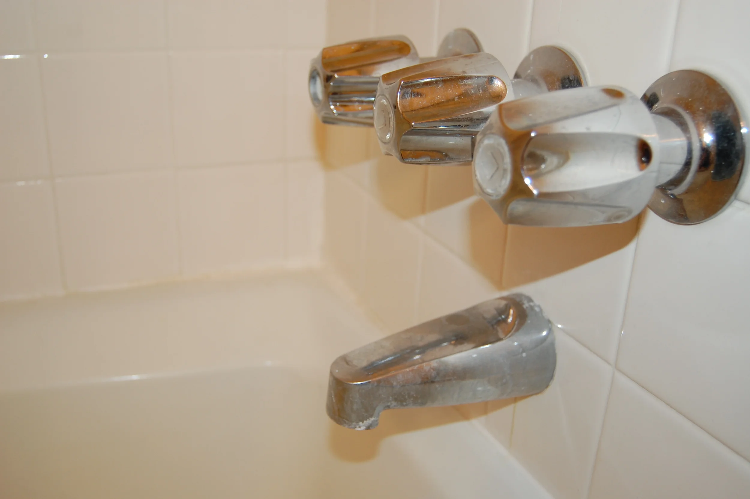
Our tub spout just twisted off.

Our tub spout just twisted off.

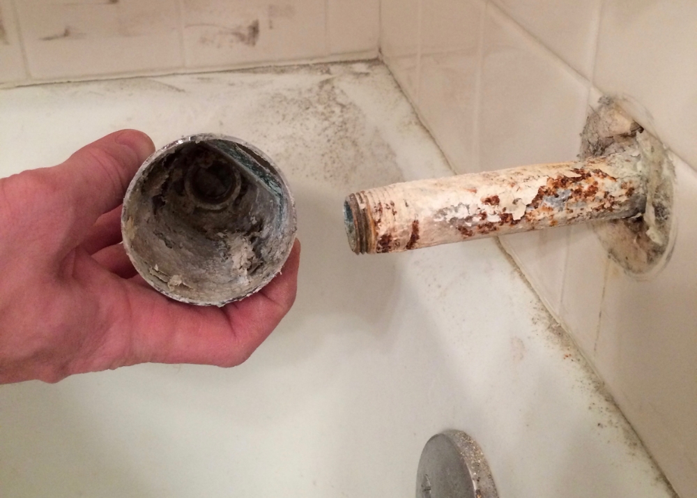
About 40 years worth of hard water deposits.

About 40 years worth of hard water deposits.

First we had to remove our newly installed tub faucets, and the tub spout.  The tub spout just twisted off.  We were shocked to find what we think is nearly 40 years of hard water deposits.  It was pretty gross.  The good news is that when everything goes back on we will have a shiny new tub spout to match the new faucets.

We started sanding the tile with the 220 grit sandpaper that the kit recommended.  It didn't seem to do anything at all.

Then we switches to 60 grit (super course) sandpaper.  It made the tile shinier.  

I went to the web searching for a tile sanding solution and found Emery paper, a sandpaper made from silicon carbide.  We grabbed the only kind they had at Home Depot (which did not fit on any of our electric sanders) and went to town on the tile.  It worked, but sanding the tile by hand was maddenly slow.

After the belt sander.

After the belt sander.

Then finally one day while I was at work Firebeard took out the big guns - the belt sander.  While still at work I texted to ask how it was going, and the above picture was the response.  All of the flat tile surfaces had been throughly sanded and were ready to be painted, but the curved edges of the tiles were as shiny as ever.  

At this point we were starting to get a bit desperate, and I opted for some chemical warfare.  Muriatic acid is a fairly strong acid that when pretty heavily diluted is sometimes used as a hail Mary bathroom cleaner.  It is used heavily diluted and as a last resort because it has the tendency to remove the shine/finish from tile, porcelain, etc.  Fortunately this generally negative tendency of muriatic acid was exactly what we needed.  We strapped on the safety gear, and allowed the muriatic acid to eat as much of the remaining finish off the tiles as we dared (while keeping it off of everything else).

After this we did one last round of hand sanding, and then very through cleaning, and we were finally ready to paint.

Next time on, "This is taking significantly longer than we thought it would Mini Bathroom Remodeling Project,"  the painted tile.

(This post contains affiliate links.)

Painting and Magical Color Changing Tile

The last I left you we had just finished removing all of the caulk in our hall bathroom, scrubbing the left over grout and tile clean, and we were waiting for everything to dry completely before we applied the new caulk.  After doing everything we could to remove the insidious mold that grew up under and around the old caulk, we were not about to take any chances caulking over damp crevices, and determined that we would wait at least a day to let everything dry before applying the new caulk.   But not being ones to sit on our laurels watching grout dry, we decided to paint in the meantime.

We had already picked out a few front runners in the paint department that are consistent with the rest of the house’s updated color scheme, and had painted a few swatches on the walls.  The front runners were Edgebomb Gray by Benjamin Moore, Moonshine by Benjamin Moore, and Paper White by Benjamin Moore. 

As soon as it dried it became clear that Edgecomb Gray was not for us.  It looked brown rather than greige in our windowless bathroom, and that was exactly what we were trying to get away from.  So far this has been something of a theme in this under lit house of ours.  The pretty, warm inviting greiges I see all over Pinterest look dirty and muddy when I get them on my walls.  At least it makes picking a paint color a bit easier.

Moonshine and Paper White  were the final contenders, and deciding between the two of them was not easy.  Moonshine and Paper White are pretty similar.  They are both light neutral to slightly cool grays that look a bit silvery or shimmery and change color slightly depending on the lighting.  We liked them both, so we lived with the colors for a few days to see if one of them grew on us. 

I waffled back and forth, leaning more toward one, then more toward the other.  I looked at them during the day, at night, with the lights on, with the lights off, and stole quick glances at them every time I passed the door (as if I might catch the paint off guard while it was revealing its true nature).    I  was not really able to make up by mind until the shower curtain we ordered for the bathroom came in (I’m not showing it just yet – it’s a surprise, and it’s awesome).  When we held the shower curtain up to our paint swatches the choice became clear.  The Moonshine looked perfectly fine, but the Paper White really popped.  We decided to go with Paper White, which is a bit lighter and brighter than Moonshine and looked great with our new shower curtain. 

Money Saving Tip:

If you are planning a painting project and have an Ace Hardware nearby check to see if they are having one of their 2 for 1 paint sales before heading out to buy paint.  A couple of times a year, Ace Hardware has a paint sale in which they sell 2 gallons of paint for the cost of one gallon.  The brand and line of paint that is on sale generally changes each time, so if you are particular about the brand you paint with this may not be the sale for you, but if you are like me, and price trumps brand loyalty, it is a great way to get paint cheap – just make sure you buy enough to finish your project or are willing to pay full price if you run out.

We were lucky enough to buy the paint for this project during one of Ace Hardware’s 2 for 1 sales, so we got two gallons of BM Paper White color matched in Valspar Optimus for $40 .  This should be enough to finish this project, and another we have planned (stayed tuned).

The ceiling paint is BM Simply White color matched to BEHR Premium Plus Ceiling Paint.  It was leftover from painting the ceiling in our office and dining room.  I love this color for a ceiling because it is definitely white, without being stark white.  I feel like it makes the room feel a bit more welcoming than a true pure white.  

We hadn't realized just how yellow the ceiling was until we started painting it.  Just look at the before and after.  It is like night and day!  Next to the Simply White the old color looked like the teeth of a 3-pack-a-day smoker. The really troubling part is that we have no reason to suspect that the prior owner of 30+ years ever smoked in the house - we think they actually CHOOSE that color....   

So here is what it looked like after 2 coats of Paper white on the walls and 2 coats of Simply White on the ceiling.  The trim still needs to be painted and we need to do some touching up on both the walls and the ceiling.  So far I am very happy with the paint color we chose, but there is a problem.  The tile in the bathtub surround now looks pink!

Next time, figuring out what to do about the pink tile.

Mini Bathroom Remodel - Leaky Faucets No More

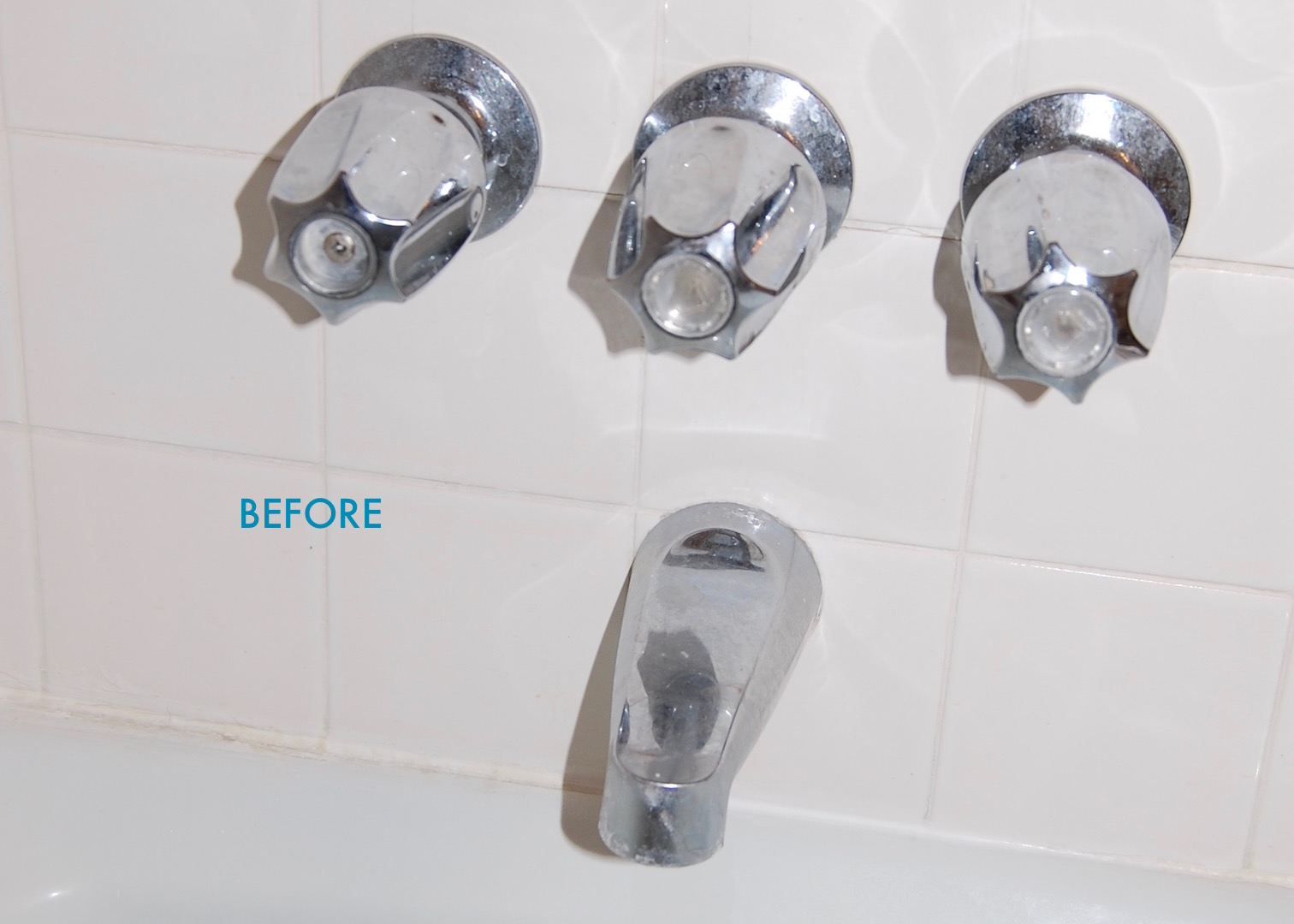
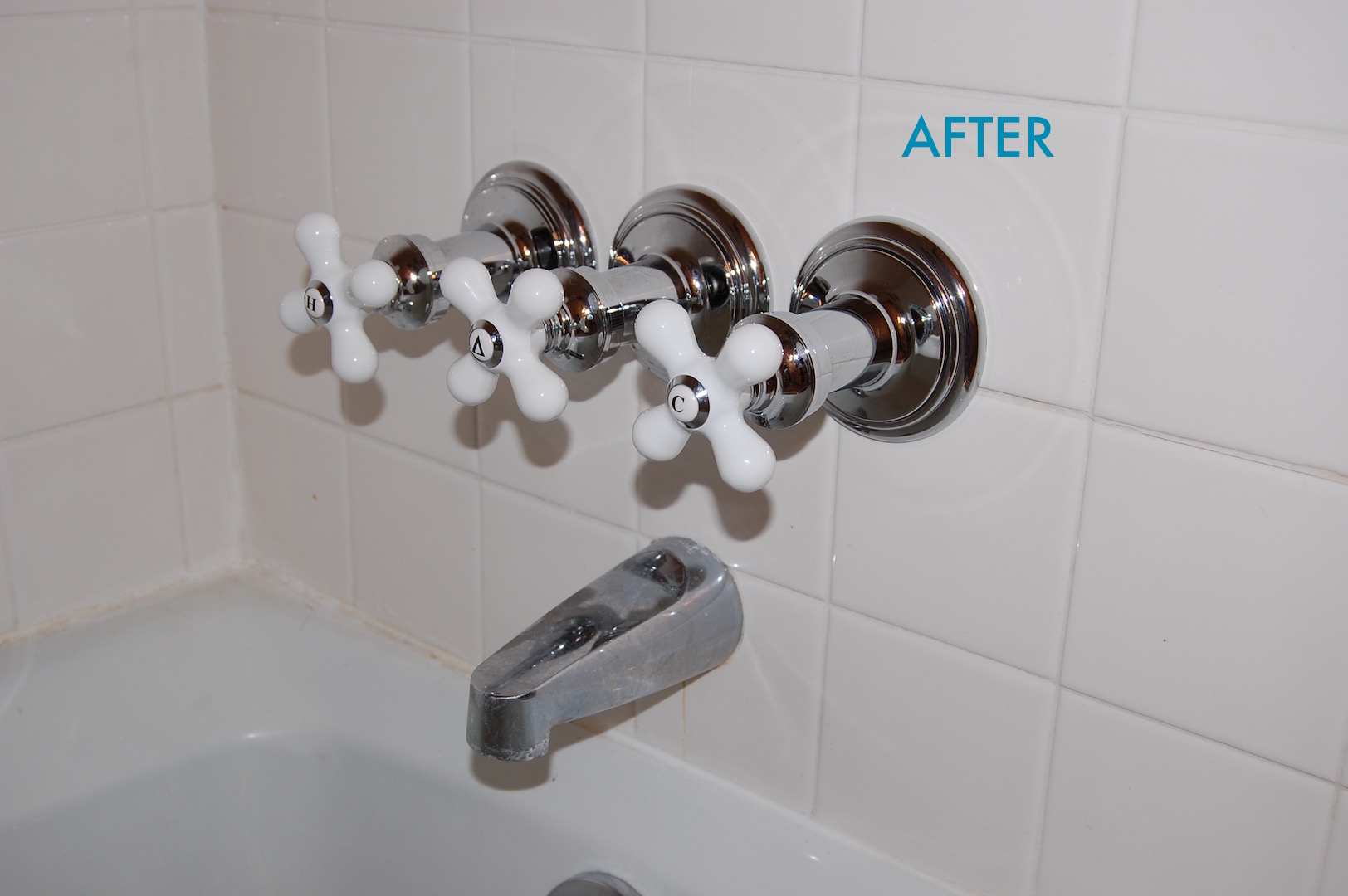
The first stop on our journey to a beautiful “new” bathroom, is changing out the tub faucets that have been dripping for months and driving me nuts (but not nuts enough to do anything about).  The drip finally got bad enough that my conscience couldn’t let it go any longer, and we dropped some money on a tub faucet trim kit.  The kit we got was the Danco 39696 Trim kit with Cross-Arm Handles for $45 on Amazon.  I picked this one because the handles look a bit vintage, which is my favorite bathroom look, and it was significantly cheaper than buying all of the replacement parts piece by piece.

The Dance Tub/Shower Remodeling Kit.  Check out the before and after.  Tile magically transforms when the new faucets are installed!   

The Dance Tub/Shower Remodeling Kit.  Check out the before and after.  Tile magically transforms when the new faucets are installed!   


I want to first say that if your tub faucets are dripping you probably don’t need entirely new tub faucets, you probably only need the washer that sits at the back of the stem where the stem connects to the water line (which is MUCH cheaper than changing out the whole faucet).  Since our handles were ugly, our stems had seen better days, and our stem seats had been damaged from months of cranking down the handles to stop the leak, we decided to change out the whole assembly.

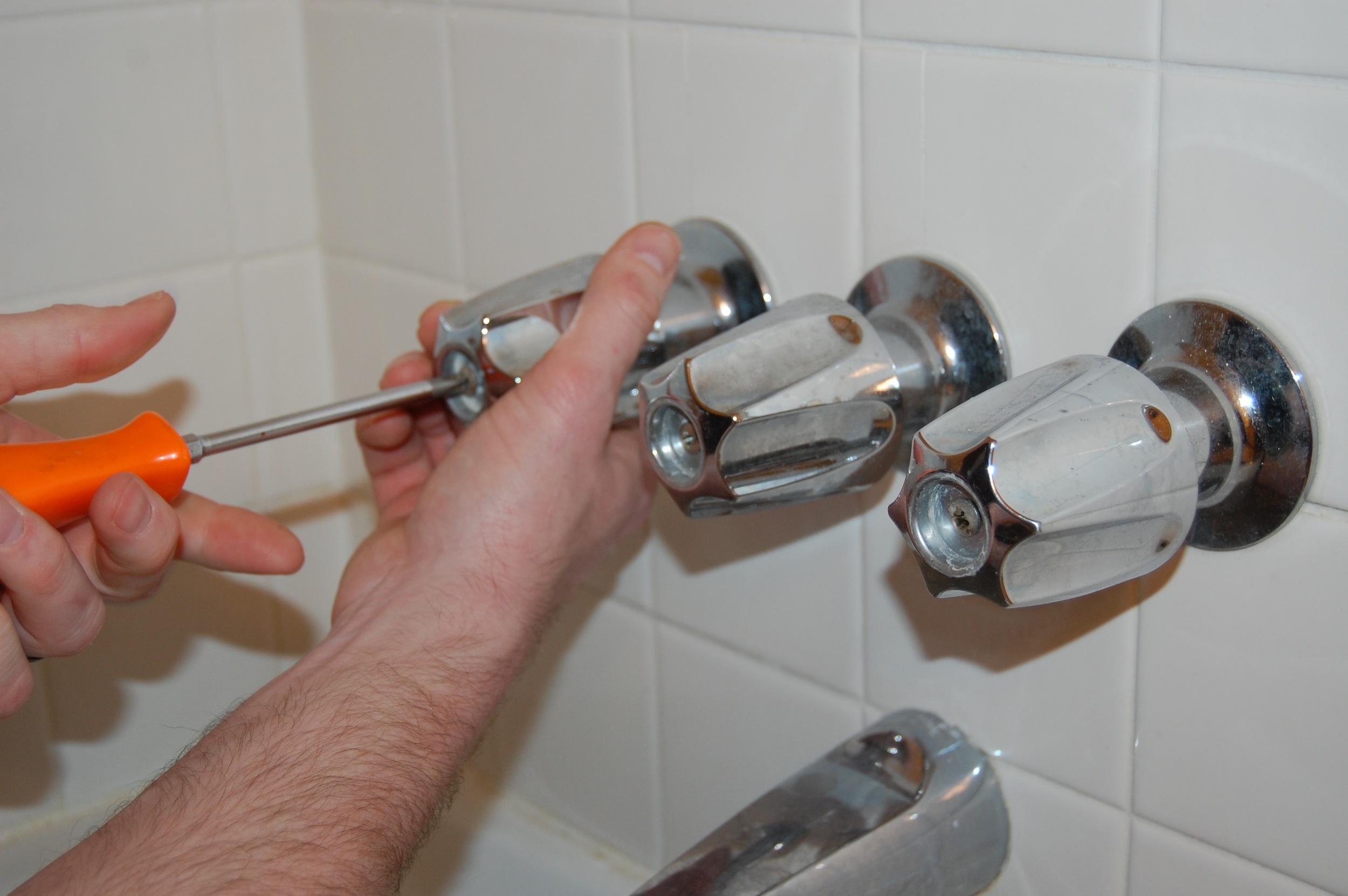
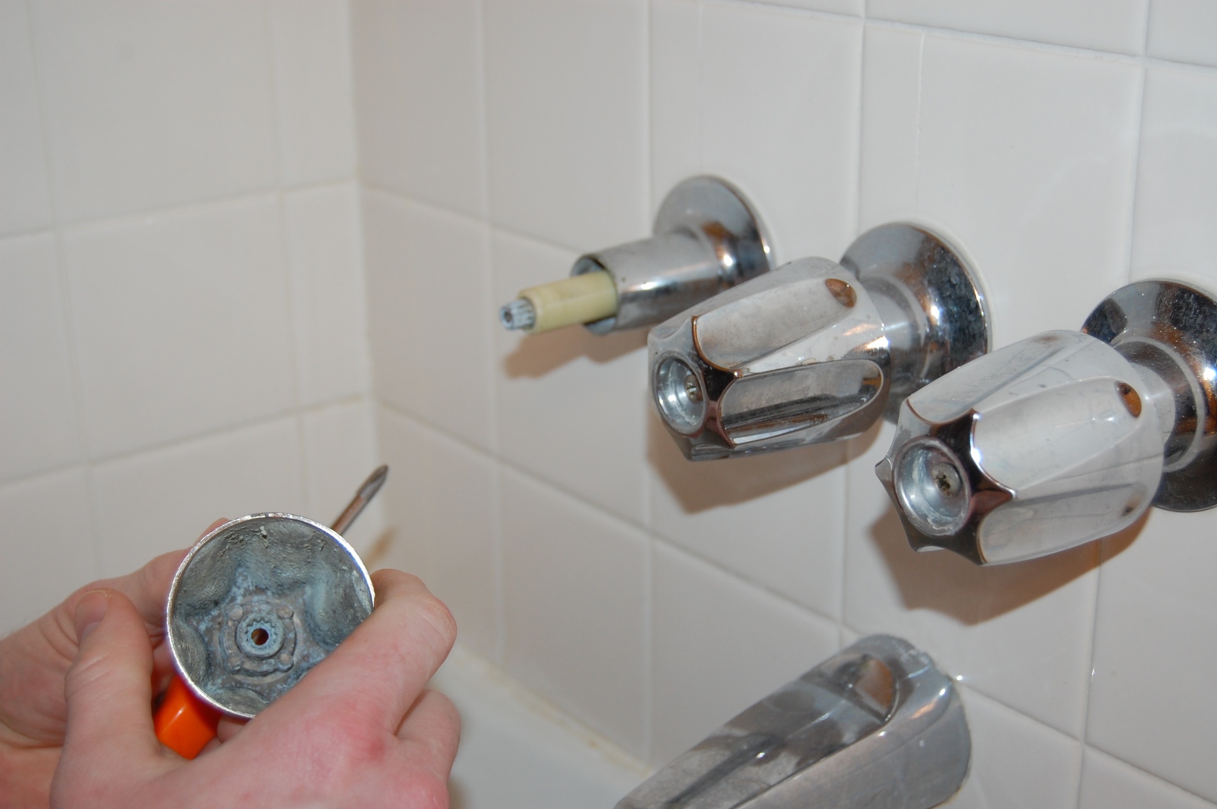
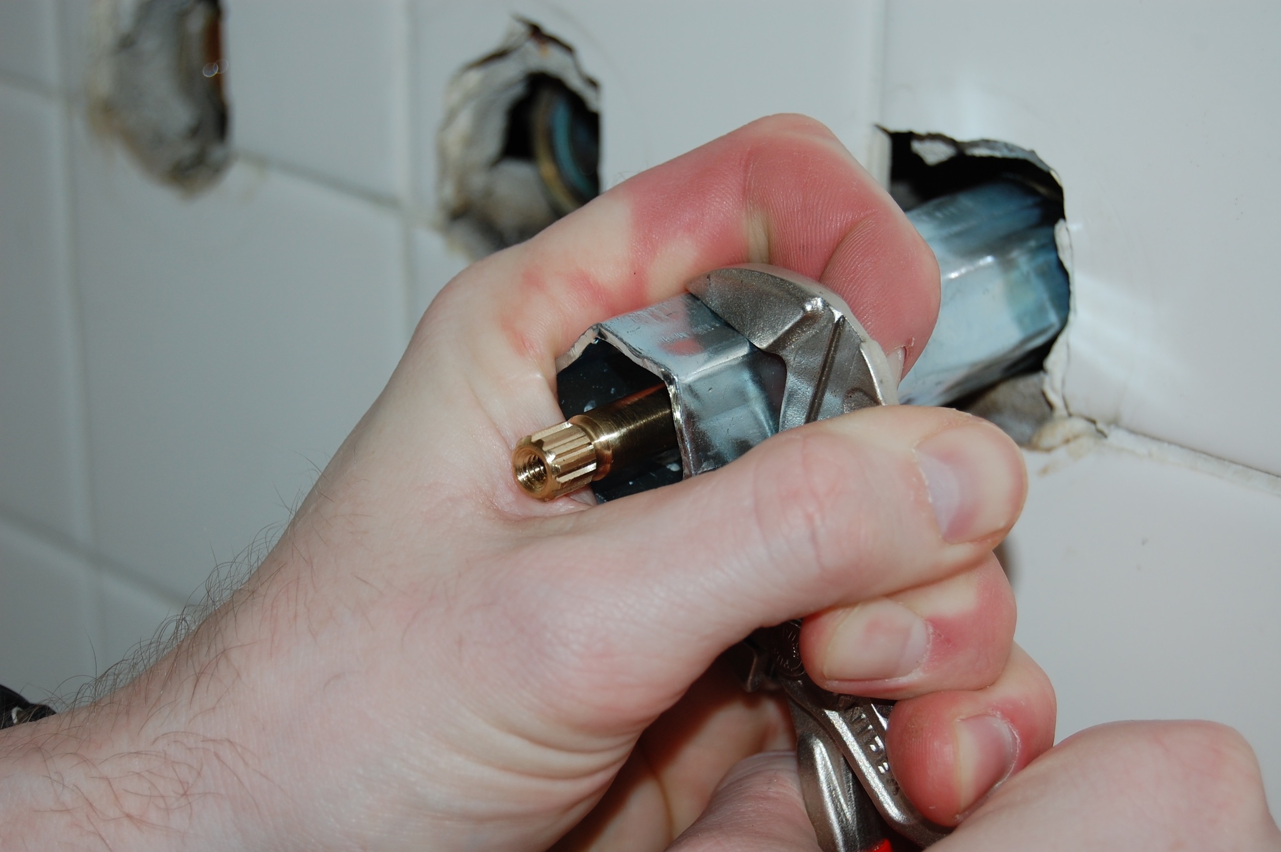
We started by turning off the water and removing the old handles, and stems.  The preexisting handles were hideous, 1970’s builder grade blocks of metal that I couldn’t wait to be rid of, so I was extremely happy about this part.  When we removed the stems we found that they were in better shape than we had expected, but we went ahead and replaced them anyway since we had the new parts.  I am glad we replaced them because the new ones are much smoother turning. 

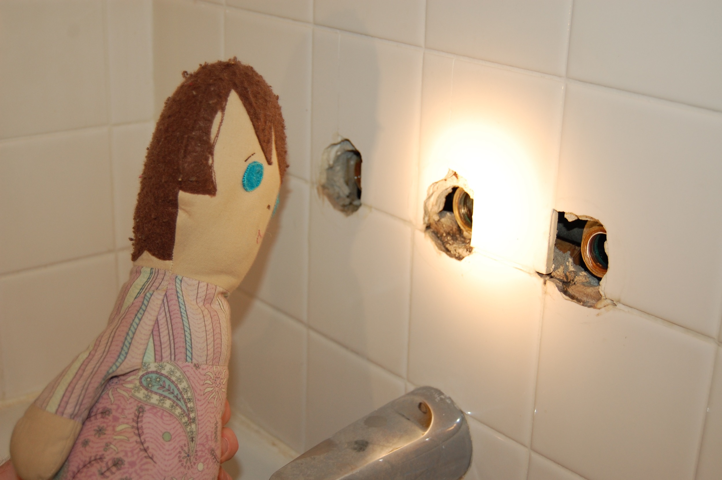
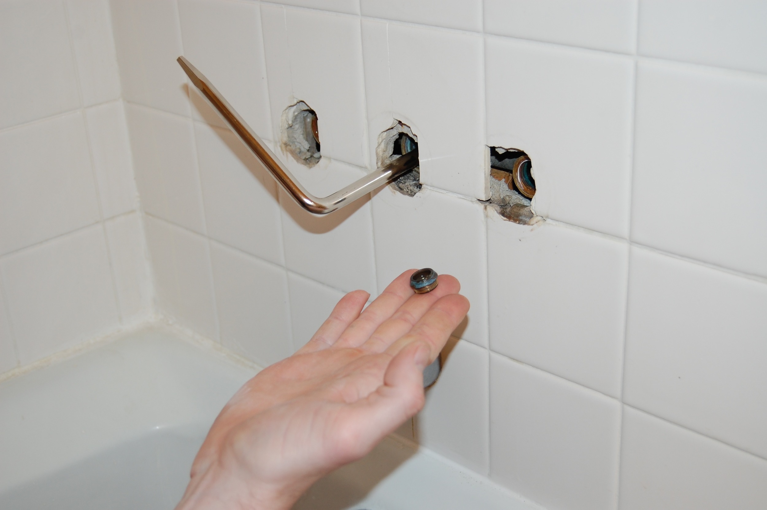
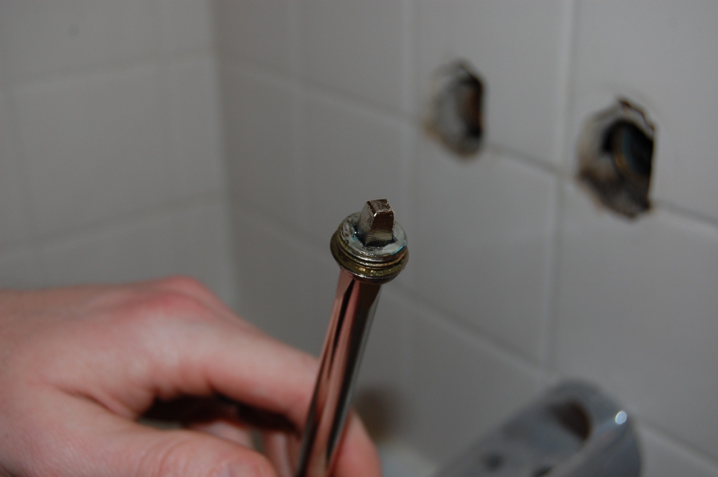
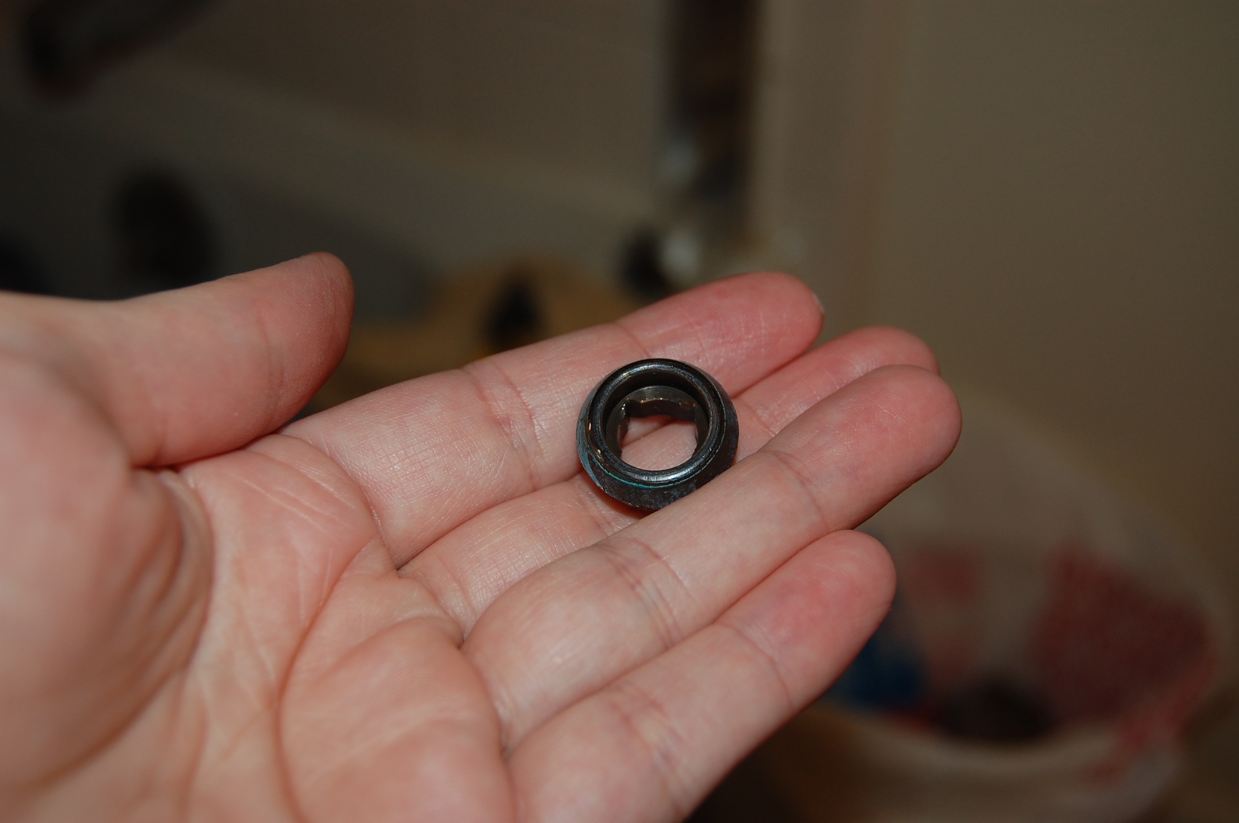
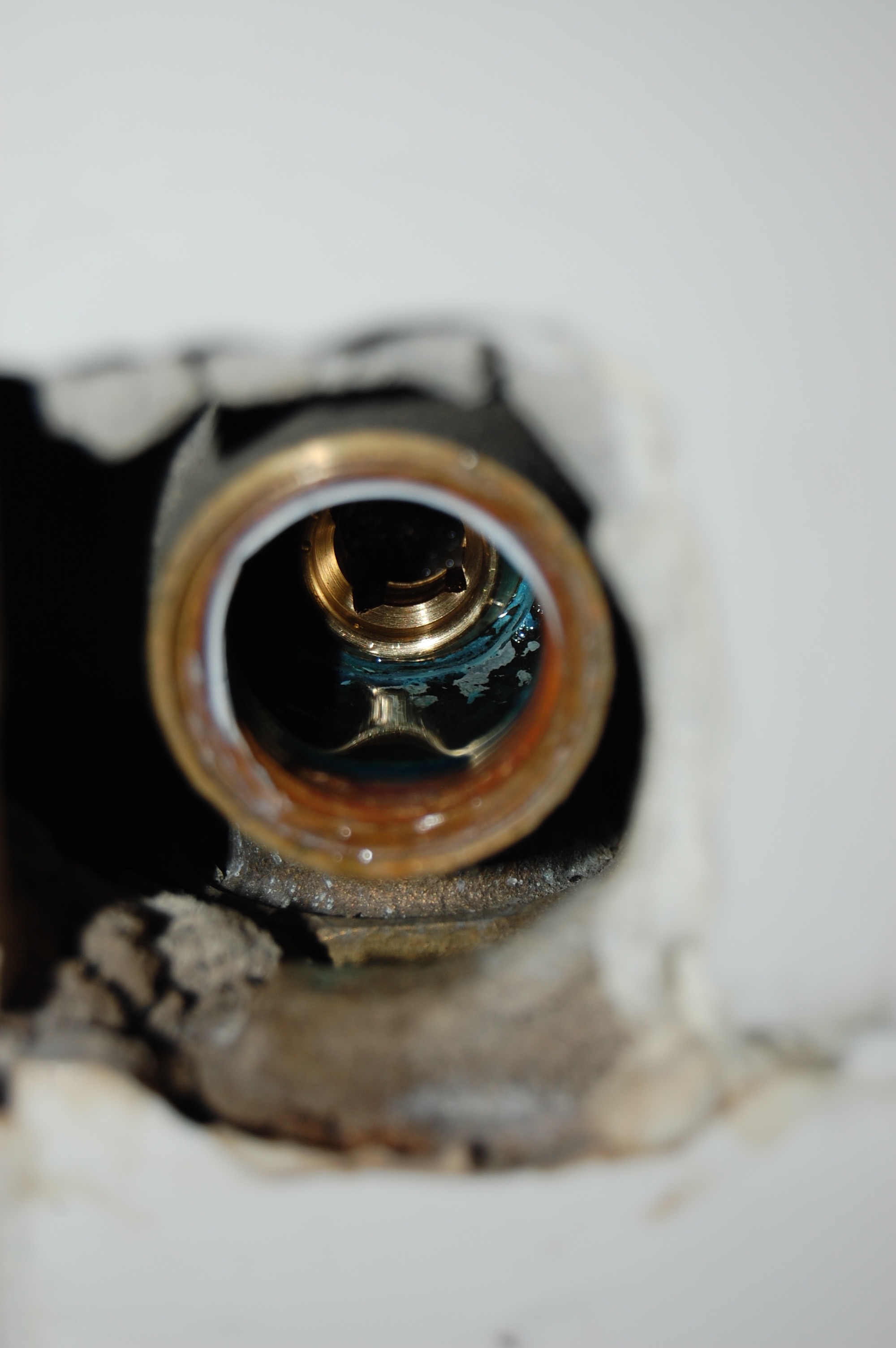
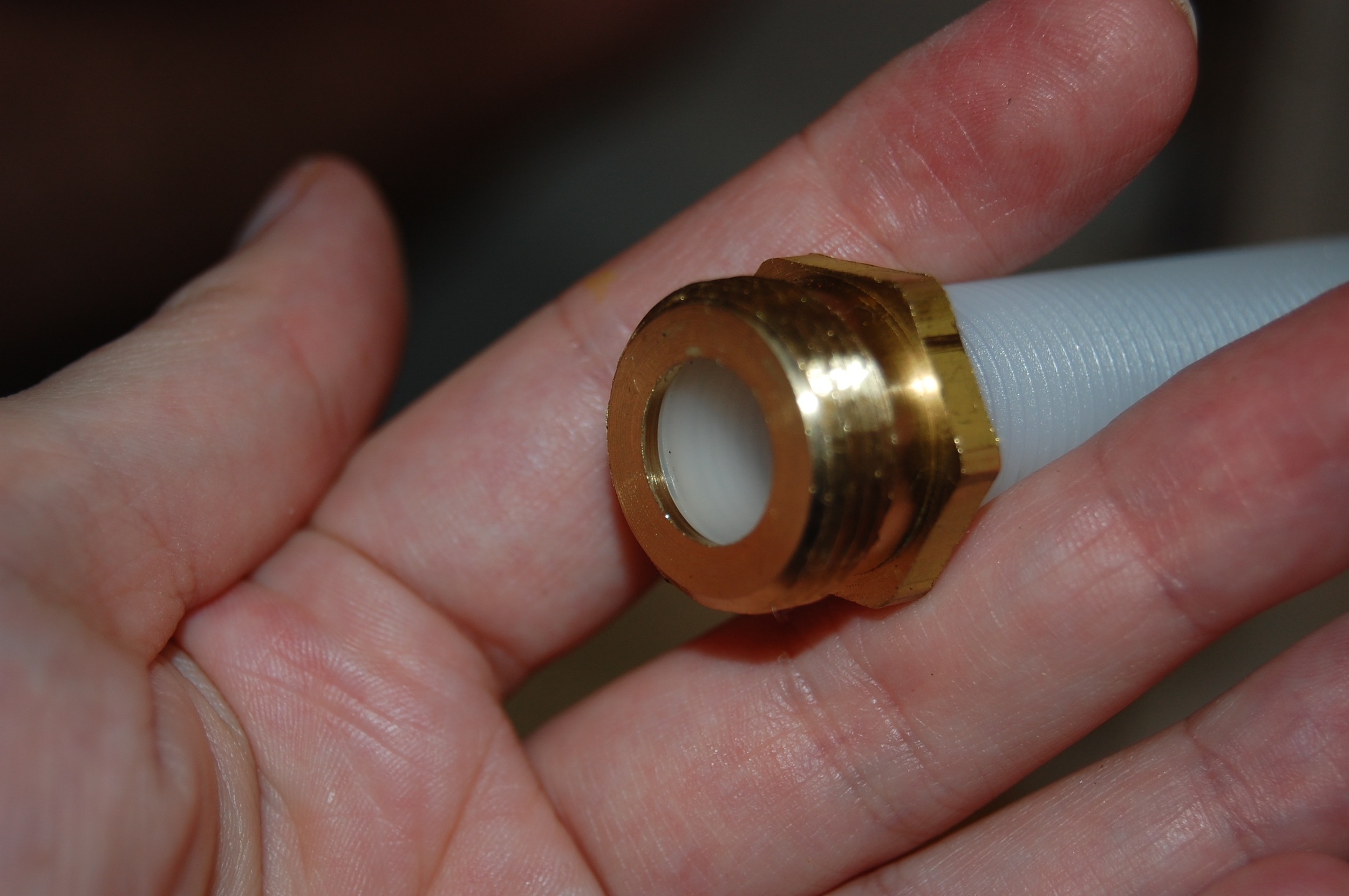
Then we found out that we were missing a tool (don’t believe the box when it tells you everything you need is included).  The seat, which looks a bit like a thick washer with a funny shaped hole in it, and sits in the pipe within the wall, needs a special tool to be removed called a seat tool (Olive, one of the kid’s dolls helped illustrate it’s placement).  There was no seat tool included in the kit, and we had no seat tool, so Firebeard when on his first trip to Home Depot and bought one.  That is another $5 if you are keeping tabs.  Once we got the seat out and compared it to the new one we knew where our leak had come from.  It was in rough shape.

So we had gotten everything out, and it was time to start putting things back together again, starting with the shiny seat.  Then in went the stems, their weird plastic covers, the flanges that cover up everything that comes out of the wall, and finally the handles. 

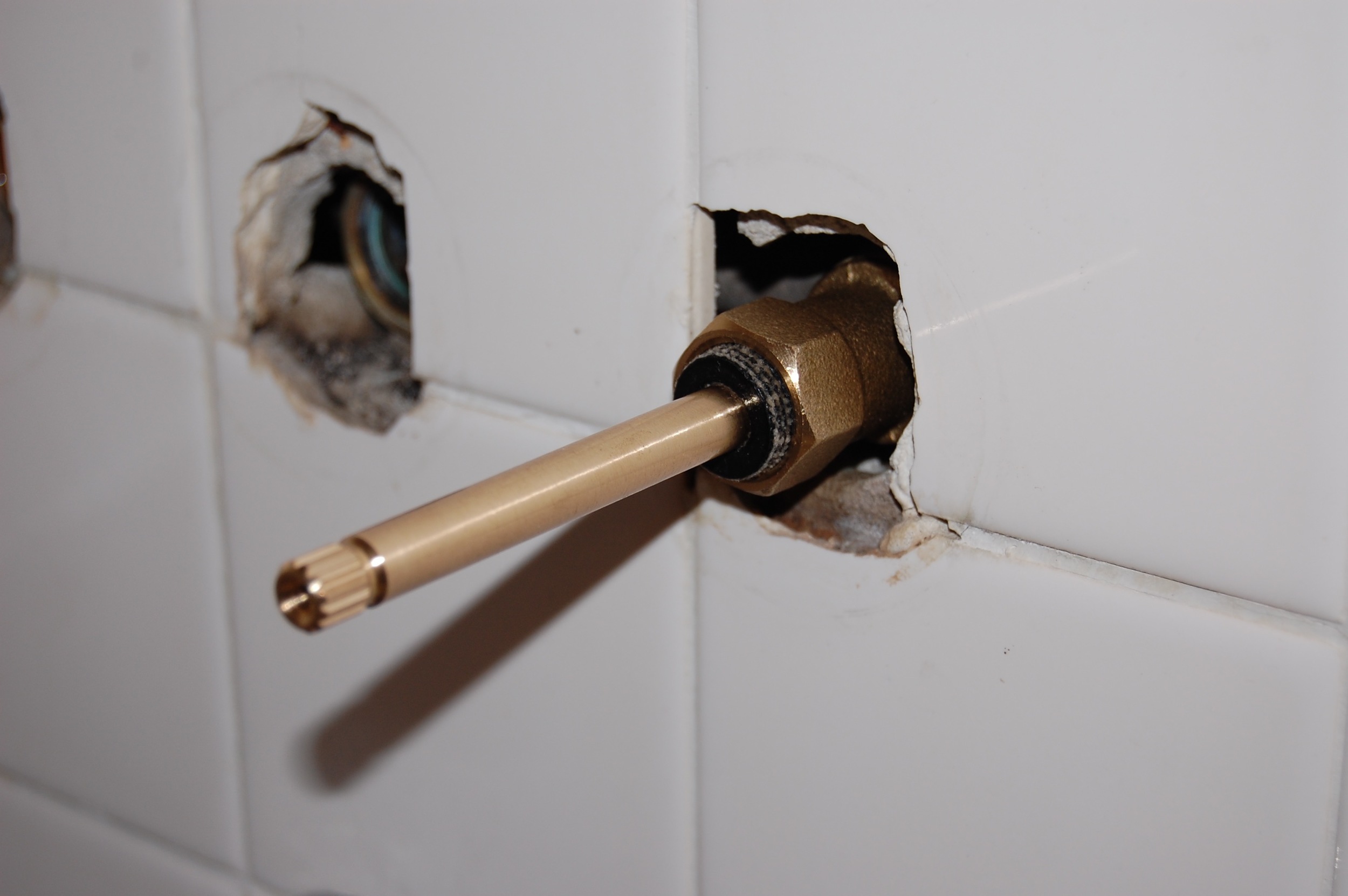
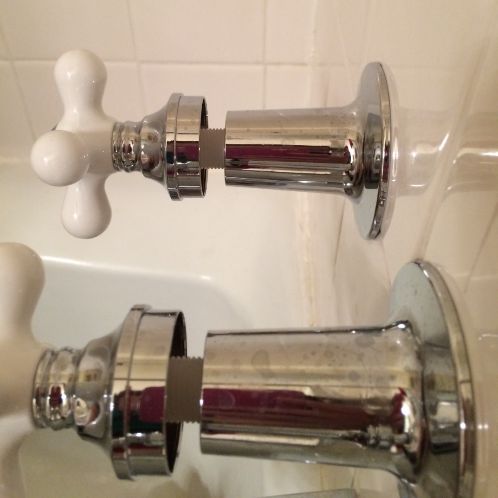
Giant Gap Between Flange and Handle.

Giant Gap Between Flange and Handle.

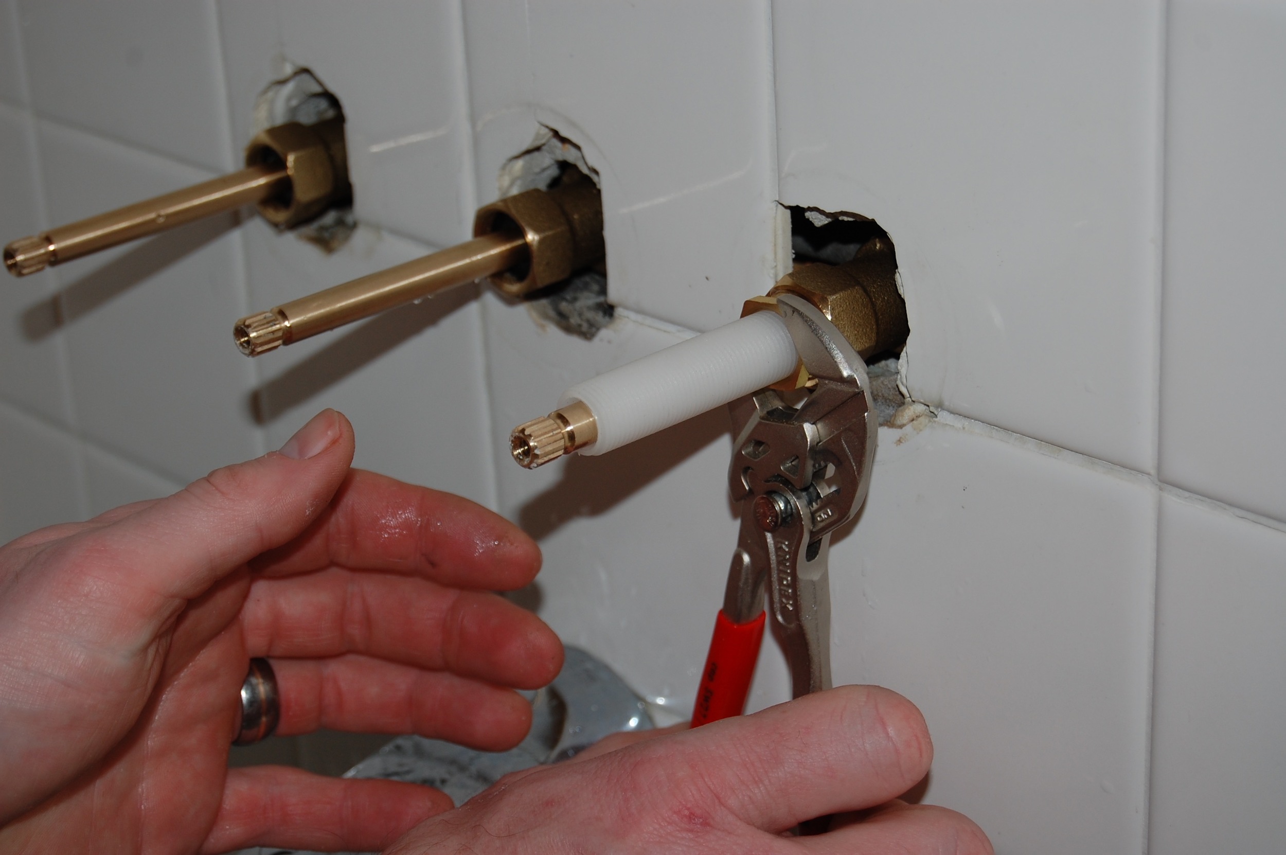
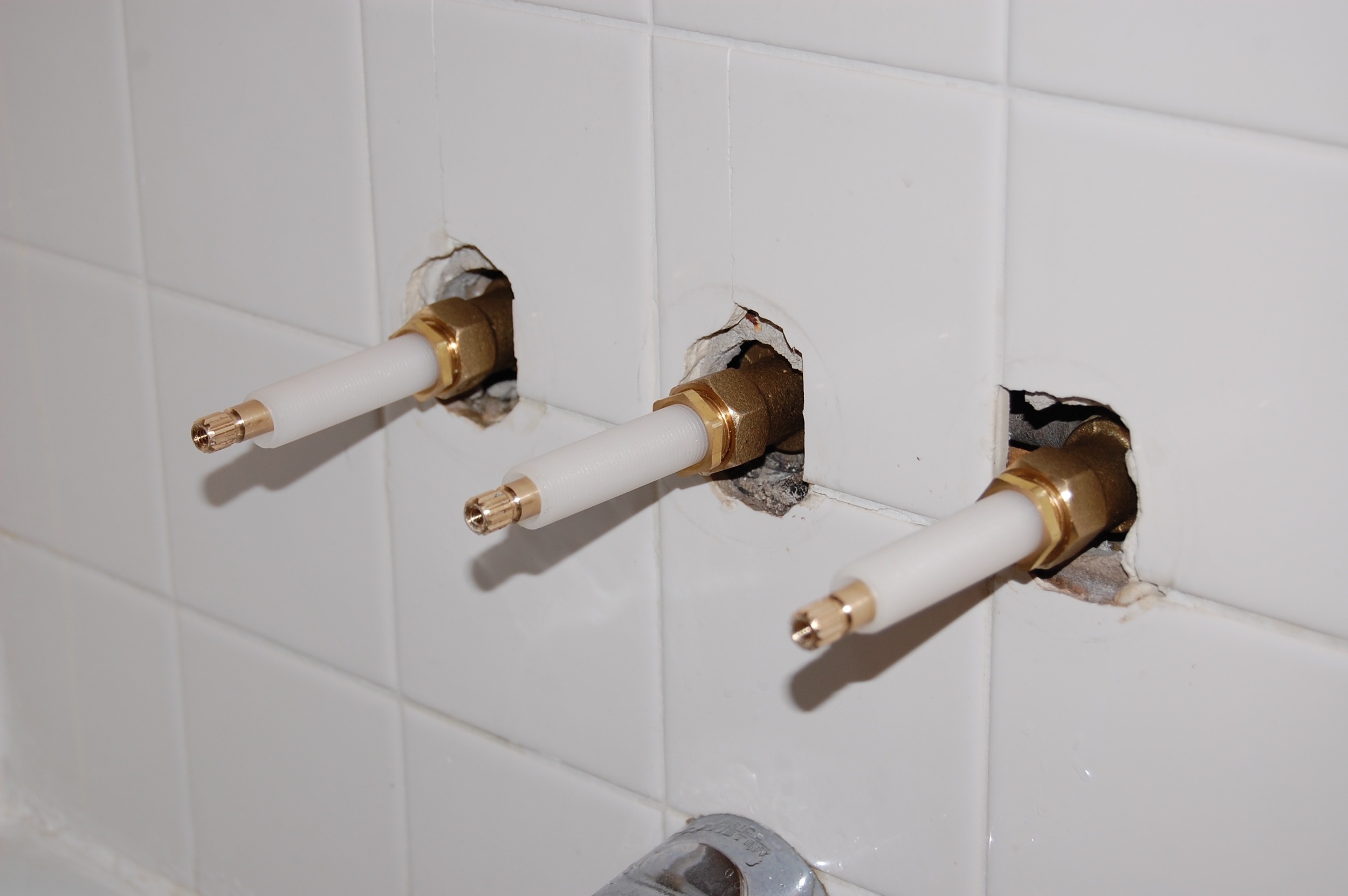
But wait, there is a problem.  There is a space between the flanges and the handle where the stem is visible.  Not a good look!  At first we thought we had done something wrong, so we took everything apart, and meticulously followed the directions when we put things back together.  Still a gap.  We took everything apart one more time and put everything back together while willing the length of the stem shorter.  That didn't work either.

You would think that all of the parts in the kit would fit together, but they don't.  So we made our second trip to Home Depot trying to find parts that would work.  We bought the longest flanges available ($7 a piece) in the hope that they would cover the ridiculously long (and more expensive to replace) stems.  There was still a gap.

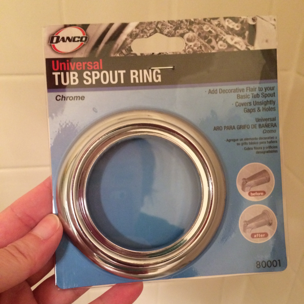
Miracle Solution - Tub Spout Ring.

Miracle Solution - Tub Spout Ring.

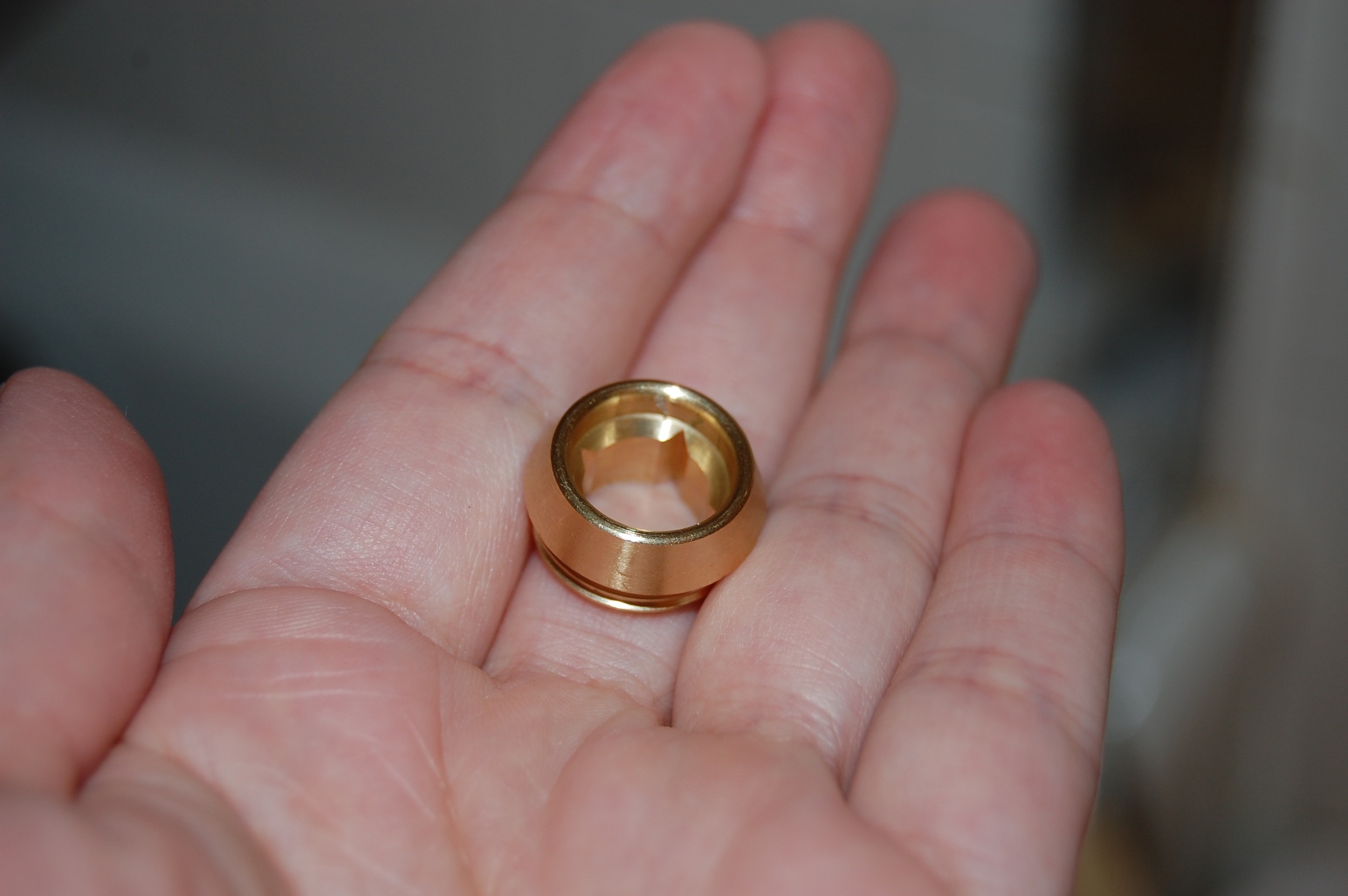
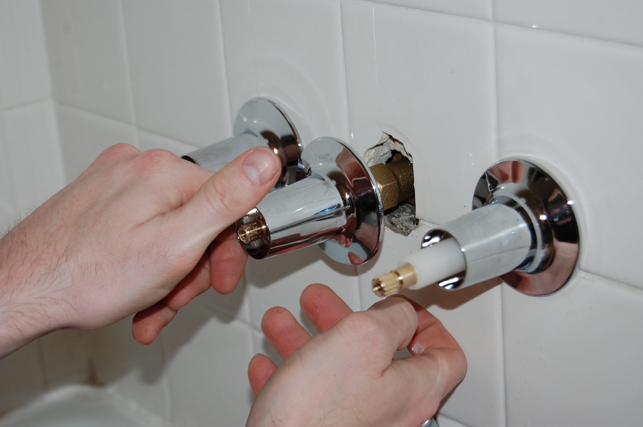
So Firebeard made one last trek to Home Depot in a desperate attempt to find something that would fix the problem before we capitulated and exchanged the kit for a much more expensive faucet set.  He came back with tub spout rings, which are tub spout decorations that just happen to fit our flanges perfectly. 

Tub Spout Rings Installed.

Tub Spout Rings Installed.

 They raised the flanges the perfect amount the fill the gap between the flange and the handle and cover the stems.  At just $2.99 a piece they were the perfect budget saving solution.

After!

After!

The only problem we have with them now, is that they make the rest of the tub look pretty poor in comparison.

Total Cost of the Mini Bathroom Remodel Thus Far: $58.96


Hall Bathroom Mini Remodel - The Plan

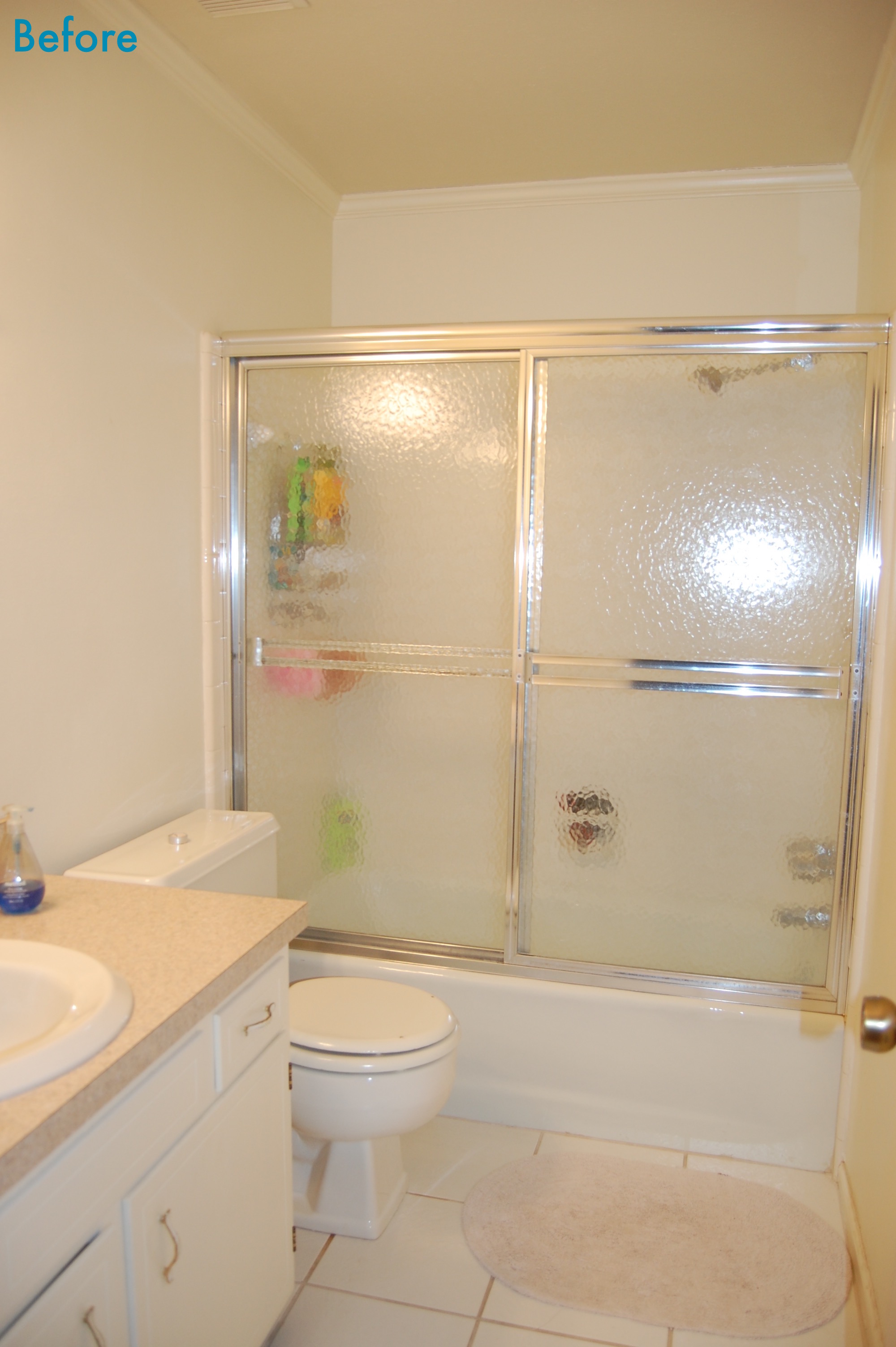
I would like to introduce you to my hallway/kids bathroom.  Since we moved into our new house, almost a year ago now, we have barely touched this room (other than to clean it, and you know...use it).  While it is perfectly functional, it is also extremely boring.

The Before Picture

The Before Picture

When I started feeling bad after Christmas we took a bit of a break from our big remodeling projects.  Even though I am feeling better now, I’m not quite ready to jump back into the heavy work – enter the bathroom mini remodel, also known as, how much can paint really do? 

Before - From the other Side

Before - From the other Side

My vision for the bathroom is to make it a mostly grown up space with a few fun kid friendly touches, that will grow with our children.  We will be fixing some problem areas, painting, adding some storage, and accessorizing in a fun, big kid sea creature theme.  No flooring will be replaced, no walls will be changed or removed.  All of the major features of the room will stay more or less intact.  This is basically a face lift, and I am really excited to see just how much difference it can make.

So what is the plan?

  • Change out the leaky tub handles
  • Remove the sliding glass doors and replace with a fun themed shower curtain
  • Re-caulk the tub and tile (it really is that bad)
  • Color the tub and floor grout since it does not look clean regardless of how much  I scrub it
  • Paint the walls, ceiling, and trim
  • Update the vanity with paint, shaker style molding, and new hardware (and possibly a faux finished countertop)
  • Add some shelving above the toilet and next to the sink
  • Change out the mirror
  • Add some finishing touches, like towel hooks, pictures, etc
  • And now that I have seen the pictures for this post I think improving the lighting may be in order as well

How long will all of this take?  Well since most of our time to work consists of weekends and the evenings after the kids go to bed, it will probably take a while even though this is only a mini remodel.  Oh well, such is life.  I hope you enjoy the journey with us!